HOME | DD
 error101 — my room
Published: 2004-02-11 20:58:48 +0000 UTC; Views: 1291; Favourites: 10; Downloads: 667
Redirect to original
Description
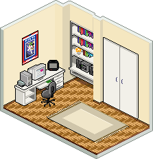
UPDATE:At last, i have renovated this piece a little, i'd been waiting for ages to work on it again...the cut-out effect is new, i think this has solved the excess space problem before, and it has added the piece more volume. i also added some more shadows to the darker places...there has been some comment on the floor tile being too colorful end eye-tiring but i left it as it is...
well, thats all i guess.
------------------------------
this one is an interpretation of my room being both my bedroom and workplace habitat.
this is as close-to-reallife as i can get on this..including my lucky robotech poster and all
 (Smile)")
please click for the full view.
Related content


Comments: 43


ne menem birseydir bu pixel art, deli etmez mi adami?... delirtmez mi? delirtir... delirdin mi peki?...
tebrik ediyorum, cidden cok keyifli olmuslar....
👍: 0 ⏩: 1


nice work. i would like to make things like that myself but i really lack the patience...
👍: 0 ⏩: 0

")


")


What program do you use to make pixleart like this? it seems there's plenty of the same style.
👍: 0 ⏩: 1

there is because there are plenty of photoshop users
and illustrator too...
👍: 0 ⏩: 1
is there a special technique you follow?
👍: 0 ⏩: 1
not much of a technique than pixel by pixel
👍: 0 ⏩: 0

Very nifty indeed. As you were told, the lack of shadows is the main fault of this piece. Adding them would improve the looks and realism quite a lot. Also, try to lower the contrast of the colors you used for the floor pattern. I'm suggesting it because I think that it distracts the eye way too much. By lowering the contrast you're eliminating this issue, letting the objects in the foreground to stand more. Oh, and try to keep the consistence on the lighting of your walls. By looking at it, it seems the light comes from the bottom left, as the wall with the closet and the library look bright and the small segment of wall at the left of the library looks dark, but then the left wall is colored in the same shade of color than the other walls. Try darkening that wall a little bit.
Hope it helps. Nice job!
👍: 0 ⏩: 1
nice set of comments, well attended by me...thnx...
i ll be updating this piece soon
👍: 0 ⏩: 0

The stereo is really good and the floor looks really good. very niceley done. why not try and add some shadows?
👍: 0 ⏩: 0

Where's your bed? Where are you?
This is well made indeed, but that room looks kinda empty...
👍: 0 ⏩: 1
yes i m thinking of some other reprise too i ll take these into consideration.
👍: 0 ⏩: 0


Nice, highly detailed little scene.
Very good piece, well done
👍: 0 ⏩: 1
the honour is mine, loved the pixeldam
👍: 0 ⏩: 0


thnx it took about a day or so i guess, its not a new piece i dont remember exactly
your room looks cute as well
👍: 0 ⏩: 0

Wow! hey thats some great pixel work. Havent seen any good + new isometric work in a while. For some reason I seem to think that this picture is missing something but what I can see is some great work. Very nice tiles on the floor, I really like that chair and the computer + monitor. That bookselve + hi-fi system look really good, I like the work on that.
👍: 0 ⏩: 1
thx so much..
there was some righteous comment about bad scaling on the wardrobe and bookshelves but i justified those and renewed the file..must be better now...
yes it does look like its missing something in real life too heheh...
couldnt find what yet
👍: 0 ⏩: 0

Excellent work. Detailed, well colored, and smooth isometric style you have here. The computer/desk setup is excellent, with all the detail needed and none of the mess that goes along with cramming it in such a small space.
One thing I did notice is that your scale looks a bit off. By that I mean the doors are very huge compared to the desk and the other items in the room. I'd scale those down a bit to match the rest of it.
Add to this and we could have one of the better pixel rooms here at deviantART.
👍: 0 ⏩: 1
yeah you re absolutely right about that scale drowsiness
i ll work on it thnx
loved your ico. btw...
👍: 0 ⏩: 0


thats cool !!
nice, the floor looks entrancing ...
or is it just me !?
👍: 0 ⏩: 0
thats cool !!
nice, the floor looks entrancing ...
or is it just me !?
👍: 0 ⏩: 1
