HOME | DD
 ErrorIambic — Simple Metal painting Tutorial
by-nc
ErrorIambic — Simple Metal painting Tutorial
by-nc
Published: 2007-04-16 00:50:15 +0000 UTC; Views: 1240; Favourites: 7; Downloads: 210
Redirect to original
Description
Ugh, maybe this will help someoneRelated content


Comments: 6

Amazing beautiful and helpful: too bad that the text is not to read at all BUT too good that you noticed the problem and solve it in writing it again as a comment  (Smile)")
👍: 0 ⏩: 0

Ok, this text is super pixelated. Heres what it says (from what I can tell)
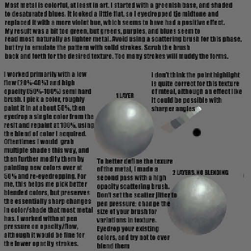
Most metal is colorful, at least in art. I started with a green base and shaded to desaturated blues. It looked a little flat, so I eyedropped the midtone and replaced it with a more violet hue, which seems to have a positive effect. My result was a bit too green, but greens, purples and blue seem to read mostly as lighter metal. Avoid using a scattering brush for this phase, but try to emulate the pattern with solid strokes. Scrub the brush back and forth for the desired texture. Too many strokes will muddy the forms.
I worked primarily with a low flow [20%-40%] and high opacity [50%-100%] semi hard brush. I pick a color, then roughly paint it in at about 50%, then eyedrop a single color from the result and repaint at 100%, using the blend of color I acquired. Oftentimes I would grab multiple shades this way, and further modify them by painting new colors over at 50% and re-eyedropping. For me, this helps me pick better blended colors, but preserves the essentially sharp changes in color/shade that most metal has. I worked without pen pressure or opacity flow, although it would be fine for the lower opacity strokes.
I don't think the point highlight is quite correct for this texture of metal, although an effect like it could be possible with sharper angles.
To better define the texture of the metal, I made a second pass with a high opacity scattering brush. Don't set the scatter jitter to pen pressure; change the size of your brush for variations in texture. Eyedrop your existing colors, and try not to overblend them.
I think I got all of that right, theres a few words I wasn't quite sure on, but I don't think its anything important.
👍: 0 ⏩: 2

That was really nice of you to type that up.
")
👍: 0 ⏩: 0
sorry for the late reply..have been very busy the past few days. thanks.. really appreciate it
👍: 0 ⏩: 0
is it me or is the text pixelated? would appreciate if you make the text more readable..
👍: 0 ⏩: 1
If you're really interested, I typed up the text below... Not sure if you still really care about this tutorial anymore though.
👍: 0 ⏩: 0