HOME | DD
 esterdoodles — Lighting Study
Published: 2019-10-08 01:15:43 +0000 UTC; Views: 513; Favourites: 17; Downloads: 2
Redirect to original
Description
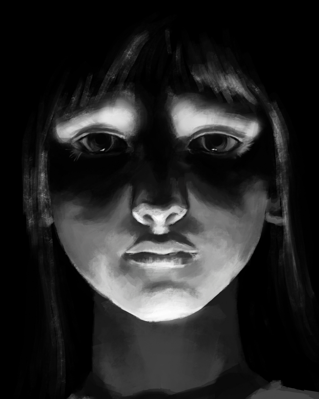
So I’m trying to follow a certain study schedule at the moment to kind of, motivate, me to be more productive as an artist.
Today’s prompt-lighting, particularly lighting that inspires you
I can’t say my reference really “inspires” me, but it sparked my interest because I realized, I do NOT paint outside of a very specific age group and I would quite like to break out of that.
The model seems to be a younger child and I accidentally made her a mid to late teen?
If you’d like, here is a link to the original source material
images.fineartamerica.com/imag…
65 minutes
Photoshop Elements 8.0
Related content


Comments: 14

Hello, I am from ProjectComment 's Weekly Commenting Project .
Your portraits mysterious lighting immediately caught my eye. You very nicely illustrated the light source being below her eye level. I especially like the contrast between her chin and throat, and eyes and forehead. The small light reflexes in her eyes make them seem alive despite the low lighting level in the portrait.
From simply looking at the portrait itselfe I can only say, very good job. Compared to the reference there are a few little points to mention. As you wrote yourself your portrait seems to be that of a teen girl (in my eyes maybe 15-18), while the reference at maximum looks like 12. From my view, this effect probably can be contributed to the fact that you drew the neck thinner in your image only reaches the outer edge of the iris and in the reference reaches the outer edge of the eye making her seem more stretched out. Additionally, her chin seems to be lower in your image again stretching the face. At least when I tried to measure it, in your image the length ratio chin to eyes in comparison with eyes to top of head (estimated through the light reflexes in her hair) is much more even in the reference( meaning the eyes seem to be more in the center of the face height-wise) while in your image they seem slightly moved towards her forehead. My sources say that a person looks more adult when their eyes move away from the center of the face while children have very centered eyes (always height-wise).
Another small thing I noticed is the differing mood of the images. Your reference for me looks neutral to slightly confident while your image has a sadder mood. This seem to be the result of your image having no visible eyebrows. Here the lighting makes it seems as if the inner edges of the eyebrows are raised, creating a sad look. Additionally, the milder shadows of her lashes remove the confident look. The missing upper lashes also contribute to less live in her eyes.
Still, these are just the differenced to the reference I noticed. The image in itself looks absolutely stunning and demonstrates a wonderful use of light shadow contrasts.
I hope you will find your motivation again and have much fun drawing and creating.
👍: 1 ⏩: 1

👍: 0 ⏩: 0

")
Also, since you mentioned it, I think you're right - she does look a bit older, and I think maybe that's coming from the aspect ratio just being a tad off? I haven't done any exact measurements but it seems that your render of the face is a little longer, but the same width, which I think gives the illusion of certain features stretching? Like, she still looks like a kid for sure - just maybe not like 6-ish like I think the photo is?? Take that with a grain of salt tho, I avoid kids like the plague irl.

👍: 1 ⏩: 1
👍: 0 ⏩: 1
Yeah sometimes you just gotta decide to let a work be what it is and move on.
They're difficult! I have found some proportion guides for body shapes but I can never seem to get the faces right.
👍: 0 ⏩: 0


Now, you mentioned you accidentally turned the reference into a teen. I think I have a good idea why that is - I don't know if you intend to work further on it, but some of these are more fixable than others. Please keep in mind that for me, these are details that really don't impact the feel of the image much for me, this already looks terrific!
- The thing probably easiest to change would be the neck. It's a bit thin compared to the reference. Why does this matter, you ask? Well, children are "cute" among other things because of their head-to-body ratio. Not only do you change that ratio, the character seems thinner or even seems to have a longer neck, and this kind of gangliness is not uncommon among teens.
- So, real talk here: I'm not one to talk when it comes to anatomy. So take this with a full hand of salt. I've been told that in manga/anime, one way to make a character look older is by making the face longer, particularly the chin part. And I think that's kind of what happened here. You might realise that children's faces, especially the younger they are, are quite round. I think this is also influencing how old the person looks in your study.
Speaking of anime/manga style (or styles in general), I think it's always great to accentuate a painting or drawing by stylising at least some elements, and I like that you brought some of your own into this. The eyes being a bit bigger proportionally is a nice touch, for example, and you made some subtle changes to bring out a facial expression. - Finally, and this is probably the most difficult to change, there's one other way to make a character look older, especially for girls, and that's smoothness and a lack of texture. Given your rendering, that's probably not all the way up your priority list.
(Although, my personal preference: I would like the hair rendered out a little more, but hey, that's really nitpicky now.)
All in all, something tobe proud of, I think.
This comment brought to you by ProjectComment
👍: 1 ⏩: 1
👍: 0 ⏩: 1
Glad you could take something from it
 (Smile)")
👍: 1 ⏩: 0


This is pretty cool in a creepy fashion.. good in a spooky movie!!
👍: 0 ⏩: 1
when i was looking for reference images this is the one that stood out for exactly that reason!
got me 100% ready to get my spook on
👍: 0 ⏩: 0

Thank you so much
👍: 0 ⏩: 1