HOME | DD
 exception — Testrender Exception 1
Published: 2003-01-14 21:36:43 +0000 UTC; Views: 406; Favourites: 1; Downloads: 6
Redirect to original
Description
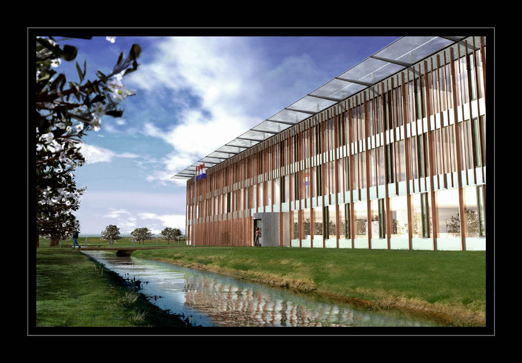
I DONT GET IT!My client says this doesnt look good enough. Im lost. He sais this looks too computer-imagery. Im doing this for an architecture firm and the building is UGLEY! this is just a testrender some minor things need to be fixed like the branch in the front but otherwise... maybe ive just been staring blind but I dont understand why it would be so bad... if any of you have comments about it please do... thanks
EDIt: I updated the sky thanks to comments...
Related content


Comments: 7


I have to agree with kernelb0i
Also
Need to add an atmospheriic effect ... use fog ... and in the standard group, check exponential and set the Near% to 0.0 and the Far% to 50. play with the far, color, and try unchecking the fog background also.
👍: 0 ⏩: 0

the grass, the lighting, the surfaces.
i don't know what you could do to fix the grass.
the brown surface looks kind of shiny, but it doesn't look like metal. so either make it look more like metal (less shine, more reflection, and a better color), or make it more opaque and flat.
lighting doesn't really fit. if it's outside, there are going to be lots of shadows. so try either playing with the levels in photoshop, or take the ambient down in your 3d program. or both.
if you're using lightwave, radiosity is a really good lighting effect for making things look realistic.
and i realize that since it's an architecture firm, they like to have people in there for scale, but the person throws it way off. it makes it completely obvious that its cg.
👍: 0 ⏩: 0

I think like vistascan does. Too shiny. Try to equalize brightness between objects.
Flag needs gravity.
I think you're doing a good job.
👍: 0 ⏩: 0

maybe the building is too bright compare to the rest.
👍: 0 ⏩: 0

I'd say tone down the lights, kill the foreground tree and most of all break up the building model with heavier textures, flat white and other colors just reveal the flaws and sterility of the model. also, some highlight bloom, diffuse glow, and heavier depth of field will go a long way on this, I know it's a previs but using stronger dof on the building would really help.
👍: 0 ⏩: 0

"OMG THATS SO COOL + FAV"
Well, no not really. The reflection on the water is alright.. I think the sky is what look kinda fake. The problem is also with the building.. I'd say that the light angle is what makes it look like "computerish"
For better response, I'd need a bigger render. Can't really say anything with such a small image.
👍: 0 ⏩: 0