HOME | DD
 excursion — Methodical Visions Interface

Published: 2001-05-29 00:19:29 +0000 UTC; Views: 1103; Favourites: 2; Downloads: 417
Redirect to original
Description
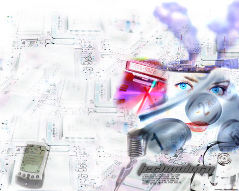
This is my version of a design for a site I am working on with my friend, lakefire [link] All done in PS 6.0, i used a texture by mGee (found on this site) and some random stock art of a cool looking eye. I am going to touch it up (especially the title) a bit more before i slice up the images. Please commentRelated content
Comments: 13

yeah, i agree with ya man..looking back this sucked dick
[excursion]
Why should I?
👍: 0 ⏩: 0

i dont like it..... its not nice... its kinda ugly man... nothing matches... but i saw ur current design and its good
-=[-RetrO-]=-
Head of OPTICO
From The Eye To The Brain
http://www.optico.f2s.com
👍: 0 ⏩: 0

damn that is looking pretty good... i wanna see this implemented soon...
[ idlejam ] - [ iji ]
i changed my mind i take it back
erase and rewind
http://www.highdescent.com?iji
👍: 0 ⏩: 0

my nipples are burning w/ a teasing sensation cause it looks so purty
------
too stupid to think of something cool to say
👍: 0 ⏩: 0

thats awesome man i dig it
Nicolas (Cype)
nicolas@dmusic.com
👍: 0 ⏩: 0

Good idea. I hadn't even thought of trying something grundgy...no clue why I've fixed the eye and a couple of other things, and I'm going to take out the texture background (it doesnt work on other resolutions for some reason...maybe I'll put it in a frame or something). Thanks for the input guys
[excursion]
Why should I?
👍: 0 ⏩: 0

Try smoothing out the edges of the eye image, I love the buttons and you should maybe only texturize the edges of the main content area. And the logo definitely needs more complication/grunge. Great design, just work on it some more.
Cottser
http://www.cottser.com
👍: 0 ⏩: 0

try integrating the texture with the eye, and I also suggest not using a texture are your background, since download times will be montrous.
------------------------
tigert
👍: 0 ⏩: 0

the texture looks really out of place, the major touchups im gonna try to do are to burn the edges of it more, and I wanna see what it looks like with regular website stuff over it, like text and images and links.
[excursion]
Why should I?
👍: 0 ⏩: 0

the eye and title lookk nice..but the texture seems kinda out of place..
.:[t04st3r_b0y]:.
👍: 0 ⏩: 0

Hey i like that
Coool, eyes, nice buttons
nice and simple
gj
-stylez
👍: 0 ⏩: 0

