HOME | DD
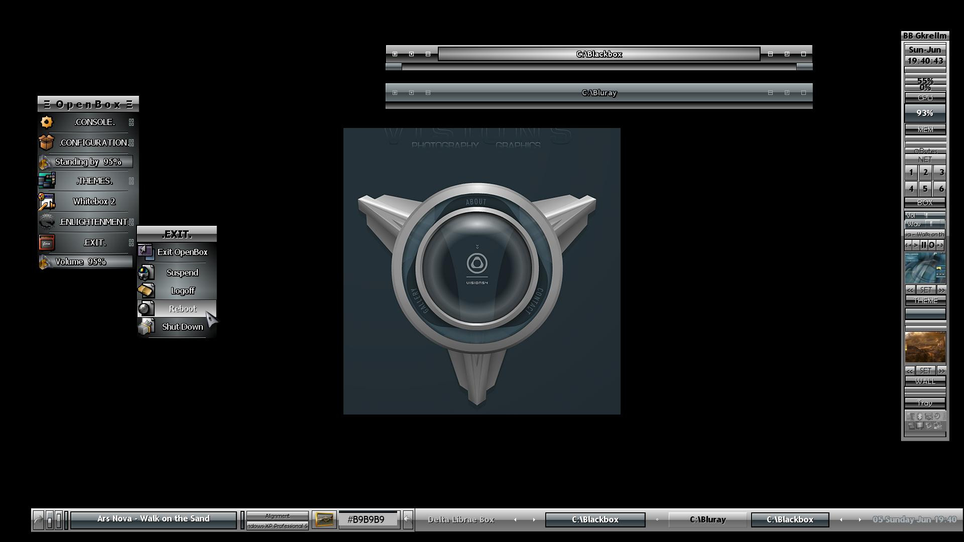
 excursion — Methodical Visions Logo v2
Published: 2001-06-08 22:30:53 +0000 UTC; Views: 635; Favourites: 3; Downloads: 79
Redirect to original
Description
Version two, changed eye...changed font. I need a font suggestion, if you have any good ones that would fit, AIM/ICQ/send me a note.Please comment
Related content


Comments: 9


version two is much better.... better font indeed and nice effect on the eye...
i got a better font somewhere here
-=[-RetrO-]=-
Head of OPTICO
From The Eye To The Brain
http://www.optico.f2s.com
👍: 0 ⏩: 0

mabe make the white grunge on top and the txt on the bottom, make fux0r the txt some more grunge it up...
so far so good
...
[fiction] http://sectae.ellicit.org
[sectae]
{.}
👍: 0 ⏩: 0

is that a fish ? thats great i dig it nice and dark
Nicolas (Cype)
nicolas@dmusic.com
👍: 0 ⏩: 0

Dude, perfect eye... the whitshy bar bellow text looks a little too busy... but otherwise its perfect... it would make one killer head for a site... maybe thats what is for...
A++ on the blending...
A+ on the busy bar, its busy, but its well detailed and no visible alias.
👍: 0 ⏩: 0

ver nice... a different more grungy font would be nice..dunno if i can help you with that though ... :/
[ trodden ]
👍: 0 ⏩: 0

I think the current font fits fine. *shrugs
Sineptor - http://sineptor.port5.com
👍: 0 ⏩: 0


boner
------
too stupid to think of something cool to say
👍: 0 ⏩: 0