HOME | DD
 expansiondesign — Entrapment
Published: 2004-11-11 08:28:05 +0000 UTC; Views: 11098; Favourites: 46; Downloads: 3409
Redirect to original
Description
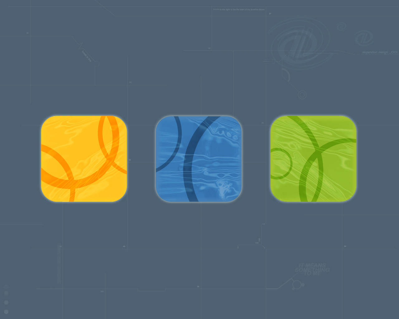
My first wallpaper! The background details where derived from existing desktops. This has been through many processes to get to where it is.Hope you like it!
Related content


Comments: 26


omg... its cool.... man... its freaking cool man... give me cool feeling
👍: 0 ⏩: 1

im glad it does... if u fav it and always see it youll always feel cool
👍: 0 ⏩: 0

Nice wp.
It would look much better without the shadows around the 3 boxes in the middle! Looks to photoshopish'
 (Smile)")
👍: 0 ⏩: 1
cool cool!! ill see what i can do!
👍: 0 ⏩: 0

wow i think that it's perfect. shit did you see how many had veiwed it?
👍: 0 ⏩: 2
no?!? i will now though... its funny though, the first wallpaper i ever made and didnt even take that seriously has been the most popular!
👍: 0 ⏩: 0
no?!? i will now though... its funny though, the first wallpaper i ever made and didnt even take that seriously has been the most popular!
👍: 0 ⏩: 0
not a favourite though?
lol cya
👍: 0 ⏩: 1

i think i fav it on ur other user awhile ago.,......*cry's* im sorry /jk.
👍: 0 ⏩: 1
lolololol yah its what i do best (confuse, not cry) i wont try to explain it................
👍: 0 ⏩: 1

Outstanding.
White lines seem slighly busy at parts (especially over the colored squares, like mykel said) and a little too grid-like. But I love the variation in them with the arrows, diagonals, and other tiny details.
Amazing. Good work. I love it.
👍: 0 ⏩: 0


i like, i dont know, i like the lines crossing through the images. If they didnt, it would look more like all the other walls, but this make it different. I really like the effects you used on the boxes too. I love the text effects you used on entrapment in the top right.. great work
👍: 0 ⏩: 1

thnkyou very much... really appreciated ")
👍: 0 ⏩: 0

Ooh I do like it. There are some things I would change about it though: the lines shouldnt cross the colored images imo. And go a little eaiser on the small details; its called minimalistic for a reason ")
👍: 0 ⏩: 1
eyah cool thanks man... you would prob like the origonal more then! its just the boxes and two scripts top and bottom... oh well... um :S i called this technical not minimilistic for that reason
")
👍: 0 ⏩: 0