HOME | DD
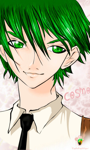
 ExplodingIchigo — Green Ink

Published: 2007-05-03 21:13:30 +0000 UTC; Views: 1992; Favourites: 36; Downloads: 1
Redirect to original
Description
This is the second in my series of pics based on my Christian-pop songs. The song I based this pic on is called 'Green Ink', and I wrote it one afternoon when it was really pretty outside. I tried to capture the meaning behind my song in this pic. hope you like it ^^Others in the series:
~Like Oxygen [link]
time: 4 and a half hours on photoshop CS2, using mostly a mouse.
Related content


Comments: 117

Nice pose! I like the grass background.
Keep up the good work!
👍: 0 ⏩: 1

Thanks very much! It means a lot! ^^
👍: 0 ⏩: 0

Hmm... I think I do like it a little more than " Like Oxygen"... I think it's the Palette... I love green. Her skin is also really well done, I like the blush effect
👍: 0 ⏩: 1
Aw thanks!! I've always liked this pic a lot too, the background is really simple but I like the colors.
👍: 0 ⏩: 0

Is there any way I could read your lyrics? it really brings the drawing to life, and I love christian music!
👍: 0 ⏩: 1
Thank you so much for the nice comment!
Unfortunately my sisters and I are trying to start our own band, so we don't want to release the lyrics to our songs until we can write music to it and play it. If we ever get Like Oxygen on Youtube, I promise I'll send you the link
Thanks so much! ^^
👍: 0 ⏩: 1
sweet! thanks so much!
👍: 0 ⏩: 1
You're welcome  (Smile)")
👍: 0 ⏩: 1
its hard to hit the ground running with music, I understand completely.... it has to capture the audience like an emotion
I was in band in high school and I loved the soul of the music, the song..... the feeling of playing with such great livelyhood.... but, its hard to find music with that much feeling... I am trying to get more into christian music, but right now, Snow Patrol is the only band that I can really sense the emotion of the music, its very expressive
")
👍: 0 ⏩: 0

Thanks, and also thank you for the invite! ^^
👍: 0 ⏩: 1


That's amazing looking, especially if you used a mouse mostly. Great color choices.
👍: 0 ⏩: 1

The colors!!
I love it so relaxing ^__^
Oh my oh my you are
so great!!! I'm absolutely
taken over by this beautiful piece!!
Great Work!
👍: 0 ⏩: 1
Wow, again, thanks a lot for your comments!! It made me happy to hear that
👍: 0 ⏩: 0

Cool.... this pic looks awseome... love the soft coloring job...XD
👍: 0 ⏩: 1

that's really good! I definitely couldn't do something like that with just a mouse.
👍: 0 ⏩: 1


thankies soo much! >w<
👍: 0 ⏩: 1

oooh!
👍: 0 ⏩: 1

thanks so much! <3 ^^
👍: 0 ⏩: 0

thankies ^^ I'm pretty happy with them too, they almost look 3D
👍: 0 ⏩: 1

This one's really beautiful. Probably the best out of the ones you showed me.
The iridiscence of the background, the soft lighting on the skin and clothes, the hair and sweet eyes...
And mostly the patterns on the body/dress, the hands and the tubes...
Everything is so pretty and appealing, so oddly attractive...
Proportions are also very precise and well done.
So, in all, this is one great piece of work. Congratulations, I love it! ^^
👍: 0 ⏩: 1
thank you very much for the comment! I really appreciate it! you made my day
👍: 0 ⏩: 0

I really like the soft, glowing feel to this picture, 'Green Ink' is a perfect title for this. The background is well done, I like the blurred focus it has and the contrasting sharpness with the reeds in the front.
The girl's pose is quite original, you did a fairly decent job at the anatomy too; her expression is very soft, delicate, and beautiful.
Her hair might be too big for her head though, if you measure a human head, the eyes should be placed right at the center. Also, the outlines for her skin are too standing out, it makes the eye focus on them instead of the soft face, softer outlines would be nicer. Her left hand (on our left side) is bent a bit awkwardly, and the fingers seem a bit too floppy; hands are full of bones, they should have sharp curves to them.
It's a very nice drawing, I like the style a lot. Just some small, possibly improvements in the future could be made.
👍: 0 ⏩: 1
thanks for your comments once again! I'll use your critique for future reference
👍: 0 ⏩: 1
You're very welcome! The pose indeed looks very nice, good thinking and planning going on there.
Yes, I assumed that you liked the hair bigger, which is why sometimes my critiques are more preference based. It works either way, it actually makes it look pretty cute here, so it's alright.
And 

👍: 0 ⏩: 1
ehe, yes, I was smart to have commented on your forum ^^
👍: 0 ⏩: 0

No comment can explain or show the beauty or amazingness of this Picture.
👍: 0 ⏩: 1
wow, thanks so much for the sweet comment 
👍: 0 ⏩: 0


Love the pose and the character! The little vials of ink look well-rendered too! I especially love the detail in the dress!
👍: 0 ⏩: 1
thank you very much!! I really appreciate your comments
👍: 0 ⏩: 0


| Next =>