HOME | DD
 explodingmuffins — Art Show Flyer WIP 3

Published: 2010-02-12 02:51:21 +0000 UTC; Views: 880; Favourites: 0; Downloads: 19
Redirect to original
Description
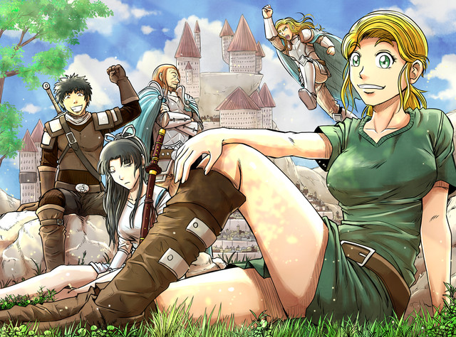
Alright, so, the only thing I need to add right now is text, but I'm not sure if I should squeeze it in the free space, move the text up and let the text kinda float in the free space, or if I should stick it on our shirts.Also, the colors/designs of the lettering is easily changed if you guys think there's anything that should be changed c:
Jamie, your face will be lightened according to how it ends up coming out of the printer...we should get a sample from Kinko's or something before we print up copies.
BUT FOR MABEL TOMORROW. I just gotta add the text. Slight adjustments like that can be made later.
[drawing by Jamie, lettering by Angel, coloring by me]
Related content
Comments: 16

Hey!... I know one out the three there!
Cool picture!
👍: 0 ⏩: 1

Oh? Are you a fellow LVA child?
👍: 0 ⏩: 1

Nope, but I'm a friend of Jamie and a local Las Vegan.
👍: 0 ⏩: 1

I haven't happened to have net you have I?
I know I've met a couple of her friends but it's been a while... it would have been at Comic Oasis if so.
👍: 0 ⏩: 1

I don't believe we have met then. And if we have, you'd probably remember me...I have a streak of blue hair in the front XD Does that sound familiar by any chance?
👍: 0 ⏩: 1

Ummmm... afraid not.
👍: 0 ⏩: 1

We probably haven't met then. XD
👍: 0 ⏩: 0

Is this supposed to be a flyer for an art show or something? I assume so from what you've been saying about it.
I kinda don't like it as a flyer. It's a little too uninviting, and even a little scary. I don't think it'd appeal to many people. It might even be a bit too dark,m what with the cool colors.
And the header is so cluttered and confusing its practically illegible.Way too many colors and scatterbrained shapes, and then it gets weirdly uniform. If youre gonna go the crazy acid trip route with the header, you shouldn't half-ass it. It took me a good 5 minutes before I realized what it said.
👍: 0 ⏩: 1

haha, you don't go to my school XD Compared to most of the art shows that we have, this one is actually going to be pretty light. The art shows here frequently have death/hell/etc themes, and the ads for them have been actually disturbing (one had instructions for Victorian-era eye surgery) so I think this flyer will just be amusing to most people XD
I did not design the text, I only colored it -shrugs- I may put the title underneath it or something in more plain text.
👍: 0 ⏩: 1

The fact that this is a poster for a supposedly light art show just makes it even more puzzling that this poster is so DARK. Aside from the dark, receding cool colors (which is the LAST thing you wanna do when trying to get peoples attention) the figures themselves are just frightening. You (or whoever drew the figures) isn't playing to the audience you're trying to get in to the show.
👍: 0 ⏩: 1

-shrugs- Like I said, you don't go to my school. The people are weird. We/they like this kind of stuff. Everyone I've shown this to finds the facial expressions hilarious, not frightening.
Thanks for the advice though. You've just got to understand that this flyer isn't aimed at normal people XD
👍: 0 ⏩: 0

I don't know how you made the crappy lettering into something SO AMAZING! it just looks awesome dude! and for the lettering i think you should put it on our shirts since it seems plain and i think it needs some attention by putting in some letters 
and i love it! i can't to see this tomorrow dude! 
and man, i feel so bad, you did most of the work dude o__o; DX i'm sorry!
👍: 0 ⏩: 1

Yaaaayyyy I'm glad you like it
That's why I love photoshop, it's really good for things like advertisements because you can make it clean and bright o3o
Angel and I don't know about the white background though. Do you think it's okay? Or do you think that there should be like a solid color or something instead?
And since we have to have the time, date, place, and our names, I'm thinking of maybe putting the text in the white space, and our names on our shirts? Or that would probably be really tacky...maybe the other way around?
And don't feel so bad, at least you guys were the ones who drew it. Oh man I didn't want to have to draw it. And I wanted to work really hard on it. I've been looking forward to having a senior art show since I was a freshman. I WILL EFFORT THIS THING UNTIL I DROP DEAD IF I HAVE TO. Effort is now a verb. Yes.
👍: 0 ⏩: 0


