HOME | DD
 exploXion — Don't forget the colors
Published: 2008-04-07 01:02:12 +0000 UTC; Views: 3518; Favourites: 30; Downloads: 1
Redirect to original
Description
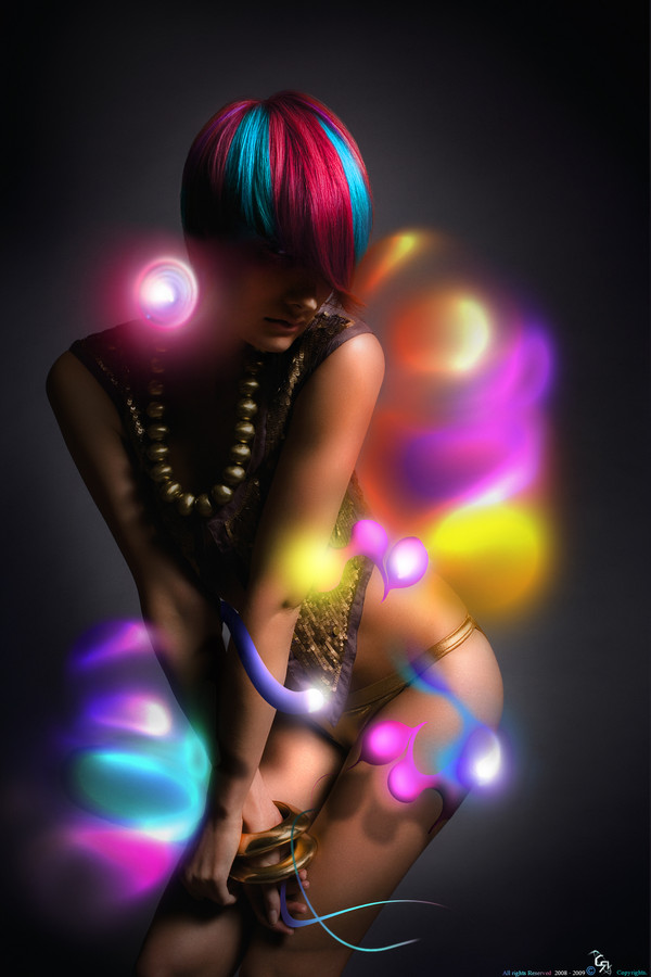
Don't forget the colors....There I tried a kindda new style. I think I got them done pretty well. UHmmm so Nuttin I hope you all like it and you are all welcuumm to leave me some comments...
Tratando unas cositas new en el PS
A mi me gusto bastante el juego de colores ke siempre dejo en mis pieza no puede faltar y ps aki kize jugar con ellos y uno ke otro efecto de lucez bn llamativos....
Summarize:
Resources- PS Cs3 extended
Time- 7 hours apprx.
Inspirations- My Boo & Pawel Nolbert(hellocolor)
Stock- [link] They have really nice pictures there..... check them out
Related content


Comments: 31


really beautiful
the hair, in particular, is awesome.
 (Smile)")
👍: 0 ⏩: 1

Thankx for the fav...
I'm Glad you liked it
")
")
👍: 0 ⏩: 0

los colores estan muy buenos pero te quedaron como mmm muy difusos pero esta muy bueno el trabajo en general
👍: 0 ⏩: 0
graxxx a mi tambn kreo ke fue una de las partes donde mas me enfoke pa ke se viera bn fashion
👍: 0 ⏩: 0


ps men encuentro eso excelente me encanto como colocastes los shapes me imagino q son no c o los pen tools los colores son llamativos mm pero hay partes q tienen demasiado desenfoque a lo mejor con menos c veria mejor  (Wink)")
salu2
👍: 0 ⏩: 0

loko tu y yo tenemos algo pendiente tu me debes algo y lo sabessss.... 
👍: 0 ⏩: 0
jajaja I will check them out
BTW thnxx for the comment
👍: 0 ⏩: 0

This is awesome!!
I would LOVE for you to use my stock!

👍: 0 ⏩: 0


hacelo ver mas realistico, algunas partes se ven q son paja haha. algunas se ven muy bien, muy buena la idea
👍: 0 ⏩: 0


graxxxxxxxx por los fav!!!!!
y vak3 voy a dar una chekiada a ver si me laten jajaja
saludos
👍: 0 ⏩: 0

greatest...
me gusta mucho
kreo k no le viene mal un fav. pa mi gallery
👍: 0 ⏩: 0

definitivamente favorito...
Compare la original con el tuyo, y en lo particular tu le has dado un plus excepcional....
Por ahi saque unas fotos parecidas, con un fondo rosa, a ver si te late hacer uno trabajo similar...
Saludos!
👍: 0 ⏩: 0
graxx por opinar y DJC graxx unn millon por el fav..
👍: 0 ⏩: 0


Alomejor es por que tienen mucha opacidad, creo que esta muy pobre de iluminacion, saludos.
👍: 0 ⏩: 0
esa es mi pregunta lol
por ke dialo hay tanto desenfoke cuando nunka utilize la herramienta ni el filtro
👍: 0 ⏩: 0

el concepto es muy bueno , talvez ahi mucho desenfoque en algunas partes y la ilu es mejorable ... anyway great job
👍: 0 ⏩: 0