HOME | DD
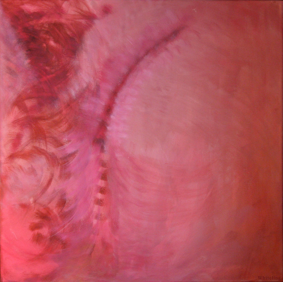
 EYOPIAOPRATIC — O' Intimacy and the aftermath

Published: 2009-01-26 00:38:11 +0000 UTC; Views: 1042; Favourites: 32; Downloads: 36
Redirect to original
Description
"O' intimacy and the aftermath"dancing through obnoxious screens of color,
we happily dismiss the weight of our actions,
first instincts may be best,
but don't remind us quite yet,
instead enjoy the hypnotic, organic shadows of our journey to find that the answers we seek are only perfect in their complexity,
and too soon our childish dance will attract the fury of consequence,
and when it speaks,
it wont whisper
Acrylic on wood
9.5" X 36"
This is the second piece in my new series, really really excited with how its going. I feel like I am really being challenged by these new works and the moments that inspire them. Heavy critiquing is very appreciated!
Related content


Comments: 7


i think its lovely
i do, however, agree with VikingJoe about the too much paint application, but my concern is with the chaos just above the ghostly lips. i don't think this section is particularly in keeping with the rest of the image, as it is a little too chaotic... the other area like this in the painting on the right side seems to have a bit more in common with the painting around it, so it works. i think the difference might be the use of colours - while the other area is predominantly pink in colour, blues and greens, pinks and ochres are introduced along with the flesh tones in the middle area.
i hope that made sense... hard to describe the specific areas i'm talking about sorry.
but keep in mind that this is only a small gripe that i probably wouldn't have pointed out if you hadn't asked for critique. i do really love it... you combine beautiful colours with very emotive portraits in a very unique way. beautiful
")

👍: 0 ⏩: 1

thank you so much for your incredible critique! and i know exactly what your talking about with the tonal quality of the colors around the face, and i totally agree with you. i wanted the look around the face to be different from the chaos around the ends of the piece but i do think a better choice of color would have set it off even better. i also agree with the paint "on top" look, i think if i could have meshed the realism better with the chaos it would have made the piece much stronger overall. and little gripe or big gripe im really glad you brought it up, that is the purpose of the critique and it is really helpful for me to get peoples honest feedback because it really helps me grow and asses my work better, and hopefully make better work in the future. i cant tell you how grateful i am for you taking the time to write such a great critique it means so so much to me. i cant thank you enough!
 (Smile)")
👍: 0 ⏩: 1
you're very welcome, i am always happy to give feedback on your work... and you are so gracious at receiving critique that i end up loving your work all the more because you are open to hearing people's comments and WANT to improve. its a fantastic quality to have
👍: 0 ⏩: 1
and i cant tell you how much it means to me that you offer your time and advice. i sincerely do want to become a better artist, and i personally find that the more work i do the more i realize how much i still have to learn (and its a lot, more than i can handle to think of at one time haha). so any help i can get along the way is greatly appreciated. so again thank you so much for everything, it means so much to me!
👍: 0 ⏩: 0
hey thank you so so much for taking the time to write that amazing critique! It's very very appreciated! I think we both came away from the piece in the same way I really love the piece and think it is a solid step forward for me but also think it could have been stronger with some tweaks. I totally agree with the "on top" comment but couldn't seem to find a way to better integrate the idea once I had gotten to that point in the piece. And the fleshy piece at the bottom was actually a fully rendered top lip and finger that I had worked on top of to introduce the bluish tone. I also am working in the next piece in the series and am about forty percent done I hope to have it finished in two to three weeks. I can't thank you enough for your great comment it was truly a joy to read and respond to!
👍: 0 ⏩: 0

I really enjoy this, the painterly applications have a nice range and scope, the partially obscured face uses what is shown to follow through on an emotional state very well, although I do think that the paint is too much "on top" of the face and that integrating the two elements so that they felt more like one would be stronger, what's happening near the bottom center is unclear to me, are those the forms of a set of lips or did your brush marks just happen to create some flesh like structure down there? Over all this is a strong work, I'm interested in seeing where you take these ideas, do you already have a new work started?
👍: 0 ⏩: 0