HOME | DD
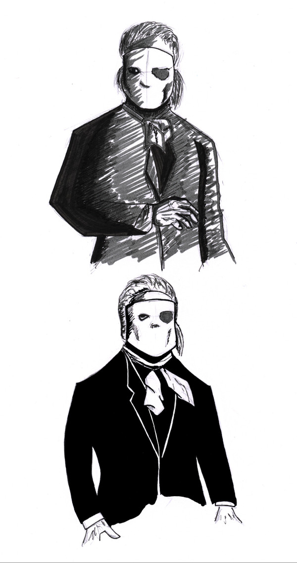
 F-warp — 1962 Phantom
Published: 2008-03-24 13:41:40 +0000 UTC; Views: 842; Favourites: 12; Downloads: 8
Redirect to original
Description
Just two quickies of Herbert Lom as Professor Petrie. Might move it to scraps later on.The 1962 POTO doesn't get nearly the love it deserves. In my opinion it is one of the most underappreciated horror thrillers ever made and definitely one of the better Phantom films. There are actually odd days when I even like it a bit more than the 1925 film.
Related content


Comments: 14

herbert loms professor petries is one of the best phantom of the opera films i seen and this art is good to me could do with little work still
👍: 0 ⏩: 0

I enjoy the film, too! This picture, however, not so much. The mask's a bit too chunky for me.
👍: 0 ⏩: 0

Really nice pic.
I have to admit I like this version also though I am fan of Leroux's novel. Must be the fact that I'm also fan of Hammer films and especially director Terence Fisher. There's a lots of good in this film: atmosphere, music, Michael Gough playing the slimy manager, Phantom playing Bach's Toccata and it feautures the only likable Raoul character. I guess when it comes down to it, the film would be more appreciated if a) Herbert Lom, who did a good job, would have more screen time and b) they would have kept the Phantom's insane love towards Christine. But other than that it is underappreciated film, both as POTO adaptation as well as Hammer film.
Okay, sorry I started ranting
")
👍: 0 ⏩: 1
I wanted him to have more screen time, too!
👍: 0 ⏩: 0

 (Smile)")

The shading on the upper sketch looks like it could be really good, if refined and finished. The solid black on the lower works well, but the strokes on the mask seem a bit inconsistent with the concept - in my subjective opinion I might ad, since I've been yelled at for saying something like this before. That's how I see it. Period.
Anyways, the poses and general design look a lot like the style you used in the comic strip, so it's cool to see you're feeling more comfortable with this line handling.
peace
👍: 0 ⏩: 1
Hm? What did you say, lancea? Oh, I've misspelled "add" have I? Well thank you for pointing it out, and doubly so for noticing only after I've submitted the comment. Charming of you.
peace

👍: 0 ⏩: 0

I had recently watched this version; I really liked it; Better than most. :}
👍: 0 ⏩: 0

I enjoy Lom, and I like some aspects of this film (like the Michael Gough stuff, which must have inspired Phantom of the Paradise), but the Dwarf thing really throws me.
But these are nice sketches, and I do enjoy seeing lesser-loved Phantoms get their due.
👍: 0 ⏩: 1

The dwarf was put in there to shift the actual killing away from the phantom to make him more likeable and I think it worked perfectly. I feel more sorry for professor Petrie than I do for Erik (don't get me wrong though, I feel real sorry for Erik too)
Anyway, thanks for the kind words!
👍: 0 ⏩: 1
I understand why they did it, I just don't find a completely blameless character as interesting as someone we have to look beyond something to feel sorry for. That's just my take--I like the ambiguity of the character.
You're welcome!
👍: 0 ⏩: 1
He wanted to fight back against all the worngdoings that had been done against him. So, not only is this Phantom "blameless", as you say, but he continues to fight for what he believes in. That's another reason why this Phantom is my my favorite.
👍: 0 ⏩: 0