HOME | DD
 F1yMordecai — Shawshank Comp 3

Published: 2007-04-19 19:49:52 +0000 UTC; Views: 1119; Favourites: 22; Downloads: 44
Redirect to original
Description
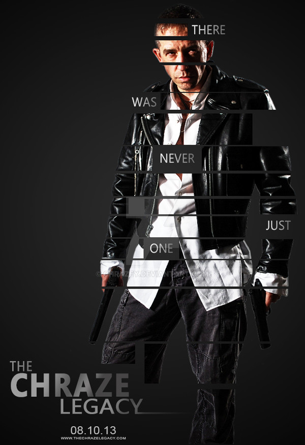
Full View Please!Comp design for movie poster "The Shawshank Redemption."
Will move to scraps later.
Original photography, edited in Photoshop CS2...lighting effects added in Photoshop. Text added in Illustrator CS2.
Related content


Comments: 6


your picture is good but the typography can be more good if you can find carefully what match with the soul for your pic...but its really good...
")
👍: 0 ⏩: 1

Yeah the type sucks, no question there hehehe..I'll have a better one coming up this week.
👍: 0 ⏩: 1

It feels like the tag line would be more effective if it was split up instead of one long line. Also, and most likely alot of people will disagree with this font choice, but maybe you could experiment with something like Times New Roman. Seriously.
I like where the image is going. But it seems like the pawns in the other hand almost take away from the King(?) in the left hand. Maybe have that fist closed or holding onto one of the bars? Maybe have both fists closed but with the King piece being revealed? Or cupping the King and almost raising it into the light? Maybe they're are no chess pieces but lots of water pouring from both hands or the cupped hands! (Yeah, I know that goes back to the whole baptism thing.)
(That's Andy isn't it?)
I like this alot because it seems like they're still a hundred different possibilities and things to try and out of the 100 a good 20 are gonna be really effective but no doubt 10 or less are gonna be great.
👍: 0 ⏩: 1
Actually that's Myat as the model. Andy is too dark
I like this one the most but it definitely needs more work. I like your suggestion about raising it up towards the light. The text sucks. I was thinking of using a more classic font like Times New Roman or Courier or even American Typewriter. Something that gives it more of a 1940s era feeling. Definitely stick to a Serif font.
I'm going to replace those chess pieces with actual stone ones...and apparently you can have a tour of the prison in Sugarland lol....so I'll see if I can take pics of the prison bars there. I'm thinking of not having the final in black and white either...instead have it really muted colors, kind of like how the movie is.
A further worked version is due next week so I'll have time to work on it.
 (Wink)")
👍: 0 ⏩: 0