HOME | DD
 FablePaint — A and O Fix

Published: 2010-06-23 01:19:04 +0000 UTC; Views: 10420; Favourites: 235; Downloads: 103
Redirect to original
Description
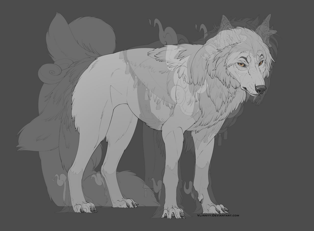
Original being the original and extra crispy being my own.I'm not typically in the habit of redesigning film characters, but I really felt this one demonstrated a complete disregard for basic anatomy and design principles. These fixes are not only doable, they're minimal. They're the kind of thing the majority of people I've spoken to have noticed.
So rather than rant (as I've done in the past) and tell you what I think is wrong, I'm showing you. Then decide for yourself if the designs still look "cute". Notice I haven't taken away the style or even given the wolves more toes.
Images taken from alphaandomega3d.com/
Related content


Comments: 162

They look more like wolves now
And this is coming from a person who LIKED the movie
Good job
👍: 0 ⏩: 0

That's better. You made their designs look so much more wolf-like. Especially with how you fixed that horrible human hair.
👍: 0 ⏩: 0

This movie is such an eyesore, oh god. Your fixes make it look decent though.
👍: 0 ⏩: 0

")

If you'd have worked on this movie I would've actually given it a chance based on designs alone.
👍: 0 ⏩: 0

I have to say you really fixed them....Humphry's face looks more realistic/normal
👍: 0 ⏩: 0

Yours are waaaaaaay better. I seriously don't know what the designer of those wolves was thinking (or smoking) when they came up with those deformed dogs. Also, wtf is up with giving wolves FOX TAILS?? .___. As a fox artist, this sort of bugs me...
👍: 0 ⏩: 1

Most likely it went through one or two passes before being approved and the models were approved with minimal corrections. The concept art I've seen looks as if it wasn't intended to be a 3D animation at first, hence the design issues when bringing it into CG.
👍: 0 ⏩: 0

Not sure if I've already commented on this xD But one thing I've noticed is that your version of these characters actually have "weight" to them... I noticed that in the movie, they seemed almost weightless, however the way you've redone this makes it actually seem like they aren't feathers. Great job!
👍: 0 ⏩: 1
Weightless-ness is a common problem in CG when animators are trained as technicians rather than artists and allow the computer to make all the decisions.
👍: 0 ⏩: 0

They look waaay better in your version, though the designs in general of the whole movie were terrible. I really think they could have done a lot better with it, especially if they had actually paid attention to the actual animal that they were supposed to be animating.
 (Smile)")
👍: 0 ⏩: 1
I think the issue probably stemmed from concept art that was designed with a 2D feature in mind being used for a 3D models. Whoever was responsible for translating the design didn't have an eye for sculpture and on the tight production timeline they were working on, they had no time to revise.
👍: 0 ⏩: 1
I think another thing which didn't help was the fact that they did a lot of the work overseas. That can work sometimes like with the Simpsons movie which was fine, but other times, if it isn't policed enough by the main studio, things can turn out really awful. My animation teacher was working as a director for a project based in Germany while he was teaching us and he had horror stories to tell about how the work was looking because the work was being done overseas (not in Germany, in Asia somewhere.) Apparently a lot of it wasn't making a great deal of sense when you watched it and the designs (which were great) weren't translating at all into the actual cartoon. It was absolutely terrible.
What begs the question though is that this was a Canadian production. There's scores of damn good artists right here in Canada that are fully trained animators that would have been leaping at the bit to animate a movie like this based in their home country. I know the studio shipped overseas for money reasons, but still... I'd rather have quality than what they did for cheap. One of the most aggravating things besides the character designs was 'Jasper Park' (based off of Jasper National Park in Alberta) which did not look a THING like the real place (or any other part of the Canadian Rockies where the movie was apparently set.) I think North American artists would have been a bit better at keeping things correct and looking good. If you're going to use a real place, you better at least make parts of it LOOK like that place so that the audience might find it recognizeable. Jasper isn't that obscure. I really, really think that North Americans could have done a far better job. The creators of that movie did not pay attention to anything. (Like the fact that real wolves would not be caught dead so close to a golf course or... I could go on and on and on about the horrible wolves. I'm sure you could too.)
It's a shame the movie turned out so bad because they had some good ideas which they could of used to make a far better film than what they did make.
")
👍: 0 ⏩: 0

I've been staring at this sssoooooo long and realzing how well you fixed everything. :3
👍: 0 ⏩: 0

Now if only the movie had looked like that, I might have gone to see it.
👍: 0 ⏩: 0
Now if only the movie had looked like that, I might have gone to see it.
👍: 0 ⏩: 1
FML FIRST DOUBLEPOST EVER.
👍: 0 ⏩: 0

so much better than the original... it's just... UUUUUUUGH You can tell this wasn't a Dreamworks, Disney, Pixar, Warner Bros, or even a Bluesky production... it was just... not even CLOSE to how well done it could have been. If I could, I would re-cast the animation director as you, not the wolf-inept loser who was in charge of this ... this... FALLACY.
👍: 0 ⏩: 0

Overall, I'd have to agree with you on your assessment of the character designs. The Extra Crispy appearances of both characters is a definite improvement.
However, if there is one thing I'd recommend keeping about the male wolf, it's the overall proportions of his face, specifically the eyes and their relation to the muzzle and forehead.
While Extra Crispy Omega wolf looks better and more intelligent, I think the Original version looks as if he has a mental disorder, perhaps mental retardation. I think that's exactly the sort of thing that might get a wolf relegated to Omega status even if he really happens to be normal in the thinker, therefore making it one thing I'd like to keep were I directing this film.
👍: 0 ⏩: 0

The wolf on the left seems as though his face is melting.
👍: 0 ⏩: 0

LOVE the new Humphrey and Kate 
👍: 0 ⏩: 0

i like the second version of kate and the original version of humpfrey
👍: 0 ⏩: 0

Your version is worth attention, really.
It's totally amazing how anatomy and proportions affect whole piece, nevertheless well-chosen color scheme and realistic colors. Sometimes I extremely enjoy viewing those pieces, and only few details -- like nose, shoulders and elbows (you did nice job on them!) and torso (or whatever it is, I'm not sure in English terms).
By the way, I prefer original's nose on Humphrey, because I think that shape looks neater, somehow.
👍: 0 ⏩: 0


Your versions are SO much better. When I saw the trailer for this movie, I though it came out like, years ago or something because the anatomy and animation were so bad! But then I realized it was coming out in 2010. I was shocked, really. The wolves look like flabby pieces of clay or something, but you make them so much better. Kudos to you.
D-n-h
👍: 0 ⏩: 0

Your versions are 100 times better than the real thing. Yours don't look like they have human hair. Yours are more natural, thank god
👍: 0 ⏩: 1
got experience. I work on BBA, we've been drawing "haired" wolves for a while now
👍: 0 ⏩: 0


I agree, the movie was a nice idea, but the way they butchered the anatomy was like >_o
👍: 0 ⏩: 0

Many thanks for this; the way the original wolves' legs work in the trailer just baffles me. It's as if they're made of rubber xD
👍: 0 ⏩: 0


The original male wolf look like he's on drugs or something. I think your version better....waaaaaaaaaayyyyyyyyyy better.
👍: 0 ⏩: 0

I'm a tad late on this, but I still wanted to comment and say I love you for this. I see the movie poster for this in my local theatre and just want to cry. Not counting the terrible plot the movie has, but those wolves just look... nothing about them is right. They're downright creepy, and as you said, show a complete disregard for anatomy and design. I love your versions much more; you didn't take away from the originals at all - you can still tell they're the same characters, same expressions, etc.
Honestly, what were they thinking?
👍: 0 ⏩: 0

thats so cool have you heard of wolfquest.org? you should if you haven't
👍: 0 ⏩: 1
I have. It's a choppy videogame clearly made by people who have a weak understanding of games and game development, but they're getting better and I encourage independent and educational entertainment. One of my old favorites was Zoo Tycoon which was fun AND educational. Half the reason I wanted more animals was to read their encyclopedia entries.
👍: 0 ⏩: 1
Cool, I have Zoo Tycoon 1 & 2 on my ds.
-Shay
👍: 0 ⏩: 0

I HATE the fact that they gave them "hair". and that they only have three toes! They have a total disreguard for wolf anatomy (they look more like fricken mutts to me!) Their tails are all wrong and the models have like, no weight distribution at ALL! Whoever designed these characters and made the models failed, horribly.
In short, I must applaud you, though you should have added another toe. xD And chopped those tails in half.
👍: 0 ⏩: 1
the point was only to insert better anatomy into the characters. I take no issue with the cartooniness of it, even if it might not be completely my cup of tea. But then not all movies are meant to appeal to my aesthetic. But simply better internal structure can improve these characters dramatically. You can look back at the earliest cartoons of the animation era and they follow these same principles.
👍: 0 ⏩: 0

your style = much better
thanks for making this, the AaO anatomy irks me
seriously, what's up with kate?! she looks like a frikkin' dog.
👍: 0 ⏩: 0

Definitely prefer the original style.
Not the best designs to begin with, though I can agree on that X)
👍: 0 ⏩: 0


Yeh the original male has a bit of a derpy expression; the extra-crispy is more more appealing.
The original female looks a bit too much like she has hair......which I know that's probably what it's supposed to look like but eeehhh.....extra-crispy's much better.
Not to mention the anatomy.
👍: 0 ⏩: 0

the original grrl looks better the crispier one looks more like a dude and on the guy the original looks better IMO the crispy one is too detailed for a kids movie
👍: 0 ⏩: 1
Actually, childrens' cartoons tend to have the most dynamic and strongest design choices when compared to the majority of fare for adults (which, at best, try to look "cinematic"). This is partly due to the medium of choice for childrens' cartoons, animation, lending itself to heavy stylization and attracting a large number of highly talented artists to the field. Sesame Street, a series meant for toddlers and older, has a lot of thought put into the puppet and set designs.
So arguing "too much detail" is, in of itself, a moot argument.
Second, I added zero "detail" on these characters. The mock ups do not add anything to the characters besides a skeletal structure and more shaped fur structure. Because right now, with the way they've groomed the fur, it looks more like something made in the late 90s. "Monster's Inc" had stronger fur effects, and the technology used to make that is now part of the standard MAYA license. I can go online and find free tutorials for fur creation with a simple Google search. I don't expect a professional studio, even if it is based in India, to be this weak. "Roadside Romeo" was another low budget affair from India and made for Indians (so there's no expectation of "sophisticated" American watchers rejecting it) and it STILL had better design aesthetic than this. And "RR" wasn't that strong either.
To add, and this might be considered tooting my own horn, but I trust USC's educational system. I just came out of a four year program for Animation from one of the most prestigious cinema schools in the world. I had design principles pounded into my brain from day one and you either absorb those lessons or crash and burn in that high pressure environment. Those lessons came from film makers who are either actively in the industry or well known on the independent scene. Now arguing from authority might seem like a very big-headed position, but on this occasion I'm going to flout my degree a little and say "I know what I'm talking about". The characters look like crap, plain and simple, and I expect more out of a studio environment staffed with professional artists. Things like symmetry, shape, silohuette and proper rigging.
👍: 0 ⏩: 2

I don't think having a degree makes you just as prestigious as film-makers who have years of experience on them. |: That's like saying having a black belt makes you a master of Kung Fu.
I think we need to take into account that this movie wasn't only rendered in 3D, but rendered for 3D viewing, and that it's 88 min. long by this rinkydink company that's budgeting tightly as it is. :/ It takes a while to make a film, y'know, and depending on who you're hiring, your quality is either going to be crappy or good. These are people with jobs, too dude.
Not everybody considers the hundreds of people working behind the scenes to get this thing done. So the character designs are crappy? That's a drop in the bucket. What irks you and what's anatomically incorrect is probably completely and utterly legitimate to what their initial concepts were in the first place. I'm pretty sure they know what they're doing, too... Otherwise they wouldn't be where they are now.
👍: 0 ⏩: 2

That's like saying having a black belt makes you a master of Kung Fu.
W-wait, kung fu assigns belts? Or was that meant to be completely sarcastic?
👍: 0 ⏩: 2
Mind, some schools do use the belt system. I think it really just depends.
👍: 0 ⏩: 0
| Next =>