HOME | DD
 Fabrikken — Hello my name is

Published: 2009-05-17 23:59:55 +0000 UTC; Views: 2755; Favourites: 29; Downloads: 1
Redirect to original
Description
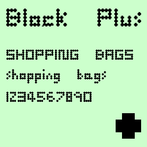
May 2009 Challenge [link]Original font was Futura (one of my personal favourites). I made sure all the ascenders and descenders were the same here, couldn't be doing with all these different heights.
Paper texture [link]
Related content


Comments: 9

I'm just in love with that lost edge of the 'F' and the strokewidth and values of the crumpled paper bits play together nicely.
👍: 0 ⏩: 0

Cheers, I think I could greatly improve this though.
👍: 0 ⏩: 1
Put more effort and consideration into the background texture.
👍: 0 ⏩: 1

Hm, I see  (Smile)")
👍: 0 ⏩: 0

")
