HOME | DD
 Faejala — Jumping into Spring

Published: 2013-03-03 18:31:41 +0000 UTC; Views: 1328; Favourites: 61; Downloads: 0
Redirect to original
Description
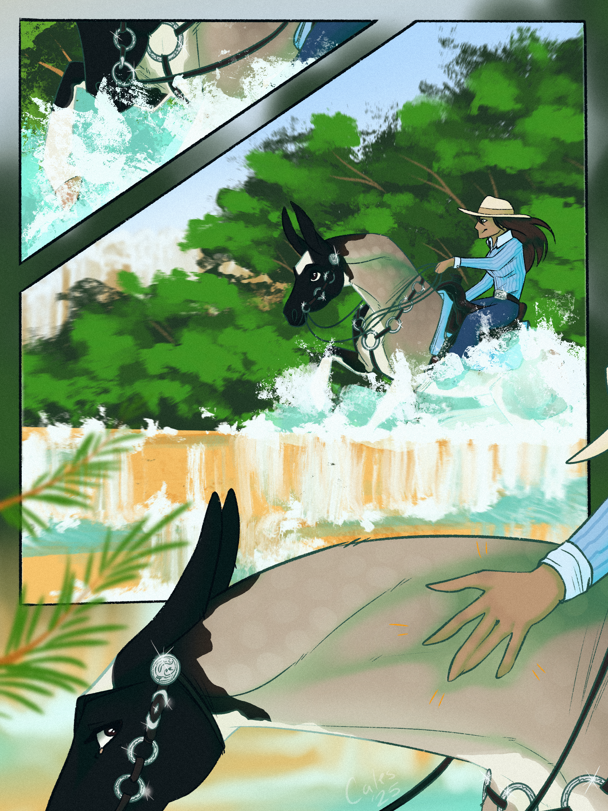
Facebook | Comissions | dA Prints |Horse: DRC Sa'id Karubi
Event: Versa's Spring Show [link]
Class: Free Jumping (coz Karubi can
 )
)Story:
Spring!
Finally it had arrived!
Wasn't this the perfekt time for Karubi's first jumping event?!
It deeefinately was!
")
So the young arabian stallion would compete his first time in his actual discipline! He had tarined a lot by himself: no fence was high enough to keep HIM inside! (Noo, they wouldn't keep him away from escaping and causing trouble by stealing someones underpants :'D)
Therefore Karubi was in a perfect condition ^^
For his first event noone wanted to overtravel so the rider was simply left out
Just as always!When Karubi entered the indoor arena, he was a bit confused firstly: so many humans staring at him...obviously wanting something...but what?
Then, he noticed the obstacle...and since he didn't want to stay around like the fool he actually is, he just did what he always does: jumping ^^
After this little jump was done...Karubi was even more confused than bevore: the humans...clapped and were somewhat happy about what he did?! Normally, they had some problems with him jumping over fences, but now it was okay? ... Strange....reallllly strange!
He'd never understand those weird creatures!
Equipment: Gimp, PSE, wacom tablett
Date: 3nd and 4th march 2013
Reference: [link]
Totally in Karubi-Mood again :'D
Ref used...again ^^ To get those evil feets right D: (coz they're evil ^^) just had to imagine my own arabian head
Wanted to do a good looking chell-shading piece with niiice clear lines...BUT that'S impossible D:
Gimp is just stupid for making good lines and PSE is faaar worse -.- (I hate doing lines from no on D
 (Smile)")
...and I'll go back to my lineless style after this piece
...maybe ... cos it actually doesnt even look that bad after finishing it ^^BUT the obstacle...crap :'D
Featured:
You are not allowed to change it or use this in any way. Don't claim it as your own.
2013 (C) *Faejala
Thanks
Related content


Comments: 28


Originality
This is a good piece. I like the colors, and the pose is perfect. You did well on getting the muscles lean and the tail colored pretty. It shows it's age very well, and I love his eyes e.deviantart.net/emoticons/b/b… " width="15" height="15" alt="
e.deviantart.net/emoticons/b/b… " width="15" height="15" alt="
One thing that confuses me though is the background. Is he inside? I mean you got the lines and all good, but I thought that there would be a metal wall like in a practice arena where you can see the outdoors.To me it looks like a sand box XD but still, its good. I could be wrong anyway haha
In the future you could definetly add a rider and maybe put some judges in the background haha I could see this bad boy winnin'! But thats just an idea e.deviantart.net/emoticons/s/s… " width="15" height="15" alt="
Keep up the good work, and I hope this was a good critique e.deviantart.net/emoticons/s/s… " width="15" height="15" alt="
👍: 0 ⏩: 1

thank you very much for your feedback!
I am really glad to hear you like it^^ (This image hasn't got much attention bevore :/)
Yes...I actually wanted to paint an indoor arena :'D But oh well...it really seems ro resemble a sand box...a bit >.< xD I just didn't want to put too much detail in the bg for not distract the viewers from the horse
Yeah, I'll definately do that...and hopefully he will
For his first jumping event I just felt like a free jumping event would be a perfekt start
Thanks a lot, I'll do my best


👍: 0 ⏩: 1
Your welcome!
Ahh, I see! Well, the horse certainly stands out and is gorgeous 
You did excellent! I can't wait what you'll draw next!
👍: 0 ⏩: 1
Hope I'll be upload to submit some more art soon

👍: 0 ⏩: 1


This is a really beautiful picture! I love the pose!
The only things I saw:
The head of your horse just seems a little too small for the body. Just a tiny bit! It's barely noticable though!
And usually when horses are jumping jumps like that, the jumps would be over grass? I may not be completely correct on that but it just seems like the sandy bottom/ground doesn't fit the fancy jump.
Your lines are gorgeous and your perspective and shading is really awesome. Great job!
👍: 0 ⏩: 1
Thank you very much!
oh...you'Re right...the head IS too small :'D thx
the event takes part in an indoor arena, so I couldn't decide abot the ground
I am very glad you like it and thanks for your critique!

👍: 0 ⏩: 0

I love the story you put with this piece, is fun, quirky and explains a fair bit in few words. On the actual image i think youve done really well. the markings are really nice and natural and the shading while simple is effective. I think one thing you could improve on for this image would possibly be the jump. Its nothing really that eeds to chage but i think if the perspective was brought a little more side on it would match the angle of Karubi. Just a minor thing. Wonderful job! Keep up the good work
👍: 0 ⏩: 1
thank you very much! It's really great to know, that someone really reads the story going with an image!
hmh, had never drawn an obstacle from this angle, so it was quite a challenge ^^ thank you for the hint! I'll do my best to improve

 (Wink)")
👍: 0 ⏩: 0

I saw this in the AHA inbox and meant to comment!
I love the very imaginative pose here. He looks so willing to jump, it's a great atmosphere. And that eye is very 'drawing' and makes a good focal point. It's also a nice kind of free shading, giving a softness to the image. There really is nothing negative for me to say... It's just a very pretty horse, in a very light and happy setting. But, since I have to say something, I might point out the lines on the jumps. Some of the color bands have very sharp curves, (like where the green meets the white) where they really should be more round. But other than that, I love it.
👍: 0 ⏩: 1
but didn't?
thank you very much, I am really happy to get all those positive and constructive feedback!
you're right, thanks for pointing this out!!
👍: 0 ⏩: 1
I know. I'm a horrible person. Haha.
I'm glad I could help! It's such a beautiful horse.
👍: 0 ⏩: 1
xDD
and I am glad you did it
👍: 0 ⏩: 0

This is amazing! Your anatomy is perfect and I love the simple background. It helps make the horse the main focus. There really isn't much to fix about it. The tail should be flowing outwards a bit more maybe, as the mane makes it look like the horse is moving quickly but the tail is just kinda hanging there. The eye looks great! The obstacle could use a little depth. Perhaps try blurring it a bit behind the horse? This piece is simply beautiful, I love the simplicity of it. Much better than I could do haha. The shading is very nicely done, and the lines really aren't that bad at all!
👍: 0 ⏩: 1
thank you very much!
oh, you're right with the tail (hmh....I guess my canvas was over :'D ) nah, thank you for noticing that!!
really glad to hear so!
👍: 0 ⏩: 1

Hello! Ok so let's start this.. I love this so much! The colors of this horse are just stunning! I love how you draw and color the manes and tails it's something I wish I could do! Now as far as something to work on I have two suggestions. #1 The head seems a little small for the body, it just seems a little wonky in that way but I love how you've drawn them! #2 the eyes are a bit awkward, I feel they need to be a little more life like! Try putting some white marks on the eye blending them out then lowering the opacity to help create the feel of water. Also the pupil seems to be oddly shaped, look at some good horse eye references, also the white you did include in the eyes is a bit harsh. These are really picky things and it's so amazing I really had to search to try and make this comment!! Thanks for the wonderful artwork!
👍: 0 ⏩: 1
Hey there!
Thank you very much for this positive feedback, I am really glad to hear so.
*stares at head* *compares to body* ... I think youre right...his head really seems a bit to small 
*stares at the eye* wtf...you're right (again
And thank you for the wonderful comment
👍: 0 ⏩: 1
You are very welcome! (don't worry I do that kind of stuff all the time then I look back and go.... dear god...)
👍: 0 ⏩: 1

