HOME | DD
 Faildogg — Magic Knight Contest

Published: 2013-05-01 07:36:43 +0000 UTC; Views: 959; Favourites: 25; Downloads: 2
Redirect to original
Description
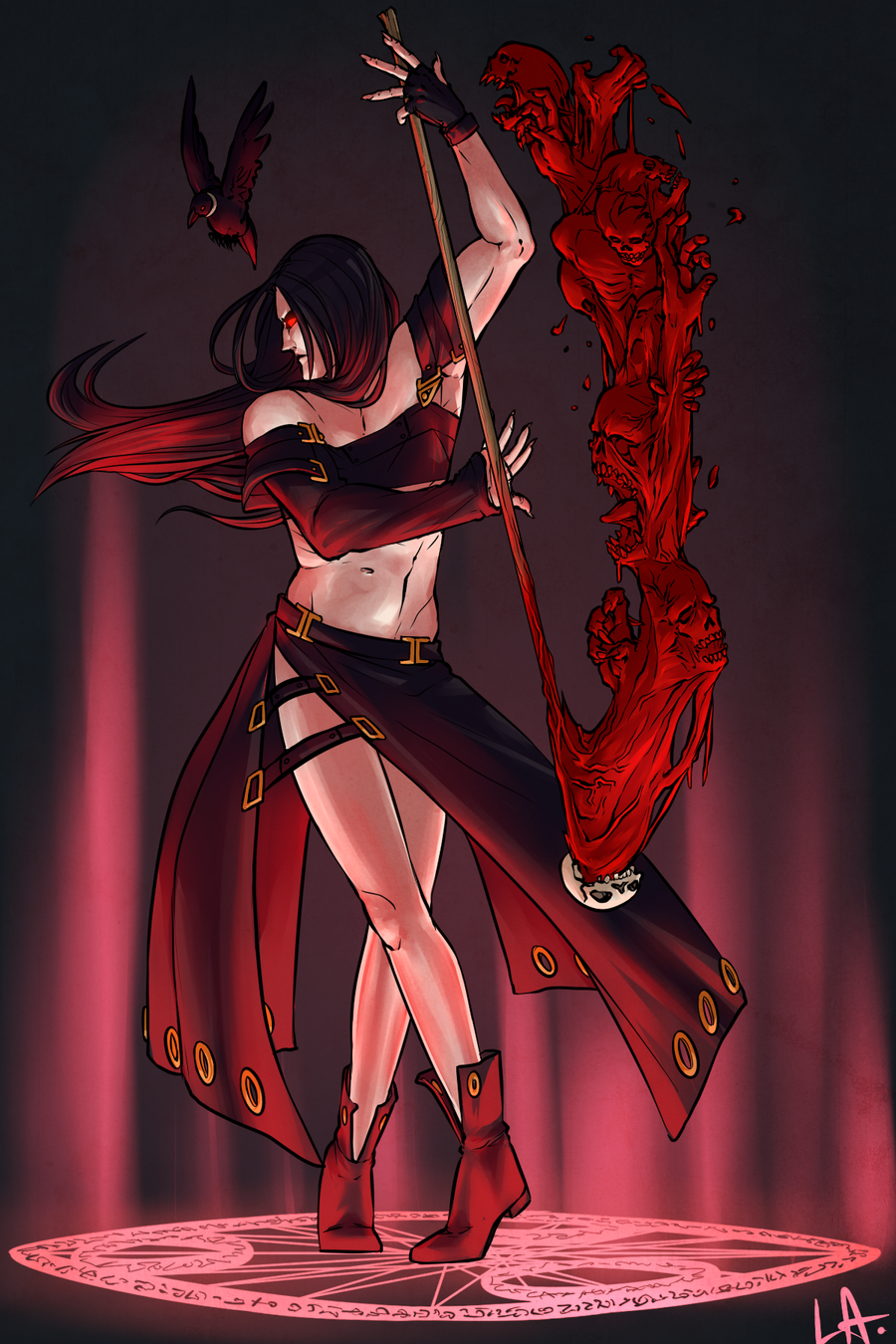
I CAN'T THINK RIGHT NOW. I DON'T KNOW WHAT I'M DOING. I'LL FIX ALL OF THIS LATER.
Contest entry to 's contest [link]
I chose the devil category! (but my final design differed completely from the initial design so eh D: ) A spider summoner/controller.
YEP.
WELL. UH
DON'T ASK ME WHAT I WAS THINKING WITH THE DESIGN I HONESTLY DON'T KNOW ANYMORE. IT STARTED WITH MY DISLIKE FOR SPIDERS. And god looking up reference pictures /shudders
OHWELL. I HAD FUN WITH THIS. Was also experimenting going from black and white to colors. Btw, what are backgrounds IDK WHAT THOSE ARE HAHAHAHAHAAHA. /sob
Ireallyshouldhavefinishedthisearlierrrrrrr
BUT IT'S TIME TO STUDY /FLEES
Related content


Comments: 12
i like the designe, it´s cool,
but creepy.
i don´t wanna come across such a huge spider
i would definitely scream*kyahhhhhh*
👍: 0 ⏩: 1

Ah thank you!
I am actually going to redo/redraw the design since I liked it ouob
But ahh LMAO my thought process for this was something like "ALRIGHT DEMONS. Succubus/ incubus is too over done. What is something that really creeps people out---"
And then spiders happened.
👍: 0 ⏩: 0


DAT ASS. I really really really liked how you colored the hair here-- it looks nice and glossy, but not too shiny at the same time. But I think that the picture would be much better if you added a nose since i personally find it a bit distracting, since it seems a bit bare.. although you could probably get away with this with another style, for your style my sir-friend i would recommend a nose. c;
And since this is for a contest I would like to point out that the coloring (although you might have attended it to be so) is a bit messy. I would clean up areas like the spider legs and the background because quite frankly (sorry I kinda worded this meanly, but i think that it is necessary) it looks like you scribbled some details. I think i know what type of coloring style you were going for, and i encourage you er- keep going for it.. Take for example the right leg, at first you were painting with a downwards motion, but for the shine you started to go vertically/horizontally. I would also like to say that you do not need shine everywhere. (yes there's lighting and all that necessary stuff, But don't always have to choose a 'whiter' tone) but you have a habit of shading--too much.(ahaha look whose talking) I think that if you had taken out the the 'shine' it would have created a texture much more pleasing to the eye.
The crosses:
Also the shading problem. It makes it look like it has rounded edges/rubbery.
I THINK (you don't need to trust me on this)
that you should use a bigger brush when you shade to get rid of of excess 'lines' when your shading.
Character design:
Usually I wouldn't really pick on character design, but for a card game I personally would have added more detail into the pieces of clothing since ennng it'sforacardgame.(I feel like you could have done much more) But ofcourse simplicity is good and nice and stuff -i may just be nit picky here. Alsooo I like the spider/the white cloth on her back, gahh that was really clever-- its like a web and stuff so it's not just some random piece of white cloth sticking near her buttox. -damnitiwishihaddonethatonmyspidercharacter-
// just realized that the contest just ended. But overall, keep up the good work. Your improving a lot //and sorry if I sounded a bit mean on some parts oh yeah and sorry for the grammar ;;ill just fail the sats.
👍: 0 ⏩: 1
WHAA DUDE I'm actually quite glad you pointed out everything I really need some criticism
And HAHA the background was extremely rushed. Originally I had a bigger design for the character, but abandoned this pose and moved on to a different one because I had no background for it. Then being the indecisive me, I decided I like this pose and wanted to work on it more. I was coloring the person just for the sake of finishing it and then I learned that I could still enter in late. And so, the background as well as the character were pretty (as in very) rushed. To be honest, the background doesn't even fit with the character at all.
What you say is pretty much all correct, I was using a lot of white tones when I was trying to shade it in black and white and totally omitted most grays. So when I put the overlay on top of it, it resulted in not many hues/tones. And I was too lazy to try and fix it. So really, I feel that if I hadn't been rushing I could've done a better job on the skin/white tones. This is totally my fault though for not spending enough time to do details and clean my lines up and such (same with character design, I really wanted to do more with the font/..chest area with clothes but didn't.)
But yeah everything was really rushed. I'm most likely going to just redo this afterwards since I really could make this a lot better. Ie. not rushedandallshittyandstuff.
👍: 0 ⏩: 1
sfsfasdfasdf aslongasyougetit. and whats the point of having art friends when you cant pass around wips and get critiques. bro.
👍: 0 ⏩: 0

