HOME | DD
 falcoDArgento — [FA] Xxcute-kittyxX
#couple #demon #demonboy #demondevil #demoness #demongirl #demons #monster #monstergirl #sexy #sexyhot #monsterboy #sexybeautiful #couplecute #demonsexy #couplepairing
Published: 2016-11-06 02:24:58 +0000 UTC; Views: 877; Favourites: 33; Downloads: 0
Redirect to original
Description
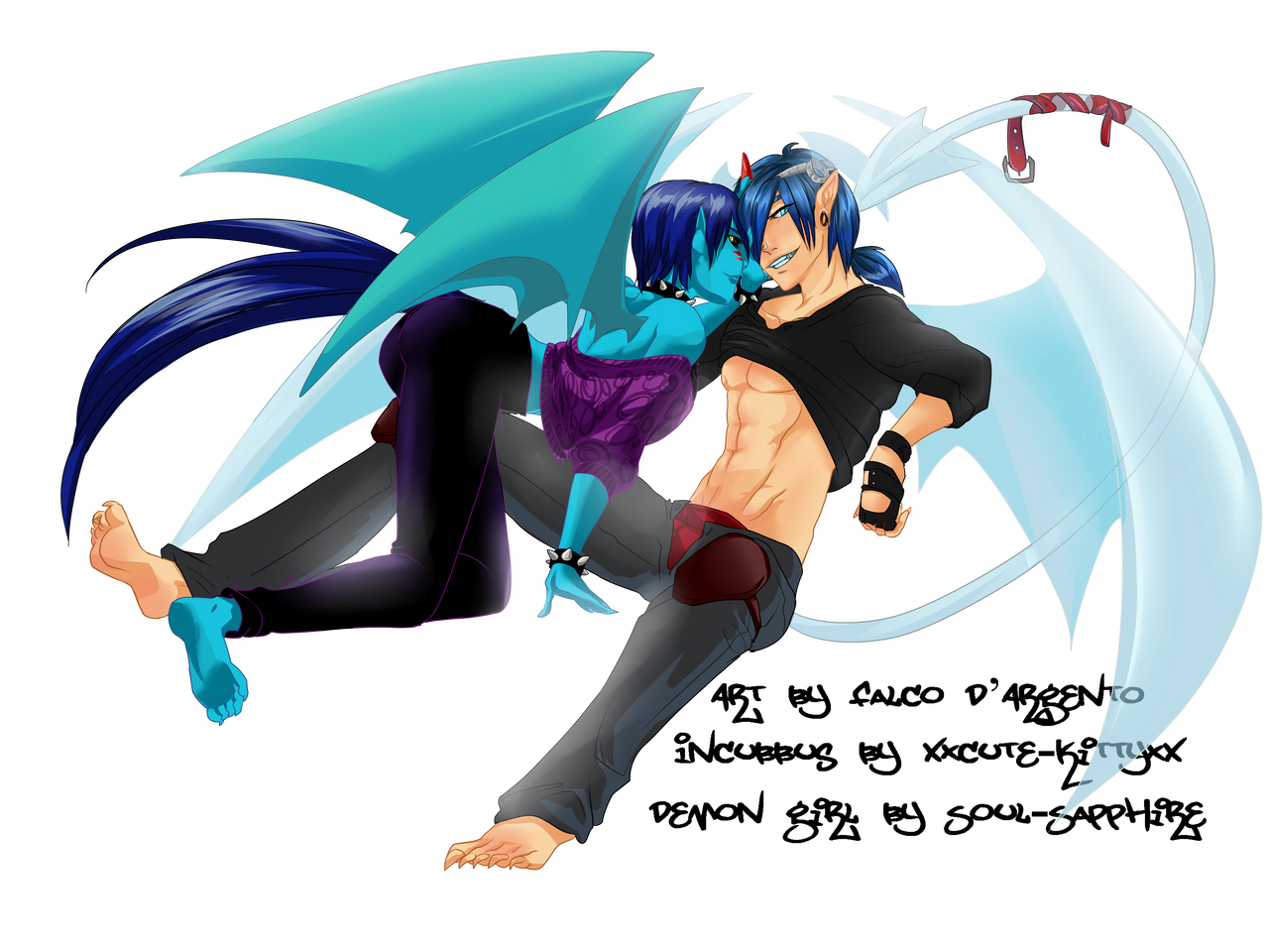
A few days ago, XxCute-KittyxX closed their contest DrawMyOCContest - Open - JULY 28th to OCTOBER 29th
I'm late, very late for entering ")
")
Here's what was supposed to be my entry...
Maybe next time
º º º
Tablet Wacom Bamboo Pen & Capture | Pen Tool Sai
Incubbus character (c) XxCute-KittyxX
Demon girl sharacter (c) Soul-Kokoro
Art (c) falcoDArgento
Please do NOT copy, edit, use as base, claim as yours, upload somewhere else (repost)
Thanks in advance
FalcoD'Argento 2021 [OPEN] Comm_INFO
Related content


Comments: 16

👍: 0 ⏩: 1

I love the heck out of this one. You did really well on the anatomy and musculature here. The guy in particular looks flawless, and I love the colors here.
👍: 0 ⏩: 1

I really like this one too, the idea stroke me dead instantly xD I enjoyed the whole process, especially those horns and wings on him, never before had I tried see-through materials, it is interesting to build
👍: 0 ⏩: 0

Wow! She has a sexy petite body & super-cute small butt!! Cute pose!
👍: 0 ⏩: 1
Thanks! I followed the owner's directions and I agree, she's delightful to the eye!
👍: 0 ⏩: 0

Hey there, I'm from
First up: I really love how you've managed the composition of this piece. Wings are hard to deal with when it comes to characters interacting, but you've posed them in a way that feels natural without obscuring any important parts of the bodies. This is no easy feat but you pulled it off well!
Over all the anatomy is very sound, and the colouring and shading of the man's skin are really lovely.
I also really like the way you've draw the clothing. The way it hangs and bunches and folds seems really natural.
The way you coloured the lineart rather than leaving it black is also really nice to see!
Something I feel could be improved upon is the colour use. The blues of the woman's hair are a bit on the garish side, and while I understand it's important to stick to a someone's references if it's not your own character, I feel like this would be more pleasant to look at if some of that blue wasn't as saturated. Also the mid-tone and shadow of her hair use the same hue, I feel like you could have pushed that shadow closer to purple. Likewise, the hues in her skin seem a little too saturated and lacking in variance.
The shading where her wing connects to her body seems a little unnatural too, there's such a sudden end to that shadow. Bringing that shadow down onto her body more might make it seem more natural.
Also, the absolute black used on her leggings catches my eye up a bit too much, it feels a bit voidlike and perhaps too dark compared to the other values used in this image. Maybe a really dark purplish grey would have been better?
Finally, if i'm going to be really picky-- I feel like the line of the man's abs are maybe a little too strong. Breaking it up a bit in places might look more natural. But that's a very minor complaint!
Anyway, hope this was helpful!
You did an amazing job on this! Keep up the good work c:
👍: 0 ⏩: 0

Hello, I’m here from ProjectComment due to you submitting your work into their folders.
I really like the way you’ve posed them and used the space on the piece. This is incredibly well done and you made some really excellent decisions. I know you didn’t create the designs, but you’ve definitely done a good job bringing forth the personalities for the characters through their faces and poses.
You also did really great on the proportions, things are where they need to be and formed quite nicely. You’ve got some wonderful foreshortening and everything seems to be how it’s supposed to be.
Some advice:
You have a lot of good shading in here, especially on the girls clothes, but I think you could take it a little farther on the characters skin and wings, to help push the three-dimensional look a little bit further. For example, it’s clear that the girl is in front of the guys leg, but adding some deeper shades on that legs pants, it’ll push the illusion even further. It’ll also help when adding the wrinkles into the clothes, shading those will help give you a stronger image.
Another thing, along the same lines, is the guys wings and tail. There a lot lighter so they are kind of hard to see, especially when only viewing the thumbnail version of this. I can tell that they are supposed to be see through, which is a cool effect and I like the way you’ve done it, but I think perhaps a background color, or a background in general would help keep that illusion while still making them easier to see to the viewer.
I read some of the other comments already given on this, and I like the idea that TigRaidoXXX had of referencing the blues throughout other parts of the image like a slight tint on the guys skin. It sounds really cool and if you chose to do that in a later image I would suggest doing it in moderation. It’s easy to go overboard with something like that.
I really love the addition of the wrapped up belt on his tail by the way. That was a wonderful touch that really added to the feel and mood of the drawing, as well as pushing that see-through quality of his tail. Excellent decision.
You’ve done an amazing job, and I really love your art and style. Keep working hard!
👍: 0 ⏩: 0

Thanks, I will
👍: 0 ⏩: 0
I'm writing it here, because I met the picture in the projectcomment folder, so I believe you want to get some feedback, so here's some
You did a nice, accurate job here, with line and coloring - that looks really good.
I see that in some places the anatomy seems to be a bit strange - the pose is not an easy one to catch... I'd suggest you double-check the guys's arms and legs length, his left leg seems to look kinda strange in this perspective (maybe a reference could help here?) I'm also not sure, where is the girl's left foot - behind the guys leg, I suppose, but that's not very clear.
Yet, speaking of the pose in general, it looks rather cool - kinda acting-for-the-camera-like, but that was the point, wasn't it?  (Smile)")
And also, the colors of the picture are slightly too vibrant and distinct... Maybe it could look better, if there was some kind of a main, leading hue, which would appear in most elements, even as a little tint... Like, wouldn't these wonderful blue wings send a highlight on the guy's skin?
Also, the shadows may look more interesting, if the color is not only darker, but of different hue and saturation than the main color.
But, the choice of colors and shades might be a part of the picture's style, so this here is only my opinion, you may see it different way
I hope, some tips will be useful...
👍: 0 ⏩: 0

Weird,I didn't get notified O-O
And Ahhh,Its so cool how you drew both of them!~ Thank you for adding my Character along,She looks so great~ I like how seductive Haiku is O//w//O
I really love their claws~
👍: 0 ⏩: 1
Da does that sometimes, it gets annoying tho it's very nice to finally know when you're called somewhere, isn't it? xP
I'm sooo glad you liked this, drawing someone else's characters is stressing when you take into consideration that it'd be rude for the author if you do it wrong ;w;
I loved your girl, I've never before thought of adding light blue skin to a character, you did awesomely =v=
And I agree, Haiku is very .. sexual x//D Why, he's a incubbus, he has to be, right?
👍: 0 ⏩: 1
Yep,I don't know when I even get to see if I don't know it :/
Haha,Thanks,She's one of my lovelies~ And I really love the colour hence her skin X3
And Yep,He's an Incubus so its natural for him to be like that X'D
👍: 0 ⏩: 0

Awww! I'm so sorry you couldn't upload this sooner Your style is so awesome, I really adore it!!
Thank you for uploading this regardless though! That's really sweet of you! *hugs* Thanks for drawing them QuQ
👍: 0 ⏩: 1
SDAFASDFASDFASD!!!
Thank you very much
I'm super astonished by your characters, they're just wonderful, its hard to take my eyes off them. Love the concepts behind them and the palettes! Thank -you- for sharing them!
No worries, it's been my pleasure using them for a little nvn I would have liked to get in touch sooner and maybe ask for an extension on the deadline, but truth be, I had a real heavy load of work on those weeks, it was until this last weekend that I got some spare time, so yeah, couldn't make it, maybe next time, if there's one nv///n Anyways, your characters are so enjoyable to draw!
👍: 0 ⏩: 0