HOME | DD
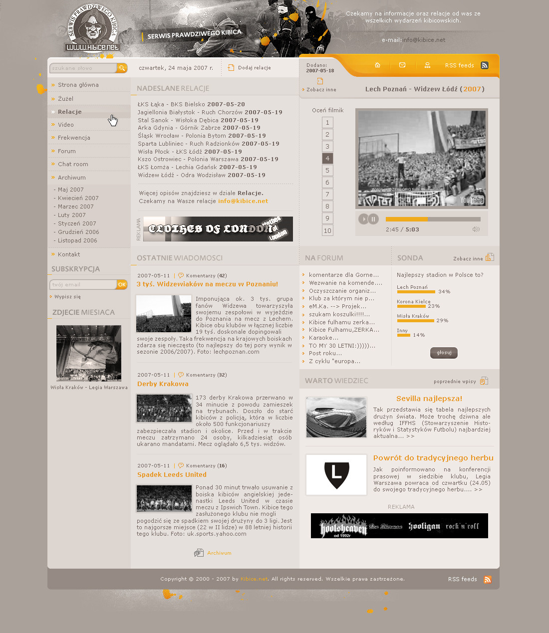
 FataL- — aeroconcept rc1

Published: 2004-11-06 16:11:18 +0000 UTC; Views: 4170; Favourites: 20; Downloads: 2457
Redirect to original
Description
Weee really like this one") hope I can realize this one and make it our official design.
hope I can realize this one and make it our official design.c&c are welcome
Related content


Comments: 62

really fuckin' amazing! by the way right padding is lower than the left
👍: 0 ⏩: 0


thanks a bunch man ")
 (Wink)")
👍: 0 ⏩: 0

omg this is crazy! i love the way both subheadings eg. news projects - are both shown! very cool... where u get ur images from - jsut google search?
👍: 0 ⏩: 1
thanks a lot for the nice comment, I get my images from [link] and sometimes from the deviantart stockaccounts
👍: 0 ⏩: 0

ahh very nice job, very pro...
i like it alot
👍: 0 ⏩: 1
heh thanks mate
btw: nice avatar
👍: 0 ⏩: 1


smooth. the design fits really well with the pic, and everything is really well done.
nice work, cant wait to see more
👍: 0 ⏩: 1
thanks a lot! glad you like it
👍: 0 ⏩: 0

thanks, I used a modified version of "eurostile" and "silkscreen". both are pretty often used by me and I guess they're not that difficult to find
👍: 0 ⏩: 0

bloody awesome mate. only this is the text on the nav dont like the font and too big. well done!
👍: 0 ⏩: 1
thanks man! lets see what I can do with the font
👍: 0 ⏩: 0

very nice design. i would try bumping up the opacity of the copy on the menu section, it's a little too faint. might also want to try aligning the copy in the menu area as well to give it a little more organizational balance (lining up news, xeen, references, products ... then the others aligned too).
👍: 0 ⏩: 1
hey great idea  (Smile)")
thanks a lot for the critics
👍: 0 ⏩: 0

this is very amazing, I like the high tech feel.
although red is usually a strong and agressive color, I like the tones you used and they fit/complement themselves very good.
nice job.
👍: 0 ⏩: 1
wasn't that sure about the color but it looks like you ppl like it
thanks man!
👍: 0 ⏩: 0

I CAN'T CONTROL IT ANYMORE!
...btw: I get the joke with the 'good' designs ya f00!!1

👍: 0 ⏩: 0

any time..... u deserve it....
and hey make a flash version of it (aeroconcept rc1) will ya... i hav a deep feeling that it will look awesome
it will i just know
👍: 0 ⏩: 1
neither got flash nor can use it :/ guess there won't be a flash version even though I'm sure it really will look great.
👍: 0 ⏩: 1
oh... ill do a flsh version and send it to u l8er (these days im busy)... im not that good in flash... but just for my practice as well ill do..?
👍: 0 ⏩: 1
you can upload it as your own deviation if you want
would be great if you could make it
👍: 0 ⏩: 1
ahh cool.... duh ill put u in to credits....
so when do we begin like ill need the normal html so i can animate it...?
👍: 0 ⏩: 1
*cough* guess that's a problem because I don't really have the time at the moment to transfer it into html :/ going to write some exams again, maybe I could finish it at the end of the weekend ok?
👍: 0 ⏩: 2
cus im in the middle of exams as well....
👍: 0 ⏩: 0

Very nice job, great theme...
Laid back + cool & professional = teh goodnaes.
Which is what this layout is.
👍: 0 ⏩: 1


Pretty good job mate! Congrats!
The only thing I would, maybe, do is create an overglow/or under on the logo to grab attention to it, as I did in my last layout for multitalent. Other than that I think it's just the way it should be. Very nice!

👍: 0 ⏩: 1
yes dude, allready got that in mind
👍: 0 ⏩: 1

Wonderful, unique navigation concept. Do the news and project sections expand as more contents are added, or are the red vertical lines scrollbars?
👍: 0 ⏩: 1
they'll expand. the vertical red lines are only to seperate each news' from each other
thank you for this comment
👍: 0 ⏩: 0

ooohh dude!! amazing... really perfect!!! my godd......
👍: 0 ⏩: 1

👍: 0 ⏩: 1
really nice... your design is perfect... is unique... beautiful!
👍: 0 ⏩: 1

wooo pretty good! love the navigation! great work

👍: 0 ⏩: 1

This one is better than the other one, Good colours
👍: 0 ⏩: 1
")
| Next =>