HOME | DD
 Fatooome — Catching fire

Published: 2012-03-17 16:07:39 +0000 UTC; Views: 22327; Favourites: 2072; Downloads: 16653
Redirect to original
Description
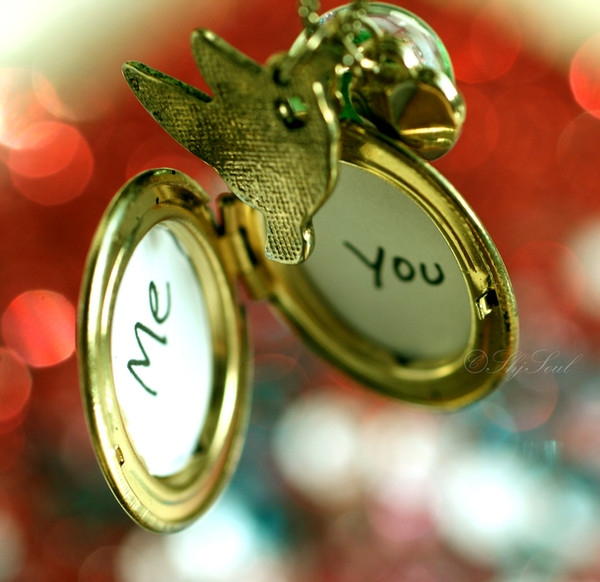
Catching Fire is the second book in The Hunger Games Trilogy by Suzanne Collins.This is just a fan-work of the amazing book

--
I left the stove open and almost burnt my hands in the process ..
-Entry for
Related content


Comments: 353

Overall
Vision

Technique
I like the concept of the photography. It brings out your creativity. However, the picture may have looked cleaner without the period. Although, the period adds a stronger impact. The idea in itself is pretty cool. Haha, maybe that's because I enjoy puns rather than groaning when I encounter one. I found this clever. The paper, on an unrelated note, looks like bread. It looks crisp. I'm assuming the burnt edges created this effect. It doesn't look like paper...nor do the edges look burnt. It's too sharp. I'm not implying that it's bad thing. Something just bothered me (and continues to do so) about the texture of the paper. It looks as if it's not paper, as if it's some sort of cardboard or plastic.
Not so sure if it's my bad vision or my crappy computer.
But making it look like bread reminds me of Peeta's burnt bread in the first book. The handwriting sort of irritates me too though. It looks neat and cute...but I think it's the period.
And the capital letters. I don't know why it should bother me so much since I love this deviation. But it does. I really like the plain background, though, rather than a textured or detailed one of some sort of scenery. I think getting rid of the watermark would bring out the quality of this picture more.
Over all, love this piece but it could use some edits. Great job~ e.deviantart.net/emoticons/h/h… " width="15" height="13" alt="
👍: 0 ⏩: 0


Beautiful, wonderful idea.
Even though the title and the paper literally says: "Catching Fire" you addressed that in such a beautiful breath-taking photo. I love how all the edges of the paper are slightly burned, and there's a "dirty" feel to the paper, I love it! The handwriting is very cute and clear, and for some reason, I can't stand anything WITHOUT a period, so I absolutely love the fact that you added the period.
The picture is so clear and vivid! <3
You were rockin' the clean nails, BUT, it could have had better lighting. It looks too dark, and not as vivid as the rest of the picture.
I love all the books, and this is clearly going on my favorites.
I'm glad you didn't burn your hand! (:
👍: 0 ⏩: 2

I agree.
Except, you don't put periods a lot, Sammich. I've noticed that.
👍: 0 ⏩: 1
Yes I do--sorta rofl
👍: 0 ⏩: 1
SEE.
You didn't add a period there.
Whatever.
👍: 0 ⏩: 1
I know! I just noticed!
👍: 0 ⏩: 1

Thanks for your feedback
Some other deviant told me it would've been better without a period ._.

👍: 0 ⏩: 2
I agree with said deviant.
It might have enhanced the impact of the photography without the period.
👍: 0 ⏩: 1
I like it better. It ties the whole thing together, well for me personally. It also seems more like a statement, like they're so sure it's that. I can't seem to explain this.
Anyways, it looks much nicer, but in some aspect, yes, if the period was gone, it may look nice.
But I still prefer the period,
👍: 0 ⏩: 1
Eh, I agree, it makes a statement. Although for some reason it bothers me.
Maybe it has to do with the fact that it's a title of a novel, a fragment, and not a complete sentence.
👍: 0 ⏩: 1
Well, I personally LOVE it(:
👍: 0 ⏩: 0

I just absolutely love this. I have read all three Hunger Games books, so it first makes me biased towards any Hunger Games art, but it also makes me picky for little details. This is a perfect metaphor for the title of the second book. The writing is perfect in this case, but at the same time, it's not perfectly written. It has that slight (very slight) hint of messiness, which makes it perfect for this piece of artwork. Ths shape of the card is very dynamic, and the burnt edges are the perfect touch. Also, the color of the card, which - to me - is like old-fashioned papyrus, it only adds to the effect of the picture. All in all, great work and great nails. e.deviantart.net/emoticons/w/w… " width="15" height="15" alt="
 (Wink)")
👍: 0 ⏩: 0

When I signed on, and saw this, the first thing I said (yes, aloud) was "Whoa. That is such a cool idea!"
When I looked closer, I liked it even more. I enjoyed how part of the words were burning, as if to symbolize the words themselves; 'Catching Fire.'
I also liked how the paper is burning in two places, one a big flame, and the other a minor one that could easily be looked over.
The very plain, dark background gave a lovely look to the picture, as it highlighted the paper, and the paper in turn highlighted the flame. This was obviously very well thought out.
This is a brilliant piece, and I think that it's perfect for the second book of The Hunger Games trilogy, Catching Fire.
👍: 0 ⏩: 0

Personally, I love this. It has a slight metaphor to it, and its ironic, It had a ig impact, on all Hunger games fans, or so I would think, I love how only the corner of the hand is showing, drawing alot of attention to the paper, and the burning. It suites the book perfectly, and its beautiful in general, your technique is also excellent, because of the angle in which the picture is taken from, and lighting, I also like the fact that your writing isn't messy, but it isn't perfect, it sets an edge for the picture. Great job
xoxox Megster1940a.deviantart.net/avatars/b/u/b… " alt=" " title="bummy1"/>
a.deviantart.net/avatars/b/u/b… " alt=" " title="bummy2"/>
a.deviantart.net/avatars/b/u/b… " alt=" " title="bummy3"/>
👍: 0 ⏩: 0


YAAAYYY.
---
Come to the dark side,
Peeta baked cookies.
I love , , , , , , , ,
How my life goes:
*Peetas face*
Me:
👍: 0 ⏩: 1

You know you can edit your signature under settings, not add a block of text and icons that distract the reader from your comment.
👍: 0 ⏩: 0

I tried doing that and failed so hard. HOW DID YOU DO THIS WIHTOUT INJURING YOURSELF?
👍: 0 ⏩: 1
I didn't use normal paper (cause i thought it would burn faster)
and I just set just a small edge on fire because it would grow while shooting
👍: 0 ⏩: 1
LOL that would have been easier.
👍: 0 ⏩: 0

 (Smile)")


Muitoo booa a ideia do FOGO!! Adorei!!! Representou bem o título do livro.. Parabéns!!
👍: 0 ⏩: 1
A very goood idea of Fire! I loved it! Represented Well Book Title .. Congratulations! ;D
👍: 0 ⏩: 0

Okay, now all you have to do is throw it into the air while it's raining, so you can set fire to the rain!
You can make this Hunger Games Meets Adelle kind of thing, you know?
But with all seriousness, i love the details, and to be more specific, i love how the ink is turning purple as it is being set on fire, i never knew ink changes color when it's set on fire.
+ the deviation's pretty Crispy! no pun intended :typherhappy:
👍: 0 ⏩: 1
That so irreverent LOL!
It was actually blue, I tried to make it as black as possible with ps
Hehe Thanks!

👍: 0 ⏩: 1
NO! YOU'RE IRRELEVANT! D:
Kidding
would've been awesome if it changed color. *sets fire on different colors of inks and makes a rainbow that changes colors while on fire*


👍: 0 ⏩: 0

i love this! you captured it at the perfect time. la-la-love it!
👍: 0 ⏩: 1
I actually captured lots of pictures XD!
Thanks
👍: 0 ⏩: 1
oh really? haha, oh well, still. this one is awesome!
👍: 0 ⏩: 0


This is a very good idea! I love the colors! This is perfect!
👍: 0 ⏩: 1

")


| Next =>