HOME | DD
 featherstockimages — unpredictable
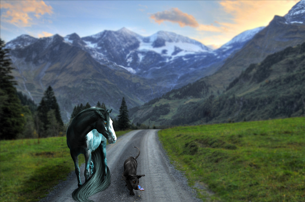

Published: 2011-10-24 00:21:37 +0000 UTC; Views: 497; Favourites: 17; Downloads: 0
Redirect to original
Description
a semi-WIP. any constructive criticism is appreciated (Smile)")
horse by atadwolfish
background by momotte2stocks
thank you stock providers <3
Related content


Comments: 16

 (Wink)")

- Run the sharpening tool over the metal mane plates to make them look more metallish.
- Do not leave those hooves just fading into the ground like that! Take the grass brush in photoshop, make it uber tiny to suit the grass in the picture, and line the hooves with it.
- You've got to make the shadows on your horse a little darker. You might be able to get away with just fooling around with the contrast. As it stands you've got WAY too much gray 'shadows' where they should be black (just like the shadows on the hill to your pony's right and even in the mounds of grass right in front of your horse). The BG says there's a massive amount of contrast going on. Make sure your horse is subjected to it or it'll forever look like it's a photomanipulation as opposed to something plausible.
- Your forelock is missing shadows. Be sure to put them UNDER each chunk/lock of hair.
- Your tail is missing some of the white highlighting you have in the forelock, especially at the top of the tail. The shadows are looking good though
- You mighht want to consider giving the black rope some dimension by taking a gray, 1px brush set at a low opacity and running it along side the curves of the rope, but only the parts that would catch the light from your light source! If your confused as to where everything should be lit up, follow the light on your horse`s body for a better indication. ie: up by the withers, the rope should be lit up more with gray highlights than it would be directly in front of the pony's chest.
Pretty picture so far! Good luck with it
👍: 0 ⏩: 1

thank you so much for all the tips! i always get messed up with the lighting/shadows, so thanks for giving me those pointers
do you think for shadowing on the horses i'd be better using the burn tool or using a small brush with a black/darker gray color?
")
👍: 0 ⏩: 1
My opinion of the burn tool is that it's essentially evil --> great for shading black and white images, but it screws with your head when it comes to colored things
The best way of shading colored objects is by painting shadows and highlights with other colors, not with the burn/dodge tool.
When it comes to shading something, you start with the base colors. Your pony has a light blue for it's coat, white for it's socks, and a light gray for it's muzzle/eye/ear/hooves. Now, for all those three base colors, select a darker version of each and these will be the colors you use to make your shadows. Then grab a lighter version of your base colors, and these will be your highlights.
The tricky part of choosing your shadow and highlight colors is deciding how dark/light you need them to be. I usually figure it out with trial and error but you can do tricks like painting all the shadows/highlights on a seperate layer and then messing with the color/contrast filters, not to mention the layer effects like Overlaying, pin-light, etc...
Anywho, I think it's safe to say that this (#277ac0) is your pony's base color. Try using #040523 for your horse's coat color's shadow and #c4f5ff for the hightlight. It helps if you look at each curve of muscle as a sort of ball -- remember where your light source is, imagine where your highlight/shadow ought to fall, then draw, experiment and struggle with it until you're happy
")
👍: 0 ⏩: 1
awesome, thank you so much for your help, it really does look a lot better doing it that way!
👍: 0 ⏩: 0


This is awesome!!
I like how the blue mountain on the left balances out the horse on the right ^^
👍: 0 ⏩: 1
haha i didn't even notice that
👍: 0 ⏩: 1

Try to work on your edges they look like you've cut and pasted the horse. and the lighting try to find the light source of the BG then add it to the horse
👍: 0 ⏩: 1
i think they need to be more defined. i kept trying to re-fix them but eventually i just gave up for now. thanks for the tips though
👍: 0 ⏩: 1

