HOME | DD
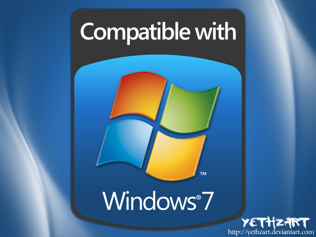
 fediaFedia — Compatible with Windows 7 icon
Published: 2009-07-24 21:37:17 +0000 UTC; Views: 56525; Favourites: 86; Downloads: 7658
Redirect to original
Description
I was bored and tried to make a compatible with windows 7 icon in Office 2010, it turned out pretty well so I decided to finalize it in photoshop and release it, because i didnt find any quality logos, just this crap: [link] [link]Anyway this is just for editorial purposes, feel free to see how it was done PPTX and PSD files included, also 256x256 and 512x512 icons.
Comments are welcome!
(C) Microsoft 2009
Related content


Comments: 57

Nice! You should put some kind of secret pixel or very specific color in there and see how many scam registry cleaners steal it for their box art.
👍: 0 ⏩: 0


Great icon! But I have a PC wich operating system is a Windows 7.
👍: 0 ⏩: 0

Cool! I am going to use this on my computer and do something cool with it.
👍: 0 ⏩: 0


Why not make them into icons ???
Every time I try to make an icon out of a png they're half the size I wanted
👍: 0 ⏩: 0

It's very nice man! Thanks, I'm happy to find a good one! Thanks a lot!
👍: 0 ⏩: 0

do you mind but i have the official windows 7 flag (edited it for personal use) and was wondering if u want the copy so u can add it to this? It looks rather nice with it.
👍: 0 ⏩: 0


nice, but it think light blue would suit Windows 7 better, instead of dark blue...
👍: 0 ⏩: 0

Office 2010 still exceed my expectations ")
btw the other icons really looks crappy
👍: 0 ⏩: 0


Hey Fedia! You inspired me to do one for myself - check it out please... [link]
You did that it in Office? Nice work.
👍: 0 ⏩: 0


You're meant to put "Capable" and "Premium Capable"

👍: 0 ⏩: 1

Never seen premium capable logo. If a PC can't run aero it's not capable, it's unsuitable for seven because aero is a key feature of it, I mean even cheap netbooks and some small MIDs have graphics cards that work with aero in the modern market anyway.
👍: 0 ⏩: 1
It's a joke related to the way Vista was marketed, with a Capable and Premium Capable logo. Lots of people got confused (though I dunno why) as the "Capable" barely ran Vista and didn't have Aero. Think a system with 1GB or less of RAM and a non-Aero capable graphics card.
👍: 0 ⏩: 1
It's funny how such systems were still sold in 2007. Hopefully in 2009 we wont find such.
👍: 0 ⏩: 1
No, seems the minimum these days is generally 2GB, but either way, almost all will be Aero capable, and 1GB of RAM will be more doable on Windows 7 over Windows Vista.
👍: 0 ⏩: 1
The 298$ notebook sold in best buy has 3GB
👍: 0 ⏩: 1
There we go, but don't forget I'm in Australia.
👍: 0 ⏩: 1
Yeah that's the problem, most computers are dirt cheap only in us
")
👍: 0 ⏩: 1
Dam right, I see lots of people selling computers I'd classify as still perfectly good (mainly Core 2 Quad's with stuff like 8800GT's) going for dirt cheap and sucks that I can't get in on it.
👍: 0 ⏩: 0


I could hook you up with a 5000x5667 sized logo or I guess I could make it an icon myself...
👍: 0 ⏩: 1

~yzal doesnt know about vector graphics... poor little fella. 5000x5667 its just insane... and stupid.
👍: 0 ⏩: 0

I guess he means the resolution lol.
👍: 0 ⏩: 1

I really like this, I can see this being lightscribe'd onto software CD's.
👍: 0 ⏩: 1
lightsribed? Hmm, i guess it would need a high contrast b/w logo for best results
👍: 0 ⏩: 1
True, but lately I hear it prints neutral color fairly well.
👍: 0 ⏩: 0

Awesome  (Smile)")
👍: 0 ⏩: 0

Nah it's great. Simplicity is elegance.
👍: 0 ⏩: 1

That's the argument of choice for the lazy
👍: 0 ⏩: 2

Less is more. Just look at adobe icons, you think professional designers don't know this?
👍: 0 ⏩: 1
Adobe Icons are extremely simple and bored .__. all of them are the same with another color
👍: 0 ⏩: 1
You probably don't know the main reason why adobe made them like that
👍: 0 ⏩: 1
Yes, i know it: Because designers weren't creative at the moment of make them
")
👍: 0 ⏩: 2

then I guess you can do better, if not, keep you mouth shut!
👍: 0 ⏩: 0
No, they invested a lot of money into those logos, too bad so many people dont get the point...
👍: 0 ⏩: 1

What's The Point Behind Them?
👍: 0 ⏩: 1
Designers work with multiple adobe apps at once, that's why adobe made the icons so simple and easy to notice without thinking. The different clearly visible colors take advantage of our brain's capability to tell the differences quickly. Even Microsoft recently followed this idea making Office icons in a similar concept.
I think this design approach is brilliant.
👍: 0 ⏩: 1
Oh! I Get It Now! Thanks
👍: 0 ⏩: 0
| Next =>