HOME | DD
 fediaFedia — Ezlo port to Windows 7

Published: 2009-12-01 13:17:48 +0000 UTC; Views: 265174; Favourites: 232; Downloads: 117110
Redirect to original
Description
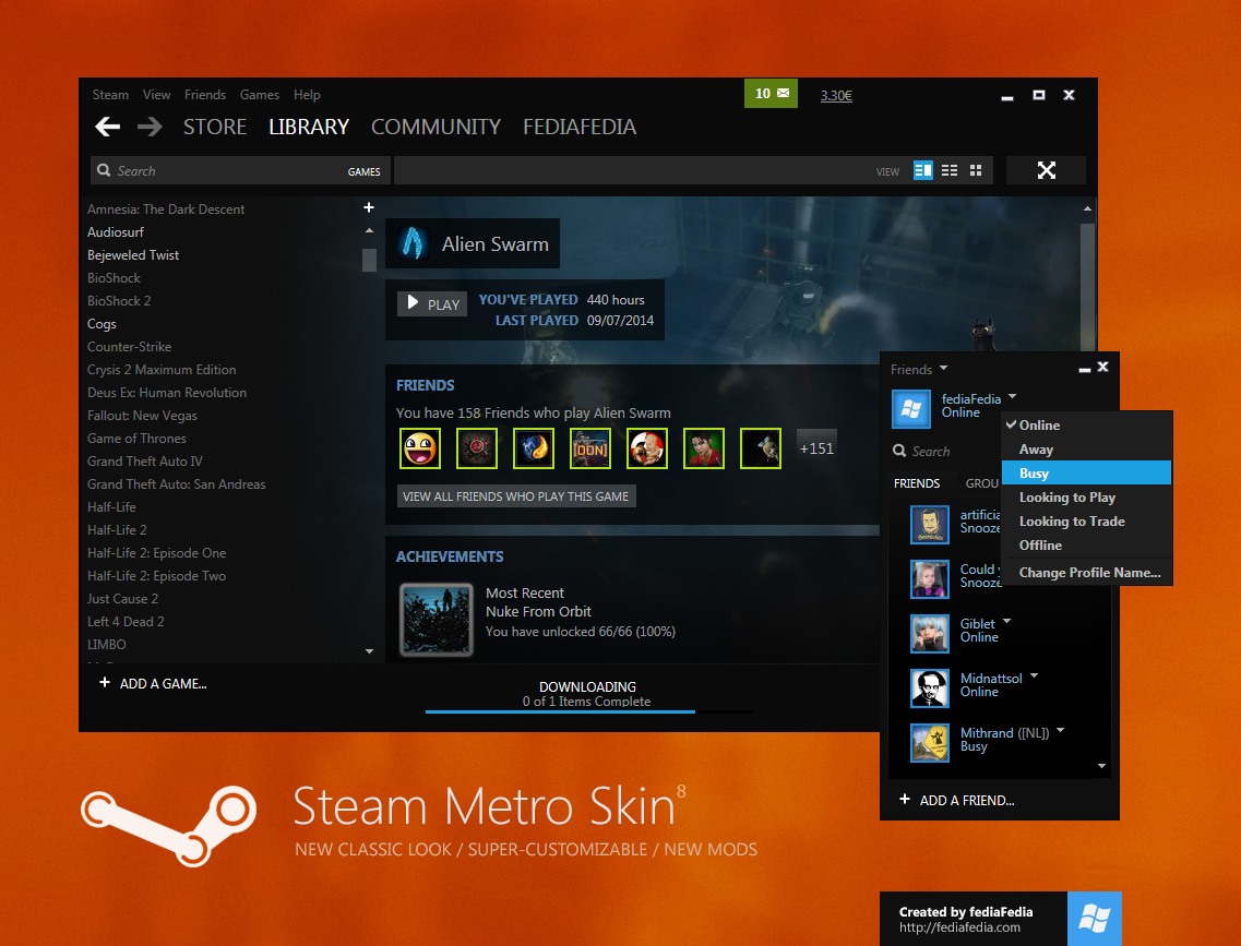
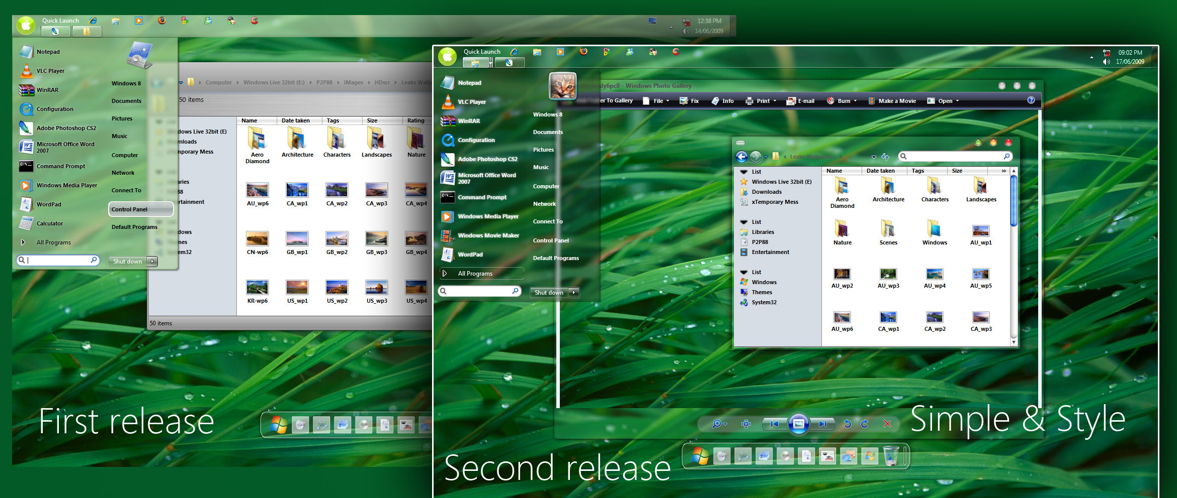
Ezlo port to Windows 7Important Update 3: Added transparent addressbar/searchbar version , you can download it separately here: [link]
Update 2: Added a automated take ownership script, fixed taskbar, shadowless frames and included a top orb :
Update! Glassed jumplists . Thanks to Steel89 for the tip.
I just had to port this and it's currently my favorite theme for Windows 7
 (Smile) - :)")
Instructions inside + 64/32bit explorers included
Credits to Xyrfo for the original
Enjoy!
Comments are welcome!
Related content


Comments: 221

Context - no, only in windowblind 7
👍: 0 ⏩: 0

mmm ... not the usual fedia standard, its hard to read the fonts in some areas, explorers look unnecessarily over-colored - but overall its beautiful ofcourse
looking for better themes for w7 from u.
👍: 0 ⏩: 1
Actually, it's the usual standard
Lots of glass and blur
And the explorer has only 1 color
 (Wink)")
")
")
👍: 0 ⏩: 1
ya ,but I meant the color looked out of place. W7 has a very "understated" kind of color use u know. So suddenly using ur theme it all turned very colorful, which somehow didnt suit it. I am not saying it looked bad or anything ...
👍: 0 ⏩: 1
It's a matter of taste, I personally hate the default looks of 7
👍: 0 ⏩: 0


great port thanks downloading now
👍: 0 ⏩: 0


deviant art needs to make a windows 7 section
")
👍: 0 ⏩: 1

I know right, how long has the OS been out now? XD
👍: 0 ⏩: 1
well since Oct 22, Thats how long lol.
👍: 0 ⏩: 1
Yeah, and people were even making themes before that for the Beta and RC...makes you wonder it's been taking so long ^.^
👍: 0 ⏩: 1
Maybe they just havent got around on it. I would think.... You know how deviantart is they are never on top of the game... Just like before Windows Vista came out.. There still tons of themes in that sections that are not for XP but for vista... And the people that made the themes never transfer it to the windows vista section once it was made.
👍: 0 ⏩: 1


And also, for whatever reason, when you use the righthand side of the startmenu for pinned items, the arrow on the shutdown button thing moves over to the right a bit.
👍: 0 ⏩: 0
Fix the clock font. It's moved up and over to the left 2px
👍: 0 ⏩: 1
Hmm, you're right, the text did move a pixel higher, dunno why. As for the arrow, yeah it's impossible to solve, it will move 1 pixel every time.
👍: 0 ⏩: 1
The arrow I can live with, but that text >.< Besides that, this is a nice theme. I can appreciate the work done by both of you.
👍: 0 ⏩: 1
What's so bad with the text? It's just a one pixel difference, no big deal.
👍: 0 ⏩: 1
Even if it's 1-2px, it still looks bad.
👍: 0 ⏩: 0


As usuals, it deserves an
Was a bit hard to get a working image here: September07... but now I got a proper one!
Thanks!
👍: 0 ⏩: 0


Can you also add a start orb for the side task bars, preferably a orb that would look good for a right side task bar? Thanks.
👍: 0 ⏩: 1
How about adding in the "limit" parts with the taskbar itself, if that is even possible. to make the illusion that the "orb" does all the way to the corners?
👍: 0 ⏩: 1

It's some wallpaper from the windows 7 regional themes
👍: 0 ⏩: 1

Oh okay... ill try find it then lol
👍: 0 ⏩: 1
Download all regional themes from the personalization gallery, after that select all and right click with 7-zip and extract all. Most of those wallpapers are very nice and worth having.
👍: 0 ⏩: 1
okay... Thanks man.
Very nice theme btw! one of the best win7 themes i've used
👍: 0 ⏩: 0

great job i've loved your visual styles since XP thanks once again. i love how the window frame is bigger.
👍: 0 ⏩: 0

It's good, I like the shellstyle and the minimize/close buttons
And thanks for the credit

👍: 0 ⏩: 0

Very noice, ossum startmenu. Great staff my friend.
👍: 0 ⏩: 1
for comment on my staff
Highlly appreciated...............................


👍: 0 ⏩: 1


Nice, I suppose the shadowless version does look better. What do you think about white text on all translucent jumplists? Most of my walls are dark enough to work with white text...even the included windows 7 wall would work nicely. Just a thought.
👍: 0 ⏩: 1
Problem with that is that it's a common setting for the startmenu places list/startmenu extended menus/jumplists. I can make a special version for you, but imagine how that would look when you open a jumplist while a browser is fullscreen or sth.
👍: 0 ⏩: 1
I see what you mean regarding common setting for various lists/places and that it could be a challenge to make the text readable white when the default for Aero jumplists is black. But, if you take your theme and use white text for jumplists, set the theme to 1/4 color intensity, 1/2 saturation, and brightness all the way down in the personalization menu, you'd get almost the default Aero translucent look. And you wouldn't have to use a dark text glow for the white text. It's still be very readable on a maximized white colored window. That would look superbly clean!
👍: 0 ⏩: 1
Thank you...looks fantastic especially if you use the personalization menu to darken the them a little. I use darker wallpapers, so it looks wonderful. You can also read jumplists on white backgrounds fairly well with the theme darkened.
Thanks again!
👍: 0 ⏩: 0

nice, really like the start menu!
btw: what's the html for making text larger [like in your descrp. box]
👍: 0 ⏩: 1

<= Prev | | Next =>