HOME | DD
 fediaFedia — Windows 10 Build 9926 - Preview + DL links

#10 #windows
Published: 2015-01-24 13:09:10 +0000 UTC; Views: 6834; Favourites: 17; Downloads: 94
Redirect to original
Description
So MS just released another build for us to try


It doesn't have everything they showed in the tech demo, but it does have quite a lot of new features.
Been playing with it since yesterday and as far as design goes, I'm impressed. Just like in the older build, the startmenu isn't fullscreen (although you can maximize it), the installation was quick. I see a lot of new graphics elements on the desktop - namely the Cortana Window. I think it's a great idea to chat with Cortana, rather than using voice. It's a little bit like Siri but doesn't have as many features yet. It's going to be awesome once they expand it to more applications and add Cleverbot-esque AI to it.
Another really cool addition is the Notification Center, perhaps not as nice looking as in my UI concept, but very handy. It has similar toggles that you can find on Android, Windows Phone and iOS.
I liked the Xbox Music app, but I'd prefer something where I don't need to sign in with my Live ID...
A few annoying things: No Spartan browser and everything felt a little sluggish and buggy at times. For instance, you cant resize most of the modern app windows beyond a certain point, and the startmenu has a lot of empty space if you unpin the apps. There are also a lot of functionality issues I've heard.
Overall, I think we're going in the right direction. I'm very excited to see what Windows 10 will be like as a final product


Certainly an improvement over 9841
If you're using Windows 10 TP, you can update to this build from the windows update.
For all others:
Download Windows 10 build 9926: x86 | x64
Comments are welcome!
Related content
Comments: 27

👍: 0 ⏩: 0

I totally want to have it but I'm not really pleased about the clunky, greyscale UI yet. I'm well aware that it will be better in the final release but I kind of want it to be like in your concept mockups and I know I won't get it
👍: 0 ⏩: 0

I tried this in Virtualbox and for whatever reason the guest additions would not work, making performance in the VM complete shit. I guess I wont be messing with this too much until its final release...
👍: 0 ⏩: 0

Not too bad, certainly an improvement.
The thing about signing in with your Live ID really is the worst part as of yet.
Oh and right, after looking at your Windows 9 concept of course it feels lacking
👍: 0 ⏩: 0

Damn, that black nav bar is fugly as hell. Metro UI is ugly, seriously, it looks lazy and made in paint =/ I hope themes can fix that.
👍: 0 ⏩: 0

I like it. One thing though, could I even say this is Metro anymore? Windows 10 UX uses thin lines across various elements unlike Windows 8 and previous Metro UI takes.
I think Windows 10 is going in the right direction and I'm also excited that it's going to be a free upgrade.
👍: 0 ⏩: 0

Liking it so far, but I don't like the window caption buttons. Too spaced out, and too big. Should only be like that in tablet mode.
👍: 0 ⏩: 0

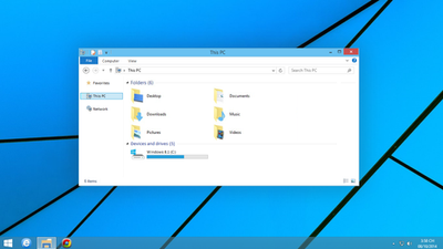
dammmnnn everything is fine unless open folder icon, glyphs icon in settings menu is awesome tho
👍: 0 ⏩: 0

I really hope they redesign the folder icons again. I do not like the new design.
👍: 0 ⏩: 2

They remind me of the numix icons. They're still better than old ones in my opinion.
👍: 0 ⏩: 1

I do like the idea of the style a bit more, but the coloring/design is meh to me. They are certainly modern... but I mean, I feel Microsoft could do so much better.
👍: 0 ⏩: 0

very bad folders ffuuuuu bad. i'm hope to redesign. you good man i love you
👍: 0 ⏩: 0

Nice to see the icons finally getting updated ^__^
👍: 0 ⏩: 0

Actually, I prefered the startmenu of older builds, it's kind of confusing now. Also, the tiles look unrefined compared to the ones in Windows 8, but it's still in development so. But the build is quite nice, I use it myself and it works smoothly.
👍: 0 ⏩: 2

Me too. Was awesome the way they had it. But I see why they did the whole XAML thing - let's see how it goes.
👍: 0 ⏩: 1

Actually, you can reactivate the old startmenu (and the Win 8.1 Startscreen) by some registry addition 

👍: 0 ⏩: 1

It looks like they rebuilt the Start Menu in these builds using the same API as Modern apps. Looks like a lot of previous features were temporarily removed because of that.
👍: 0 ⏩: 1

I hope they bring it back, because pinning documents was quite handy, also I don't like this new settings app - glad that Control Panel is still there, even when it's hidden
👍: 0 ⏩: 0

Did they reduce the shadows behind windows or is that just how inactive windows have always looked?
👍: 0 ⏩: 1

Looks like the shadow size has indeed decreased. I liked it when it was big. Really separated the windows nicely.
👍: 0 ⏩: 1

Aw man that sucks, I too liked it when they had bigger shadows. Some custom visual styles should be able to fix that though. However, I was looking forward to hopefully being able to live with the default theme this time around.
👍: 0 ⏩: 1

Indeed, as they are in win8. As it is, I use the win10 theme for my win8.1 laptop.
👍: 0 ⏩: 0

Did you find any way to activate transparency on the start menu ?
👍: 0 ⏩: 1

That's not included on this build.
👍: 0 ⏩: 0

