HOME | DD
 fediaFedia — Windows 8 Media Player Concept

Published: 2011-12-17 10:22:54 +0000 UTC; Views: 29955; Favourites: 84; Downloads: 902
Redirect to original
Description
Comments and suggestions are welcome!Also [link] /discuss
Related content
Comments: 88

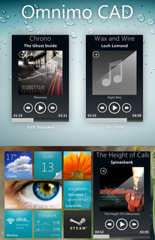
That was the point to resemble media center. The dark blue is kind of a de-facto color for multimedia almost anywhere.
👍: 0 ⏩: 0

I was honestly a bit disappointed with the leaked screens. I hope Microsoft can conjure up something a little more appealing or, better yet, take a hint from the community at what we want in a functional media player. I like what you've come up with; it looks to me as if you're re-engineering some of the UI elements from Zune player, which, after getting used to it, really has a beautifully simple interface.
👍: 0 ⏩: 1

Zune is awesome, I predicted that microsoft would just slightly modify it and put it in win8
👍: 0 ⏩: 1

Since I started using Zune Player in Vista, I had hoped they would add some codec support to it, support USB media players, and replace WMP for Windows 7 onward. Maybe they'll integrate Zune Player into the Windows 8 media player, who knows?
👍: 0 ⏩: 0

Looks stellar, man. I can only hope the final version will look even half as good as this concept.
👍: 0 ⏩: 1

Thanks! I wouldn't worry though. With windows store, any developer has potential to make an awesome music player.
👍: 0 ⏩: 1

I made a version of the WMP too.
but your just got better
👍: 0 ⏩: 1

wow! imppressed! i made a metro youtube concept, hope ull check it out!
👍: 0 ⏩: 1

There is wonderful work! I think, that in the result it will look like this.
👍: 0 ⏩: 1

i like it..."metro was supposed to be a thing of beauty not abomination of apps"...concept is beautiful
👍: 0 ⏩: 1

its really awesome looking and would be a great concept to go off of. I would rather it be a reskin to Zune though. Like the post said prior to me, Zune should take over the music department in Win8, Its going metro, so why not bring what started it all? Windows Media Player is seriously redundant, and if its continued to be put in, and not reskinned nicely like you have here, there is seriously no point and they should stick with Zune.
👍: 0 ⏩: 1

Zune is awesome, but I doubt MS will use that.
👍: 0 ⏩: 0

I wish! It would be pretty difficult to mod it to look like this...
👍: 0 ⏩: 0

I don't know why, but I think Microsoft would put Zune on Win8 - you know, all the metro stuff started with Zune.
👍: 0 ⏩: 2

I doubt they will, but it would be a good idea.
👍: 0 ⏩: 1

It would be good, because Zune is fairly superior than WMP.
👍: 0 ⏩: 0

yep, metro starts with an m and so does microsoft. microsoft starting using transparency in aero with vista. then all of a sudden, they drop all the transparency stuff and go to clean and VERY simple metro UI. it can sometimes be very good looking, though. especially the with Segoe UI font that MS uses. please read my blogpost on microsofts metro [link] thnx!
👍: 0 ⏩: 1

Yep, I love the Segoe UI. Specially when used as "Light" (in Photoshop)
👍: 0 ⏩: 0

The leaked image much resembles the current player Windows Phone has which is one of the few [and probably the biggest] disappointments I had with the phone. The music hub itself was well-designed, but the played and this player are both terrible examples of Metro. If it isn't majorly improved in RTM [which, you're right, probably will,] perhaps we do indeed should fear for the future of Metro. Speaking on the Windows 8 experience, I really haven't been using anything but the News app when it comes to Metro, but I can't really blame that on the design. I find the Weather app rather attractive. I'm just considerably more immersed into the Desktop experience.
But yeah, back to your concept : Beautiful. I really think you hit those panels spot-on. The Zune itself hints various things the panel could display flipping.
By the way ... Zune. That's the way to go for the Metro app. Starting there, we could get some beautiful and useful.
👍: 0 ⏩: 2

I agree about the News and Weather apps. Those are definitely polished. Maybe MS will make the player more attractive later on. But I doubt they'll use Zune.
👍: 0 ⏩: 1

I think it'd be a good point of reference. Using Zune itself as a metro app would be, perhaps, lazy on their part. But I think the Zune is a good use of Metro and studying why that is might give them an idea of how to make the player look good aswell.
But yeah, Zune or no Zune, I'm betting they'll make it more attractive. It simply makes no sense to leave it like that.
None.
👍: 0 ⏩: 0

windows phone IS metro, thats y it looks so simialar. i think that microsofts gonna stick with metro. but one thing that bothers me is that some times, its too simple. and also, microsoft most likely is veeering windows 8 towards tablets. please read my blog post on this topic! [link] thnx!
👍: 0 ⏩: 1

I know Windows Phone IS Metro. The music hub, which, again, I find to be well-designed, it's a great example of how metro should be implemented. My problem is solely with the player. As we would call it in Zune Software, the "Now Playing" area. The Now Playing section of the Zune Software is beautiful. And I like it a lot. And I was expecting to like what Windows Phone brought there. Which didn't happen. I was quite disappointed.
👍: 0 ⏩: 1

o, well every1 has their own opinions
👍: 0 ⏩: 1
<= Prev |
