HOME | DD
 fediaFedia — Windows 9 Concept BETA2
#concept #metro #windows9
Published: 2014-09-11 22:24:21 +0000 UTC; Views: 44271; Favourites: 142; Downloads: 1610
Redirect to original
Description
SEE FULL CONCEPT fediaFedia.com/ 9UPDATE I took into consideration some of the suggestions posted here. Check it out
 (Smile)")
Also I worked on developing several concepts on how the startmenu would work, see it here [ANIMATED] i.imgur.com/1PJzqfz.gif
Earlier today they released a bunch of leaked screenshots from Windows 9: www.theverge.com/2014/9/11/613…
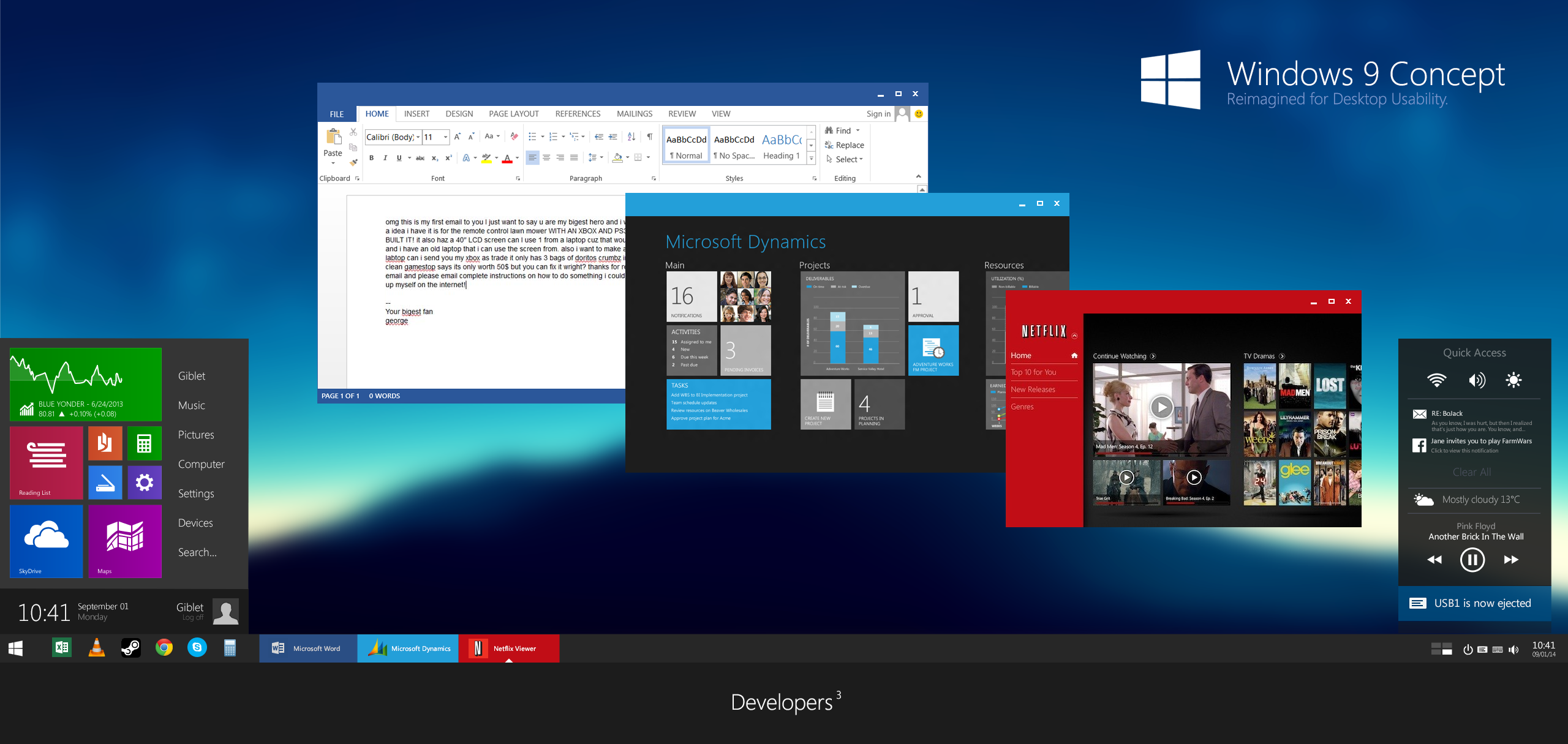
I was quite disappointed by some of the interface elements as usual, so I decided to make my own concept. I'll describe some of my ideas for the Windows 9 UI:
Compact Metro Startmenu
Redesigned to be more minimalist and neutral. I switched around the tiles with the links, a bit like in Longhorn. The menu can be resized vertically by dragging its top border up. Tiles and menu items can be scrollable using the mousewheel.
On the bottom we'll find the original charms clock and the userpicture / shutdown button.
Titlebars - re-imaged for usability
With the coming of Metro apps. I decided that windows should no longer have borders on the bottom, left and right. They are resizable just the same, but the titlebar is the only border now. Now for the best part - developers can define the color of the titlebar, just like the icon and the name. We no longer need to rely on the titlebar icons and titles to recognize a window - you'll know that Spotify is green, Netflix is red, VLC is orange and so on. Of course, the taskbar buttons will reflect the titlebar color too, making it incredibly easy to switch to your apps using color coordination alone. Colorization options can be disabled in Personalization.
Also, each titlebar context menu will have more options such as Always on Top: i.imgur.com/EaQdInK.png
Quick Access
Time to catch up with Apple. A simple and powerful Notification Bar that will centralize things such as notifications, music controls, weather, stock info and any other widgets people would care to develop. Functionality wise it would be similar to Android's control center. Quick Access can be opened either with a touch gesture, a keyboard shortcut or by clicking the Quick Access icon in the system tray.
Everything else
The taskbar has minimal design changes, I also haven't really done anything with Windows Explorer. With their ridiculous ribbons, it might be a bit of a pain.
Anyway, I wanted to see what you guys think about these ideas!
Improvement suggestions and comments are welcome!
Also check out this:
Related content


Comments: 73

👍: 0 ⏩: 0

colored tiles are much preferable than the windows 10 style
👍: 0 ⏩: 0


 (Wink)")


I like Quick Access menu, better than Windows 10 - 9926 Preview.
👍: 0 ⏩: 0

So beautiful. Especially love how open applications look on the taskbar
👍: 0 ⏩: 0

Beautiful! Love how each app has an "accent" color. I'm obsessed with accent colors. Also love how there isn't an overload of white and gray. Looks awesome.
👍: 0 ⏩: 0

Great concept. Not a fan of transparencies + flat design tho. Reminds me of IOS.
👍: 0 ⏩: 0

Love the Quick access, flat taskbar windowing and Consistent Coloring! Microsoft says its taking Windows Users' opinions into consideration with Windows Insider- BS. I would love to see this implemented!
👍: 0 ⏩: 0

It is possible for someone to make this a Windows 8/8.1 theme (visual style).
I find it AWESOME!
I could do it.
Also check out my themes.
👍: 0 ⏩: 0


It's a shame that Windows 9 will never exist...
👍: 0 ⏩: 0

The title bar is a bit large, it should not take much space of the window.
Windows should have shadow or border (this is called "securing window") because if you have a window over another window, you won't be able to know the ends of each window if they have the same color.
The start menu is nice but i think the links at the right (music....) should be smaller and SHOULD NOT BE at the middle of the start menu (vertically).
Generally it's a beautiful concept but all it needs is focusing on some details.
Great Job!
👍: 0 ⏩: 0

I would pay a lot to receive a interface like this. SOMEONE PLEASE MAKE THIS COME TRUE!
👍: 0 ⏩: 0

I mainly like the fact that it has more personalization, and an interesting design looking start menu.
The only thing is that I'm not a "flat" fan, it would be nice to have some aero effects and some line detail or something, then I would love it a lot.
But as a flat type of design, it's still good for what it is for those fans.
👍: 0 ⏩: 0


Please send this and your Explorer Concept to Microsoft, it's just awesome. Microsoft isn't able to make a good, consistent design so please help them out! ")
👍: 0 ⏩: 0

First of all, I am just considering the start menu now - I didnt took a closer look on the other details of your concept, but i will mention that another time. IMHO your idea of the start menu in action is as bad as microsoft did it. I dont like the idea of having to resize the start menu, the way you showed in the gif. I think it would be better to offer a button, who increases the size of the menu to a defined size and inside the resulting area you can scroll through the Programs. - My two cents on your idea for the start menu.
However, I dont like to put the metro apps inside the start menu - this is not what has been requested by the complaining crowd (partially including myself). A start menu, where you can start the Desktop-Programs has been requested. Having metro and Desktop Programs in the start menu will definitely lead to confusion and does not solve the requested feature.
I think the "Metro-Startmenu" should be integrated into the Desktop, with the taskbar at the bottom, but the Desktop how we are used to know is still accessible. The Desktop is divided by the section, we are used to know and the Metro-Section, which can be resized by a huge grip (it has to be huge in order to be accessible with your finger on a touch display). This Metro-Section can also be covered by the usual Desktop Programs. If wanted, the Metro-Section can be moved to the side of the Display and do not show again. It should be a feature, which is nice to have, if the Device is Touch and/or Desktop compatible. Furthermore the Metro-Apps, can be viewed within the section OR dragged out of it and behave like their own windows. Sitll The start-menu for Desktop-Programs is still accessible in the bottom-left corner and will not have too major differences from Windows 7 - just being a little bit more "clean".
It would degrade the Metro-Surface to a simple quick-launcher, but widgets can be put into it as well and IMHO it would better serve the Aim for providing ONE OS for all Devices, than the other ideas, I have seen so far.
I definitely should make a Concept of my Idea, in order to clearify myself.
👍: 0 ⏩: 0

wow looks amazing
👍: 0 ⏩: 1

Thanks, I'll try and add this in the next revision
👍: 0 ⏩: 1
No problem friend and lookin' forward to see it :3
👍: 0 ⏩: 0

I hope Micro$oft will see this and give you a Job as lead designer or something like this!
For me it looks like some freakin great inovations.
Sorry for my poor English and have a nice weekend
PS: "Reaction of Micro$oft"

👍: 0 ⏩: 1

I love that you made the Title Bar of Windows Function like the Status Bar in Windows Phone 8.1 apps where it is coloured to the app's main color, but with Title Bar Functionality. It looks very consistent with the rest of the Windows Line up! Great Job! I'll also do this as it is necessary for desktop Modern UI apps to have this in order to look consistent with Windows Phone 8.1 apps.
👍: 0 ⏩: 1
Thanks! I was just sitting with a blank photoshop document moving my mouse around the windows 7 taskbar buttons (they colorize when you hover them), and then I thought, if we can do it for taskbar buttons, why not do it for Windows altogether?
👍: 0 ⏩: 1

If only the windows team were as great designers as you are
")
👍: 0 ⏩: 1
comments.deviantart.com/1/4817…
👍: 0 ⏩: 1
Oh, no wonder!!! I really appreciate the reply fediaFedia!
👍: 0 ⏩: 0

Here you go, I blurred it though imgur.com/DAw056N
👍: 0 ⏩: 1


Very nice! I'm not sold on the title bars - the colorization is a great idea, but in this widescreen world I covet my vertical pixels. They look great, but it seems like a lot of wasted vertical space.
👍: 0 ⏩: 1
Thanks! Unfortunately we cannot get rid of the titlebars as it's ingrained into our souls that windows has a titlebar with min max close buttons, changing this even slightly would cause a huge backslash from most of the users
👍: 0 ⏩: 0

Great concept !
It's sad that micro$oft doesn't even take time to call designers of your level.
👍: 0 ⏩: 1
I'm sure they do, but: comments.deviantart.com/1/4817…
👍: 0 ⏩: 0

Nice concept !
I think that the start screen mode is a bit weird, I was expecting it to be some kind of full screen mode for the start menu. But anyways, I'm sure that Windows 9 won't look like this in it's final form. Like how Windows 8 drastically changed from the Developer preview to the release.
👍: 0 ⏩: 1
Thanks!
You mean how Windows 8 changed from a green background newtechworld.net/wp-content/up… in DP to a purple background in RTM? download.ba/program-image/wind…
👍: 0 ⏩: 1
Well, not just that
👍: 0 ⏩: 1
I was implying the improvements were kinda minor
👍: 0 ⏩: 1
Of course, but from the DP to RTM, it was mainly visual polish, which is I guess what's gonna happen between Windows 9 Preview and Windows 9 RTM.
👍: 0 ⏩: 0

Your Start menu is by no means compact compared to the leaks... but I really like the rest.
One thing though, how do you know what app is activated by looking at the taskbar?
👍: 0 ⏩: 1
Yes I'm working on the startmenu a bit. And that's a good point, I'll have to think about it
👍: 0 ⏩: 0

Yout concepts are great.
Love the no-boarder designand the colourable Titlebars are a nice indicator, especially if the colour matches the colour of the application in the taskbar.
I'm an absolute minimalist though. I removed the Start Menu Button (I'm on Windows 7). I can just hit the windows button for it to pop up. I don't know how I feel about the Notification area, but as long as I can disable a lot of it.
👍: 0 ⏩: 1
Thanks, I'm sure that can be tweaked. You mean the tray icon area right?
👍: 0 ⏩: 1
yeah,
I also took a second look at the Start Menu, I do like the design and think that it would be really handy for some people, but for me I probably would just like a list of previously opened folders or Programms.
Having the time and date in the start menu is a nice touch. It is easily acessable witht he push of a button, it has more space available for readability and I can have more space available in the taskbar.
You also have this IO Logout Symbol in the Notification Area, which gave me an Idea. I also use Linux, Lubuntu, which uses the LXDE Deskto. On the bottom right corner on the screen, where Win7 has the button to show the desktop, it has button to open a little shutdown(or reboot, hibernate, standby, etc. ) - window. That would be soemthing leatly to have for the taskbar too (or on the start menu, I can't see it in your screenshot).
👍: 0 ⏩: 0
| Next =>