HOME | DD
 fediaFedia — Windows 9 Explorer Concept BETA1

Published: 2014-09-13 17:41:31 +0000 UTC; Views: 13751; Favourites: 84; Downloads: 385
Redirect to original
Description
Well, a lot of you probably seen my Windows 9 concept and I'm humbled by the reception it got so far")
Most of Windows UI concepts start with the fundamentals like the Windows Explorer, but I decided to leave it for after I've worked out some common UX groundwork. To better understand this new one, I recommend reading the description of my previous concept.
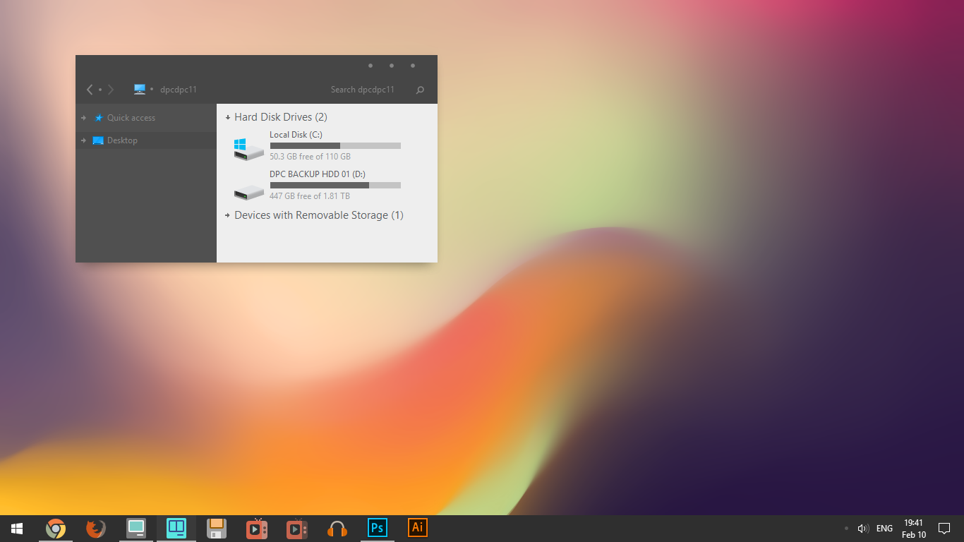
And now, for Windows Explorer.
I know for a fact that there is no way Microsoft is going to do anything drastic with explorer, so I decided to keep most of what already exists, just give it a little spitshine. The biggest feature is probably the tabbed browsing which replaces the search bar, very similar to Internet Explorer 9 screenshots.fr.sftcdn.net/fr/s… Some other elements have been moved around to give some more breathing room. This is quite a busy looking app and there's certainly many things that could be simplified.
Anyway, let me know what you guys think! Let's improve this some more with your help
 (Smile)")
Related content


Comments: 10

👍: 0 ⏩: 0

Nice, but I can't imagine using WE without that bar at left side.
👍: 0 ⏩: 1


how you design these concepts ? i mean in which way ?
👍: 0 ⏩: 0


I'm not even going to look at your concepts because they are too awesome and I'll get bummed out because Microsoft will just give us the same UI as 8 but with a few tweaks here and there
")
👍: 0 ⏩: 0

"Scroll on icons to view Contents" seems kind of useless as a popup. Perhaps a tooltip or temporary sidebar?
About the search, you should make it like IE9 indeed, aka search bar in address bar, not in the bottom.
Also, if you want to change the ribbon icons, you should redo them from scratch, your current ones are ugly.
Anyway, keep up the good work!
👍: 0 ⏩: 0

looks great, but the ribbon and the icons don't exactly fit the light metro design
👍: 0 ⏩: 0
