HOME | DD
 feimo — 20101211
Published: 2010-12-11 07:22:34 +0000 UTC; Views: 77752; Favourites: 3815; Downloads: 3163
Redirect to original
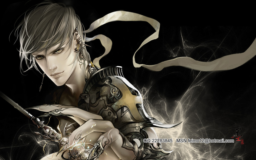
Description
tabletopRelated content


Comments: 172

It's trully amazing... Like everything you do! Awesome!
But based on your drawing pattern, this one is quite simple, mainly on the face. What doesn't make it less worth the appreciation!
Please, keep pleasing us!
👍: 0 ⏩: 0


Cooool... @_@ So compelling. Its absolutely stunning ^-^
👍: 0 ⏩: 0

A little bit of gold and dark black. Amazing. And that face.
👍: 0 ⏩: 0

I have to say well done on this. I love the design, but I would have chose a different color scheme for it. Something a tad bit warmer to help separate it from the black background maybe. Also the item in the hand, the fading off the page just makes that look incomplete to me. I hope this helped and I really do like it.
👍: 0 ⏩: 0

great job! the character's expression is very strong, very sexy... i like how it seems 3d but not really... like its caught somewhere in the middle.You get plus points on the dusty effects! it makes the picture look like its moving
")
👍: 0 ⏩: 0

I love your artwork! i can never say anything bad agains them.
somehow i think there is something missing in this picture, but i can not find out what.
👍: 0 ⏩: 0

EEEEEEEEEEEEEEEEKKKKKKKKK!!!!!!! your so crazy!!! SO MUCH DETAIL!!! 
👍: 0 ⏩: 0


This is absolutely breath taking. I like the monochromatic use of a single color scheme.
👍: 0 ⏩: 0

Use a lot more colors! It's not all bright, but the picture still pops. I think that might be because of the light reflections off of the armor and things. The character design itself is great. Just more colors.
👍: 0 ⏩: 0

outstanding look and feel so smooth. awesome work!
👍: 0 ⏩: 0


 (Smile)")

It's truly AMAZING!!! One of your BEST EVER if not TOP!!
I really like the colors used, they might be considered mundane colors but somehow they are exactly what should be used!
The lights behind him highlight him as needed and not overshadowing him
I really like the artwork in his armour, claws and earings.
Love the color of his eyes, hair and lips and the movement is just
 (Wink)")
👍: 0 ⏩: 0


beautiful work. The only thing that I can see that might need improvement/fixing are the head band strand. They don't look like they are attached the characters head. There are no cues as to the bands being anchored to anything and look as if they are random aspects to the background.
👍: 0 ⏩: 0

*can't find the words to type...*
dark + cool = beautiful
👍: 0 ⏩: 0

Amazing! I love the the bit with the hand the most.. the detail is wicked! I feel like I should be able to see my reflection in it too
👍: 0 ⏩: 0


the asymmetrical layout is nice. although i wonder where the bandana? comes from? it does look nice and dramatic but doesn't seem necessary for this piece. keeping that area black could draw more focus towards his face.
his face has a very fierce expression. it is very strong.
his claw hands look kinda cartoony when compared to the tool he is holding, because the tool is much more realistically rendered so when i look at his fingers i think of plastic. but the hands do match how his face is rendered. the hand just looks odd to me when paired with the tool. cartoonifying the tool could potentially balance that out. or how bout covering up more of his fingers with realistically rendered metallic decorations.
anyways, this is still a good piece.
and i agree with everyone else on how the lighting adds drama to the piece
and about what some people said about the ring finger, i think you should cover it with more metallic decoration because the lighting and texture looks off when placed right about a very realistic/shiney/metallic object. you could decorate it like his other fingers (which seem to be more covered)
👍: 0 ⏩: 0

So, what is happening outside of the frame to the left, that it lights up that otherwise-unlit side of this one's face? It's obviously very bright and very focused, since it only lights up that part of his face and neck. The other side of him, I can understand being lit by the wispy energy stuff behind him, but the left side is sort of off.
The detail work is superb. I am especially fond of the ethereal wisps surrounding the bulb on the bottom of the trinket, but if they are supposed to be luminescent, they do not show up very brightly on the metallic sheen on the trinket itself. Also, of particular note is the very slight distressing on the armour; this is spectacularly done. I am impressed.
👍: 0 ⏩: 0


Fantastic! Your attention to detail really brings the picture to life.
👍: 0 ⏩: 0


excuse me ,miss.when will fong vo nhai hav the 20 th chap
👍: 0 ⏩: 0


I love this piece! It's beautiful yet strong all at the same time. The color scheme really works for the mood he's giving off. Claw rings (or are they his actual nails) are really cool they give your character the right amount of danger that's needed for this piece. Kind of like, "I'm badass, I know that I'm badass and I think that YOU should know that I'm badass." His armor is unique as well, which is awesome. I always did like it when warriors had armor that described them indiviually or helped them in some way (like if he was fast, he had armor for speed. If he was strong, his armor would be for strength).
I don't think that the weapon he has in his hand is needed, the piece would look really good if the guy was just reaching out to grab somebody. I also think you should get rid of the ribbon, it's kind of distracting and it's not really needed.
Overall, I like the piece. I hope this was enough of a critique for you.
👍: 0 ⏩: 0


This is such a beautiful picture, the lighting and the shadows really complement each other perfectly, the balance is just right and neither one overpowers the other. The colouring is smooth, the detail on the armour is great and the addition of the wisps at the bottom of the picture really flatter it. Great job!
👍: 0 ⏩: 0


very stunning I was blown away by the talent in this art piece
👍: 0 ⏩: 0


I love the colors, and the details! You can never go wrong with gold, gray and black.
Another great piece!
btw, I 
👍: 0 ⏩: 0

Beautiful color options. The ring finger ( second from the right) looks off somehow, I can't seem to understand what's happening at the end of it.) Great use of Light sources as well.
👍: 0 ⏩: 1

I agree with Crest-o-SilverFire. The ring finger looks weird. I believe it's because the colors of his fingers blend in too well with the object in his hand.
But I love the intricate detailing and the use of light.
His eyes are very pretty and seem as if they should stand out more. Maybe a brighter tone? or lighter shade?
Overall it's a beautifully intricate and well put piece.
And just curious... What's in his hand anyway? Is it a sword? Wand? Part of a scepter?
👍: 0 ⏩: 0


| Next =>