HOME | DD
 FEISAR-CSY — Green Systems Versions

#blueflare #digimon #fighters #fusion #green #heart #kudou #mikey #systems #taiki #wars #shoutmon #xros #xroswars #digimonxroswars #taikikudou #xrosheart #digimonxros #digimonfusion
Published: 2016-03-04 10:13:43 +0000 UTC; Views: 1208; Favourites: 4; Downloads: 0
Redirect to original
Description
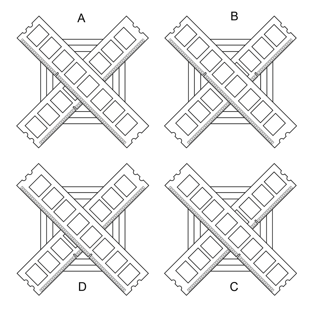
I was redoing my Green Systems (Army) flag/logo/symbol and I realised that there are many ways in which the sticks of RAM could be orientated. I was thinking of going for version A before I decided to play around with rotating the RAM sticks. A and C are more asymmetrical than B and D. The letters go clockwise starting from the top left corner.EDIT: The differences between them is where the notches(the small gap) of the sticks are. You may want to look at the designed zoomed in to really see the small (yet quite important) difference.
Which do you think looks better? Comment below with the corresponding version's letter and why. I would like to see if any version stands out more than the others.
EDIT: To me, it's a fight between A and B. Any arguments for or against? I'd like to know.
Related content
Comments: 2

There's a problem here.
They're all look alike.
So what's the difference between them all anyway?
👍: 0 ⏩: 1

I'll have to edit the description...
They all do look the same if you do not look deeper. The differences between them is where the notches(the small gap) of the sticks are.
👍: 0 ⏩: 0


