HOME | DD
 Felipegm — Eternal

Published: 2005-11-08 19:06:16 +0000 UTC; Views: 1301; Favourites: 29; Downloads: 119
Redirect to original
Description
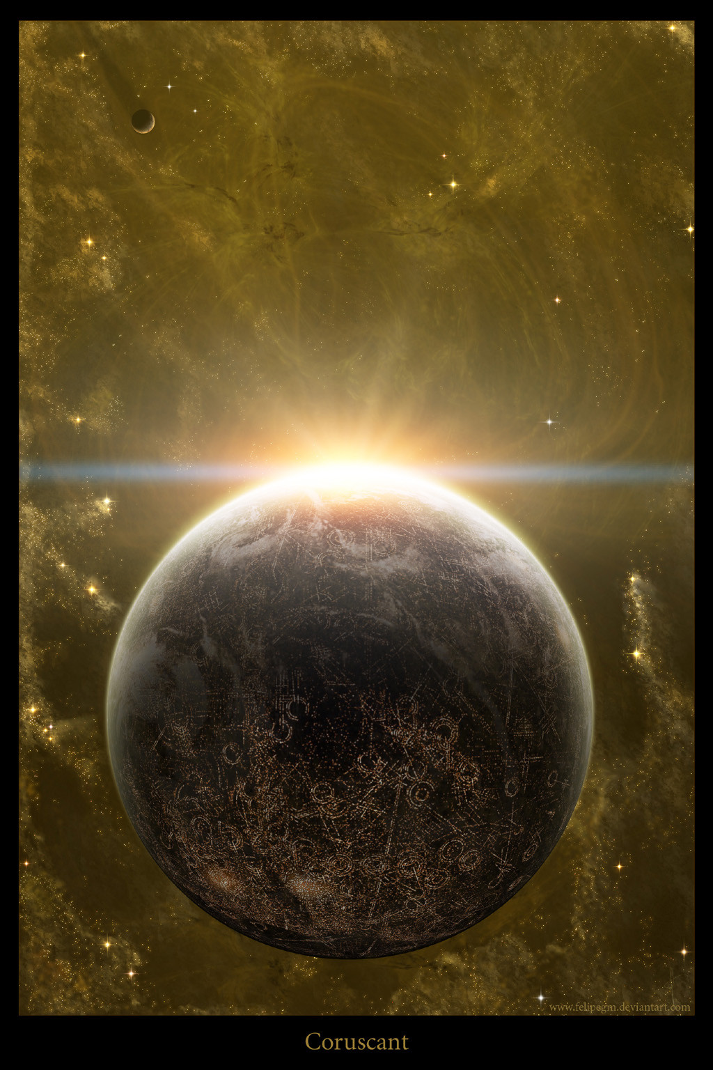
Full view and comments will be trully appreciated.Thanks a lot for the clouds pictures. Take a look at his gallery here [link]
EDIT #1:
 Changed the colors of the nebula. Made them red and more subtle.
 EDIT #2:
 Changed the oppacite of the satelite; Changed the atmosphere of the planet; Made the blue atmosphere higher on the "sky"; Changed the shape of the nebula, as well as the oppacity of the stars, fading the smallest ones.
Related content


Comments: 28


This really stood out to me! I cant tell it was different pictures putten together, I love it.
👍: 0 ⏩: 0


Nice concept, but I think you may have rushed it a little.
Here are the things I think need to be changed:
The glow on the planet is to big, make it less than half that thickness.
I can see areas on the rim of the asteroid rings where you have rubbed bits out. That needs fixing.
The small satellite is too clear (colour wise) it looks like it is within the planet's atmosphere. put it behind the blue layer.
I think you faded the blue sky out too soon. Stretch it up the image further.
The stars are lovely, but you need to thin out all but the brightest ones, they wouldn't be bright enough to see in the setting of this picture.
The nebula needs to be thinned out alot, and given some shape. At the moment it looks kinda like a blanket
Hope this is helpful.
👍: 0 ⏩: 2

Hello,
Took some time to make the corrections you´ve suggested and the piece got much better and more realistic. I´d like you to take a look at and tell me what you think of it.
Thanks again for the help

👍: 0 ⏩: 1
I can't remember exactly how it looked before (you could slip the old version in scraps for comparisson as a WIP), but just looking at this with fresh eyes, so to speak, very nice.
Lovely, rich tones, you've done a good job at matching the shadow on the clouds with the shadow on the planet.
Crisp and clear cut. Not too busy.
Very nice atmosphere fade.
Only two little niggles, and they are minor really.
No matter how I look at it, I feel that with the angle of the light, where the ring goes behind the planet on the left, I don't think the planet would cast any shadow on it.
I always have a grip about the atmosphere fadeout on pictures like this, and I have had to curb my opinion slightly ")
That said, I really like this piece now, and I have got to fav it
")
👍: 0 ⏩: 1

You´re right... ")
Thanks a lot for all of the comments and sugestions.
I´ll take a closer look at the piece and correct it with time a much more patience.
When I finished I´ll let you know so you can take a second look and tell me what you think of the modifications.
👍: 0 ⏩: 0


Breathtaking. It'd have to be a small moon to be that close.
👍: 0 ⏩: 1


I...must express my LOVE for this!!!
"Oh Eternal...Will you take my hand in marrage?"
👍: 0 ⏩: 1


Great job! The space bit though looks a bit to busy, with all the stars and the cloud texture there in the background. Do you know waht I'm talking about?
Great rings on the planet though  (Smile)")

👍: 0 ⏩: 1
I really don´t know  (Wink)")
👍: 0 ⏩: 1
Yes, maybe.... their red colour is also distracting.
But I was talking about what's behind the stars; the bluish-turquoise nebula texture. I don't know, it doesn't seem to fit.
👍: 0 ⏩: 1
Changed the colors and made them a little more transparent... What do you think?
👍: 0 ⏩: 1
Hmm... the colours are better, but it just seems that the nebula background starts too suddenely.
Also, the opacity is wrong on that smaller planet, it shouldn't be so dark as it appears to be in the atmosphere taht way.
👍: 0 ⏩: 0


