HOME | DD
 fensterer — Abysmal Torment CD Layout

Published: 2009-09-18 15:15:33 +0000 UTC; Views: 2892; Favourites: 25; Downloads: 0
Redirect to original
Description
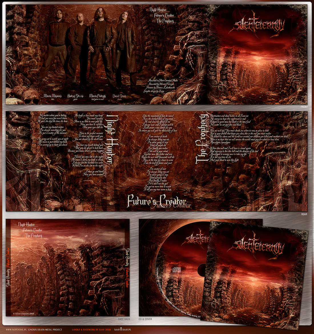
I wanted to post this a while ago but just never did.All photos by me, no stocks! (with exception to the house, photo credit goes to my Father-In-Law)
 (Wink)")
Related content


Comments: 53


Very impressive, I like the earthy greens and blues, contrasting with the fiery oranges.
👍: 0 ⏩: 1

Thanks, I appreciate all the kind words!
👍: 0 ⏩: 0

Phil, I LOVE this! It's very well crafted and it has a very gloomy atmosphere!")
👍: 0 ⏩: 1
Thanks, Mario! The band wanted to layout the cd themselves so I just did the artwork.
👍: 0 ⏩: 0

Superb design work
Strange, bizarre and mesmerizing
Well done dude!
👍: 0 ⏩: 1


Phil , great work .... Like the whole design a lot ... Especially the upper left photo is awesome

👍: 0 ⏩: 1

 (Cool)")
Thanks, man. Glad you like!
👍: 0 ⏩: 0


Great piece!
didn't you post the finished piece some time ago?!
👍: 0 ⏩: 1
Thanks and yeah, but I posted the front cover art and not the entire cd package. I was waiting for it to be released and well, it's been released for a little while now so I thought I should finally post it!
👍: 0 ⏩: 1
know the feeling man! the theme is great and your tone management is always a great touch. Keep it up!
👍: 0 ⏩: 1
I appreciate it. I'm working on a couple more so hopefully they'll be done soon.
👍: 0 ⏩: 1
can't wait to see the results!
👍: 0 ⏩: 0

Maybe sharpen some elements, and this would be an even more outstanding image!
👍: 0 ⏩: 1
I always appreciate the suggestions, thanks!
👍: 0 ⏩: 1


you are a genius

👍: 0 ⏩: 1
Thank you so much, that's very kind of you!
👍: 0 ⏩: 1
you're welcome dear!!! is a plaesure see your work
I admired you...really. Sorry for my bad English
Take Care dear


👍: 0 ⏩: 0

I love the atmosphere from the weather in all the pictures. All the pictures really look like they were taken as they are and perfectly flow with each other.
👍: 0 ⏩: 1

Great work and details, Phil. Damnengine level if we can call it a clishe...
👍: 0 ⏩: 1
Thanks, Cyrill. That's quite a compliment.
👍: 0 ⏩: 0

great work, really. i totally agree with ~Saint-Gut-Free about the type. i'm glad you submited images clean
👍: 0 ⏩: 1
Thanks. They wanted to layout the cd themselves but I haven't got my copy yet so I don't know how it turned out.
👍: 0 ⏩: 1
that usually turns out horror
👍: 0 ⏩: 1
I actually just recently got a copy and it didn't turn out too bad. They added a couple more pages of just photos but the layout looks really good overall. I would changed may couple small things but I'm glad it turned out the way it did.
👍: 0 ⏩: 1
glad to hear that then  (Smile)")
👍: 0 ⏩: 1
Yeah, they did put text over one main object on the cd image itself but for the rest, not too bad.
👍: 0 ⏩: 0

like the content (has an abysmal feeling which goes with the band's name), muted tones and overall palette, text should look good over the top. man, what's up with death metal type bands using that type - just abysmal.
👍: 0 ⏩: 1
Thanks Mike!
Yeah, that type of logo is used a lot. If a band asks me to design a logo, I have to tell them that it will not look like what seems to be the trend at the moment and that they'll get something more original to help stand out more.
👍: 0 ⏩: 0

Thanks, man! I appreciate it!
👍: 0 ⏩: 0
| Next =>