HOME | DD
 fERs — Kunstwerk CI - 1
by-nc-nd
fERs — Kunstwerk CI - 1
by-nc-nd
Published: 2008-10-27 20:29:56 +0000 UTC; Views: 7420; Favourites: 53; Downloads: 0
Redirect to original
Description
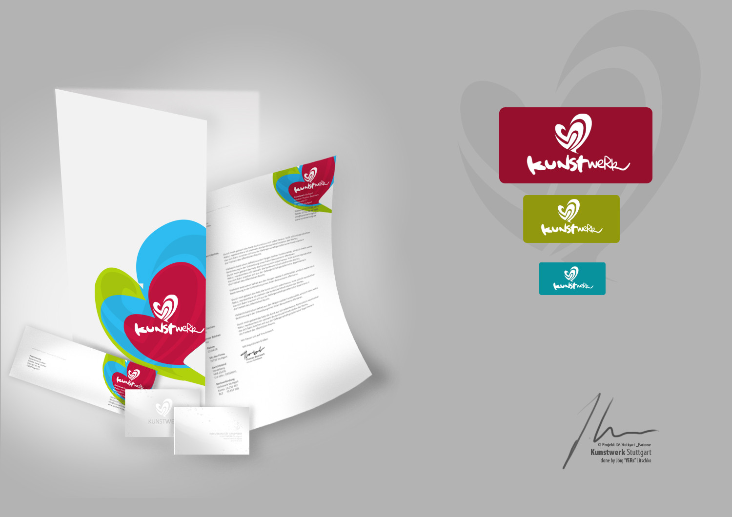
Kunstwerk CI ProjectThis is Part One which includes, Logo in 3 different Types (not uploaded yet), Cards, Letterhead and a Storage Case.
Second Part will include more.
Delievery Date (for Part One) will be November the 5th.
Related content


Comments: 28

Nice work indeed, but the logo reminds me of algida heart... Very nice colour palette and composition...
👍: 0 ⏩: 1

thanks, but i am not from slovakia, so i don`t know what an algida heart is.
*edit* after i search on google, i know now what you mean. Its called langnese here in Germany. And yearh, a lot of people told me that
👍: 0 ⏩: 0
Nice work indeed, but the logo reminds me of algida heart... Very nice colour palette and composition...
👍: 0 ⏩: 0

I Like your clean design work. I am looking for several contract graphic designers for some print based, corporate design work. I have a full description on my deviant page below with an example of the type of work we would like. Can you please take a look at it and let me know if you are interested.
Deviant Link: [link]
My Email: mail@ayms.com.au
I hope to hear from you in the next day or so. Either way your work is great and I am a fan.
Mike
👍: 0 ⏩: 0

lovely logo! would be a great womens clothing line
👍: 0 ⏩: 0


sehr schick  (Wink)")
👍: 0 ⏩: 0


wow find ich voll schön.
die farben sehr geil (:
👍: 0 ⏩: 0


Die Farben haben mich total an eine firma denken lassen in der ich zufällig auch arbeite^^ sieht echt stark aus, muss man ja mal sagen. Lob!
")
👍: 0 ⏩: 0

schön.
logo finde ich schön ausgearbeitet mit farben.
aber presentation ist nicht ganz so schick geworden finde ich.
da wird dieses jahr bzw vielleicht nächsten monat was perverses von mir noch kommen mit einem sehr großem konzept an material und die grafik wird sehr sehr realisitsch aussehen, zumindest hoffe ich das.
aber ist aufjedenfall was cooles geworden.
👍: 0 ⏩: 1
dann bin ich mal gespannt was du machen wirst
👍: 0 ⏩: 1

Beautifull (Smile)")
Fav
👍: 0 ⏩: 0


visitenkarte dürfte imo auch bissl farbig sein.
sonst ganz nice.
für einen kunden oder zum üben oder für schule?
👍: 0 ⏩: 1

nice work
erinnert mich ein wenig an "Langnese"
aber sonst
")
👍: 0 ⏩: 1

das gleiche dachte ich (leider) auch
although - great work!
👍: 0 ⏩: 0

