HOME | DD
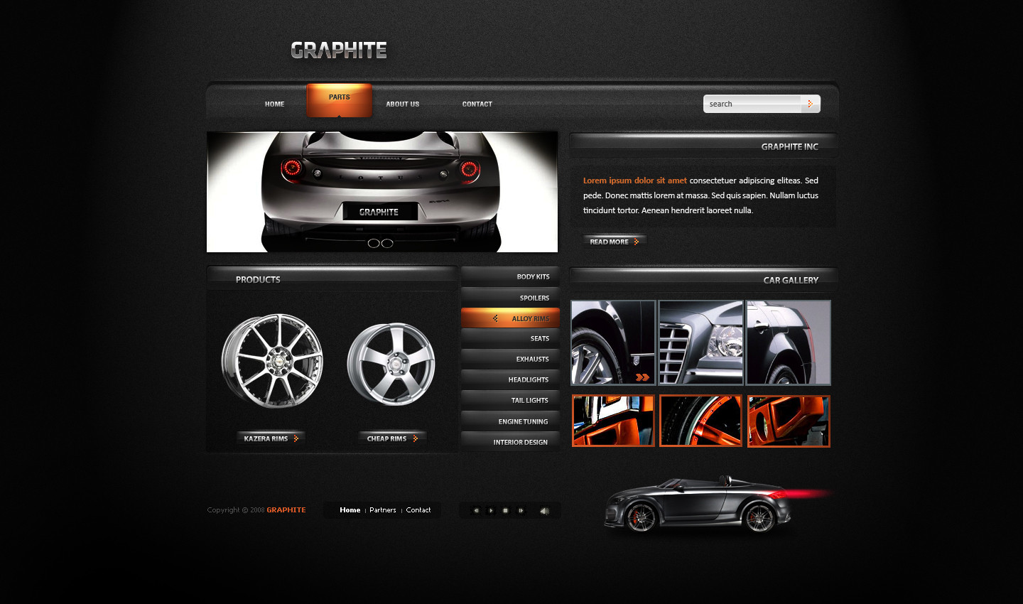
 FIAMdesign — Koenigsegg Practice project

Published: 2008-09-14 11:13:00 +0000 UTC; Views: 21813; Favourites: 115; Downloads: 1062
Redirect to original
Description
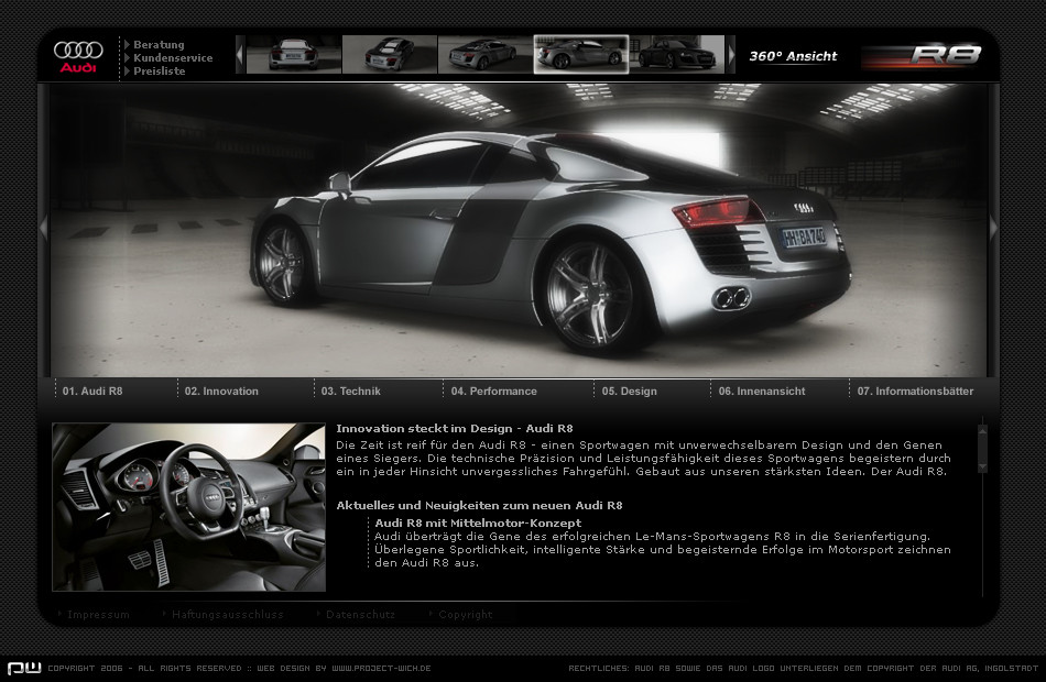
When I woke up this morning I wanted to do a car webbpage for practice. So I took Swedens coolest car and made an complete redesign of their page. Here is their old site, [link]"This is a Practice project only" Hope you like the outcome! Comments and favs are very welcome!
Edit: Some fine tuning
Related content


Comments: 40

I liked yours much more..clean, sophisticated and serious...which softwares did you use/?
👍: 0 ⏩: 0


That's a lovely concept. It's suprising how they wouldn't want such a website compared to thier current one. What font did you use on that menu? I've been trying to find a similiar one everywhere but I can't seem to find one. I have all fonts you can think of except tall and short width fonts! I'd be really thankfull if you could tell me
👍: 0 ⏩: 0

very nice job mate, you got a sexy working style
")
👍: 0 ⏩: 0

This one deserves to go live! Show it to 'Seg marketing  (Smile)")
👍: 0 ⏩: 0

great stuff, I've faved that alredy but I supose I didn't leave a comment before ;]
👍: 0 ⏩: 1

Thanks! You do great stuff to (one of my favorite designers)! happy hollydays!
👍: 0 ⏩: 0

...and did you it all in "this morning"?? I will take one entire week... hehehe
Awesome!
👍: 0 ⏩: 1
Yeah it was done in one morning 4h maby. Same as the paitings you do would take me an month to finish
👍: 0 ⏩: 0


Looks much more better & more professional than there own site.
Try sell it to 'em  (Wink)")
👍: 0 ⏩: 1


Tryin out the black nowadays eh? Looks pretty sick, like your style!
👍: 0 ⏩: 1

Very nice, but the reason for my comment is a typo: It should be "at its best".
👍: 0 ⏩: 1


If that would be possible It would make me an very happy dude
👍: 0 ⏩: 0


Im glad it inspired you in some way
👍: 0 ⏩: 0

sometimes to overblended but its so got that u'll get a fav
")
👍: 0 ⏩: 1
Thanks! I will try to tune the bleding down abit
👍: 0 ⏩: 1
The ammount of glow is reduced with about 60% so it has changed
👍: 0 ⏩: 1
much better at the top, but i even mean the sides of the frames they are much to light
👍: 0 ⏩: 1
Check out the sides now! There are still highlights, But the light is reduced by a big ammount!
👍: 0 ⏩: 1
much much much better, but i would put it even more down
👍: 0 ⏩: 0

Thanks Laruie! Glad you like it
👍: 0 ⏩: 0