HOME | DD
 fibermarupok — Banshee-RythmBox Re-Imagined
by-nc-nd
fibermarupok — Banshee-RythmBox Re-Imagined
by-nc-nd

Published: 2010-03-05 06:38:45 +0000 UTC; Views: 8920; Favourites: 42; Downloads: 482
Redirect to original
Description
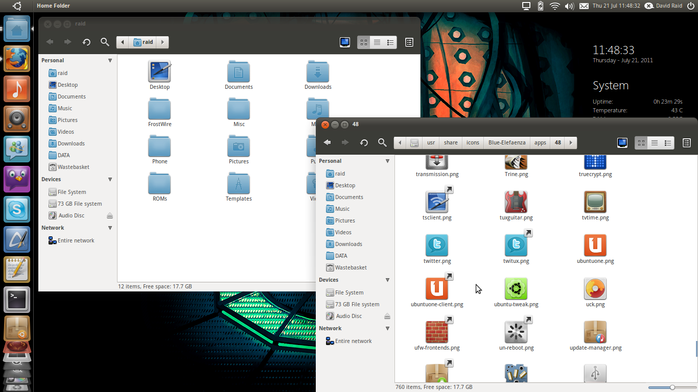
Inspired by my recent jaunt in refining the Lucid GTK theme for Ubuntu, I decided to do a refresh of the default music player for Linux in general (Gnome specially). Rythmbox. Though the design might also be implemented for Banshee. The colors I choose keeps up with "Light" theme of the new branding specs by Canonical. Hope you like it. BTW, this is just a mock-up and not a real application. (Smile) - =)")
Related content


Comments: 33

i like the colors and simplicity of the gui components, very nice
👍: 0 ⏩: 0


This is beautiful.
The elegant and sleek gradient in the first bar draws attention immediately to the player controls.
I really like this.
👍: 0 ⏩: 0

the font in playlist could be the same size than font of menubar.. i think..
👍: 0 ⏩: 0


HI! fibermarupok
Awesome Design.
What about a revision that you promised DanRabbit?
What would make it even Better
👍: 0 ⏩: 0

Best music player for linux mockup i've seen - excellent.  - :D")

👍: 0 ⏩: 0


This is gorgeous. I've actually seen this linked on ubuntuforums.org which linked to another blog.
Please oh please let someone make this a reality.
👍: 0 ⏩: 1
PS. This looks way too much like Mac :/
👍: 0 ⏩: 0

Srsly.. this is amazing work!
Would be realy great having this
👍: 0 ⏩: 0

I really hope rhythmbox and/or banshee gets to look this. This is at least possible in Songbird as a skin. Of course, it wouldn't be native GTK, but it would assume Ubuntu's new standard look and feel.
And i like the volume being the way you have it in the mockup. I'm normally very picky and comment on everything, but i feel like what you have above is perfect for me.
👍: 0 ⏩: 0

I dont like where the library count thing is. Id prefer to remove the status bar altogether.
👍: 0 ⏩: 0

This is some hot stuff!
Just a couple thoughts:
I don't think there really needs to be a label that says "Cover Art"
I'd like to see a version that uses a compact menu with more of the menubar items intergrated into the main UI.
There is a lot of space in between the view buttons and the volume slider. What do you think about putting the slider directly on the toolbar? It would save a click and I think it would spell out the functionality a little more explicitly.
I see in your view buttons you have a list view, and an album view (essentially a grouped list view). One thing they did in the new iTunes about that was that they actually made the album art a column in the list view. I think this probably makes a little more sense
I'm not sure if this would actually turn out, but what do you think about some monochromes in the sidepane for categories?
 (Wink) - ;)")
👍: 0 ⏩: 1

Hi Dan, let me see what I can do with your suggestions. I'll post an updated version soon. I think the layout is possible with Songbird. If anyone can theme this, that would be great!
👍: 0 ⏩: 2
I was planning on making this theme with Songbird, but now that they dropped Linux support it's not possible. You could try to get interest in a fork for Songbird and make a new music player. That would take a ton of work, but I'd be there to help.
👍: 0 ⏩: 0
awesome, can't wait to see what happens
👍: 0 ⏩: 0

wtf?
holy shit this is great.
i hope this would be real.
love it!
👍: 0 ⏩: 0

I think you should use a similar volume slider to your earlier mockup for changes to the new default theme..
The horrizontal volume slider with the arrow
👍: 0 ⏩: 0


damn this is soooo sexy
I wish they would make it as elegant as this
good job fibermarupok
👍: 0 ⏩: 0


you should talk with someone who can modify rythmbox, cus this mockup is amazing and should be live!
👍: 0 ⏩: 0

Eddie's Into the Wild is awesome.
Oh, and the mockup is great, too!
👍: 0 ⏩: 0


i like your mockup. It would be nice to be the default
👍: 0 ⏩: 0