HOME | DD
 FIDoAlmighty — Savior 2
by-nc-nd
FIDoAlmighty — Savior 2
by-nc-nd
Published: 2008-10-20 16:03:31 +0000 UTC; Views: 4217; Favourites: 111; Downloads: 0
Redirect to original
Description
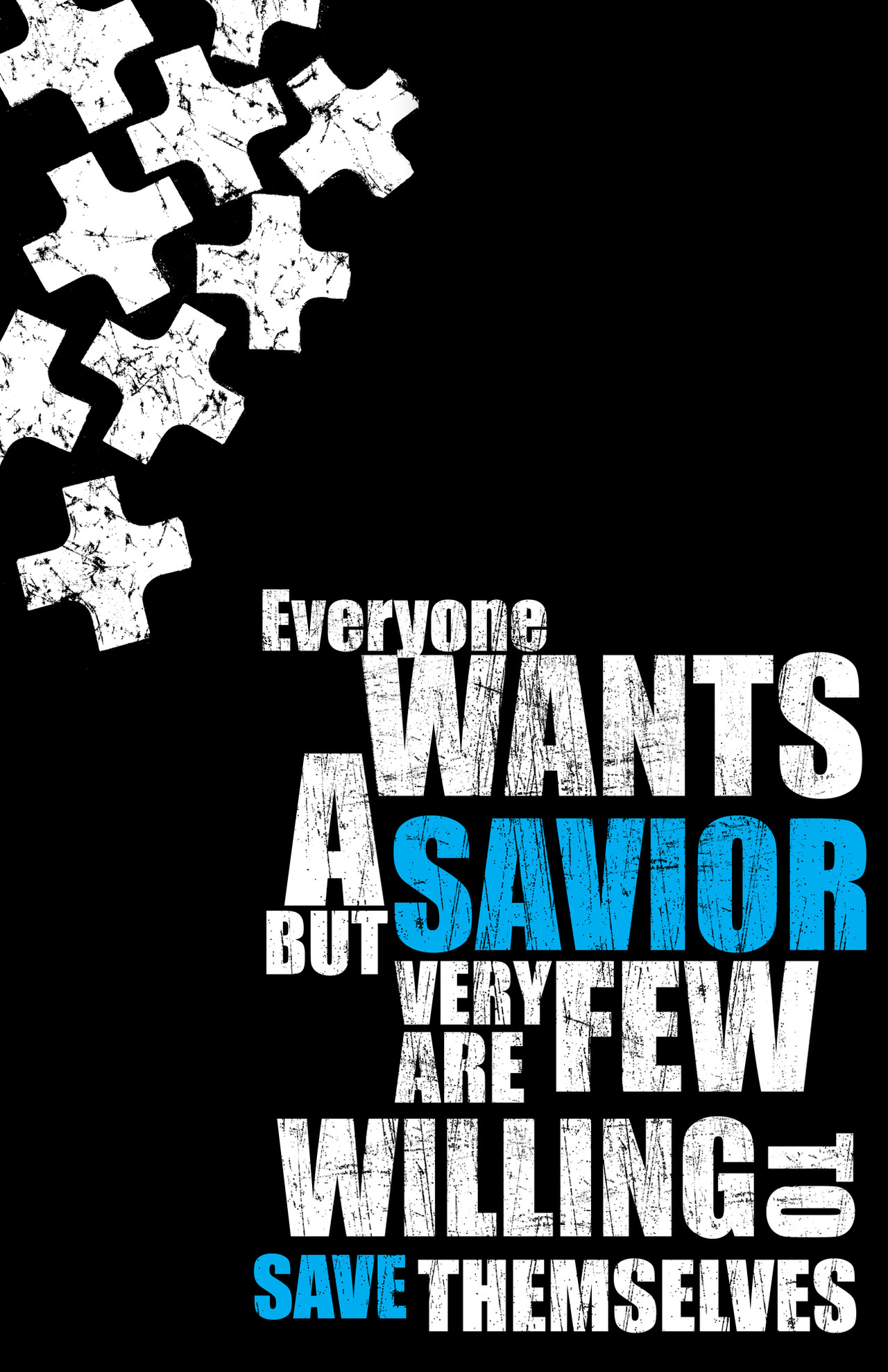
Forgive me Father for I have sinned. I have used Impact to a poster design.Hmm...yeah, I decided to see if I could make a design look mostly good with the Impact font for which I am told never to use.
EDIT: I've noticed that I've gotten a lot of favorites on this piece. Now, maybe I've become too insulated from my own work, but can anyone tell me why they like this piece? I'd really like to know. It was meant as an attempt to use a font that most graphic designers agree is too blocky to work. So, I'm really curious as to why people gravitate toward it.
Related content


Comments: 13

I think what draws us to it, is the blockiness. I think it fits well with the crosses and the boldness of what you are saying. Also the message is something a LOT of people will agree with. Anyone that has to deal with fanatics and neophytes. So many people today are so caught up in their entitlements that they put them in their spirituality. They actually expect the heavens to part just for them without any effort on their part. The rest of us who are some what sane (because acting like that is clearly not sane) are tired of it. I think the clarity of what you are saying brought people to this. The simplicity of the font really helps with the clarity.
👍: 0 ⏩: 0


I don't know why others like this piece. I can just tell you that I like it for just about four reasons: 1. the strong contrast between the white of the text itself (which uses a very strong font, and it just enhances the straight lines) and the black background, and the brightness of the light blue you've used; 2. the asymmetrical feeling given by the text on the right bottom side and the pieces on the left upper part of the composition; 3. the different dimension of the various parts of the text and that "to" turned vertical; 4. the "ruined" effect given to the whole font.
Nice work! ^____^
👍: 0 ⏩: 0

I like the message. It's very good and very true. Everybody out there wants a Savior and someone to fall back on, but most people aren't willing to take the first step to finding Him. It's sad, really. But great poster! I love it! The design is very cool as well!
God bless you!
👍: 0 ⏩: 0

Excellent job here!! hey which font did you use??? Like it!!
👍: 0 ⏩: 1

Just Impact. My mission was to take an ugly font and use it in an interesting way.
👍: 0 ⏩: 0

I like it because it's so blocky, honestly. The arrangement of words and color makes it work.
👍: 0 ⏩: 1
Thank you. I'm glad someone finally spelled that out because I honestly didn't have a clue. No, really, I'm not being sarcastic. It was one of the pieces I was just toying around with when I came up with it. The idea was, "Let's take this font that is ugly as hell and so unworkable and let's make it work."
👍: 0 ⏩: 1
I think you succeeded. I'm glad I could help.
 (Smile)")
👍: 0 ⏩: 0

Doooooo iiiiiiiiit. If you can pull that off, you will be super awesome poster guy forever. Hmmm, maybe a series using the "forbidden typefaces?"
Seriously, though, you did a good job.
👍: 0 ⏩: 1
Thank you again. I'll try it. See what comes of it.
👍: 0 ⏩: 0
Rules are made to be broken, you typographical rebel, you.
(In other words, I likes it. ")
👍: 0 ⏩: 1
Thank you. The idea just came to me for a split second today and that's what came of it. Maybe a papyrus design next?  (Wink)")
👍: 0 ⏩: 0