HOME | DD

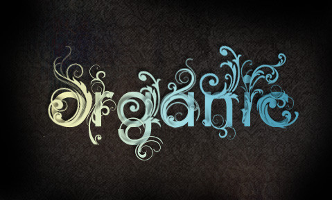
FillTheFrame — Typography

Published: 2009-05-28 03:07:47 +0000 UTC; Views: 5109; Favourites: 35; Downloads: 145
Redirect to original
Description Typography.
Related content
Comments: 13

Bellasphemy [2011-06-08 09:08:00 +0000 UTC]

I saw another version of this: [link]

THIS IS COOOL!

👍: 0 ⏩: 0

ceanji [2011-04-13 13:58:34 +0000 UTC]

i saw this at psd.tutplus.com!

👍: 0 ⏩: 0

GraTion-B [2009-12-08 20:32:57 +0000 UTC]

i do the same..but other letters

[link]

👍: 0 ⏩: 0

Philipee [2009-11-19 12:09:15 +0000 UTC]

nice tutorial isnt it, really like the wood effect

👍: 0 ⏩: 0

Sycamorewest [2009-06-02 08:06:18 +0000 UTC]

??? in two minds, blends too much, have to look hard! good idea.

👍: 0 ⏩: 1

FillTheFrame In reply to Sycamorewest [2009-06-02 09:52:44 +0000 UTC]

The letters are suposed to look asif they are made from glass. Hence why the blend with the wooden background.

👍: 0 ⏩: 0

Intercrac [2009-05-28 13:11:45 +0000 UTC]

wow looks great

👍: 0 ⏩: 1

FillTheFrame In reply to Intercrac [2009-05-28 21:28:21 +0000 UTC]

thanks

👍: 0 ⏩: 0

thinking-fish [2009-05-28 03:14:08 +0000 UTC]

awesome

👍: 0 ⏩: 1

FillTheFrame In reply to thinking-fish [2009-05-28 03:17:27 +0000 UTC]

Cheers x

👍: 0 ⏩: 0

JusticeVonBrandt [2009-05-28 03:09:09 +0000 UTC]

I really like the water

👍: 0 ⏩: 1

FillTheFrame In reply to JusticeVonBrandt [2009-05-28 03:11:01 +0000 UTC]

Thankyou ! x

👍: 0 ⏩: 1

JusticeVonBrandt In reply to FillTheFrame [2009-05-28 03:14:07 +0000 UTC]

You're welcome

I'd really think it'd pop out more if it were on a darker back ground. The wood grain on the text and background makes them blend.

👍: 0 ⏩: 0