HOME | DD
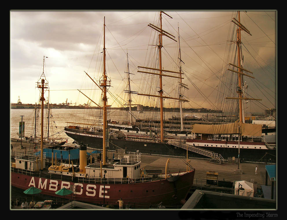
 FiniteAnarchy — The Impending Storm
Published: 2006-06-25 19:42:24 +0000 UTC; Views: 776; Favourites: 25; Downloads: 47
Redirect to original
Description
At the South Street Seaport as a storm approached. I thought it looked interesting with a sepia tone, though I may sumbit the original too. Comments please. Full view for best detail.Edited lighting to increase visualization on the boats.
Further edited through image variations in photoshop. Gave it a brown coloring on a duplicate layer then erased everywhere except the left sky. Sky is now darker than original. I'm actually rather happy the way it turned out.
Hope you all enjoy it
 (Smile)")
Any critiques on tone, coloring, composition and so fourth would be greatly apprciated.
Related content


Comments: 50

I like how the framing makes this composition impressive. Like the lovely tones as well. Great shot

👍: 0 ⏩: 0

Wonderful! I can almost smell the salt sea air! I especially enjoy the way the clouds and the lighting bring out all the delicate rigging on these fine ships. Excellent work!
👍: 0 ⏩: 0

I think what helps this is that there's nothing too modern in the shot. With the beautiful antique feel to the colours. it could be an old photo from the dying days of commercial square-riggers.
👍: 0 ⏩: 0

I like this a lot, the tones really give it a nice classic and timeless feel. And I think that the mess of criss-crossing rope and lines just looks cool. Nice work!

👍: 0 ⏩: 1

Not much to say that hasn't already been said, but certainly a

👍: 0 ⏩: 0

The general sepia toned colors in this shot add so much dimension to the ships and the sky--the textures really show quite well.
Great shot!
👍: 0 ⏩: 1

I like how simplistic is seems, even though there's actually a lot of detail.
👍: 0 ⏩: 0

Wonderfull shot
light is perfect, and the atmosphere old time ship.
congratulations :d
")
👍: 0 ⏩: 0

This is a most excellent photo. Great work!
Where is this?
👍: 0 ⏩: 1

Thank you. South Street seaport in NY
👍: 0 ⏩: 1
Ah, yeah I had kinda figured it was probably some cool New England port. xD
👍: 0 ⏩: 0

i like the way you manip'ed it - gives it an old feel - awesome work
👍: 0 ⏩: 1

I think I'd like it better with a bit more contrast ^^
And that boat on the frontground with this big AMBROSE is disturbing me, the photo all above is really great!
👍: 0 ⏩: 1


I agree with what *dwop has said ^^^
another way around the blown out sky and the underexposed boat would be to take at least 3 shots with different exposures and merge the images in photoshop using the HDR method
but i just love the mood here wonderful
👍: 0 ⏩: 0


Your colors are way to vibrant to call this a sepia tone, what I would say you ended up doing was making the image very warm and inviteing
I can dig it though looking at this I fell like Im on the dock and want to enjoy the nice weather that comes along with being there
Very nice capture
👍: 0 ⏩: 0

I really like the detail the ropes provide and I think you've chosen the tones well. I do like the lighter sky on the left, kinda gives a feeling of hope (through sunshine) in contrast to the storm...(I hope you know what I mean!)
...if I had to be picky, maybe next time, try and get the horizon a little more horizontal or balanced, other than that tiny thing, it's a really nice shot!
👍: 0 ⏩: 1
I understand what you mean
👍: 0 ⏩: 0

the lighting in this piece is awesome. And the colors! Makes me miss living by water. Nice work.
👍: 0 ⏩: 1
thank you very much
👍: 0 ⏩: 0

I love the warm feel to this, the sepia gives it a nice, warm stormy temperature. This photograph is reminiscent of some great photography back in the day.
Lovely colors and composition, great job.
--Ruse
👍: 0 ⏩: 0


")

The contrast of light and dark love that with the old ships but the ship in the front with the name seems a little out of place but that just might be me.
👍: 0 ⏩: 0

is there really a storm coming? hehe. i like this photo a lot. the architecture of those boats really look good and mix that with the atmosphere that those semi-dark clouds create. nice j0b
👍: 0 ⏩: 1
thank you. yes, the storm was real  (Wink)")
in more ways than one really.
👍: 0 ⏩: 0
TranscendenceEngine [2006-07-09 00:21:21 +0000 UTC]
Very nice, the tone really fits the image well, and I really like the subject matter. One thing, though - the yellow-ish glow in the sky on the left seems to disrupt the image somewhat.
👍: 0 ⏩: 0

Nice shot. I like the angle and composition alot - and the placement of the stormclouds off to the side gives it a nice ominous feel to contrast the bright sunshine to the left.
👍: 0 ⏩: 0

i like the earthy tones of this picture. very nice
👍: 0 ⏩: 0

amazing work! i really like the rustic tone you created and the overall vintage feel to the photo.
👍: 0 ⏩: 1
thank you! whenever i look at sepia colored photos they also seem to give me that feeling of vintage, like its all from the 1930s or something.
👍: 0 ⏩: 0

The tones in this are wonderful, and I do love the chaos. Life on the docks is chaotic, especially in old times and fishing communities.
It reminds me of the bottled boats and the old explorers weathering the storms.
👍: 0 ⏩: 1

I would advise to try manipulating with the tones and colours a little cuz in this state the composition gets a little chaotic.
👍: 0 ⏩: 0

This photograph is awesome. I love it. Like the other person said though, it appears the sepia effect fades on the one side, although I'm sure you're right, it's just the clouds being lighter and what ever, but if you were able to make that part look more like the other clouds in color, I would definitely have to fav this. I really love it though, it just kinda bothers me how the clouds in the one corner look almost completely white. :\ Anyway, very awesome!!!
👍: 0 ⏩: 1
i have increased the sepia toned color on that area of the sky. i think it turned out well. thanks for the tip!
👍: 0 ⏩: 0

I really like the sepia! the photo is great, the composition is very appealing.
👍: 0 ⏩: 1

I don't know why this photo hasn't got you more comments. It's very reminiscent of other big guys around deviantart and their work.
A few things.
I don't know what the original looks like, I want to see it. Maybe my following comment won't mean anyhthing afer seeing the original.
The sepia seems to be faded from left to right, getting deeper on the right side of the image. I'd try to lighten up the colouring on the right side of the image to give the effect a little more subtlety.
The exposure it great. The sky is a little overexposed, but the ships would be underexposed if you tried to compensate - unless you used a ND grad filter. I'd try experimenting with that. I carry mine around all the time with me. I don't use it much, but when you do, you really appreciate its effects. you can do it digitally, but its easier the first time around.
I'd say this is one of the better pieces of your gallery, I think youv'e got the same problem as I do - submitting all your stuff and not just the absolute best. Thats something I try and work on these days.
This photo is great, if people don't comment on it, they're not right in the head considering similar photos to these around here earn themselves daily top favorites on the front page - which is silly I think.
Cheers.
Dwop
👍: 0 ⏩: 1
The right side is very dark because the storm clouds are very dark. When I took this picture it was literally about 5 minutes or so before it started raining. I'll see what I can do about lightening the exposure. I will put the original up later on as a comparison. But over all the the right side is much darker in the picture because of the storm clouds blocking out any sun. The tone I used made it look like the entire sky was covered but it's not.
Unfortunately I don't have any filters on my camera to really play with. I wish I did. Most of the effects I use are done digitally to compensate. I'm still pretty new to DA so I've submited a lot of stuff that I thought was good but wasn't really up to par I guess.
But thanks for the compliments!
Cheers.
👍: 0 ⏩: 0