HOME | DD
 fire-ice-n-lightning — ID 2012
Published: 2012-01-16 21:46:15 +0000 UTC; Views: 525; Favourites: 19; Downloads: 13
Redirect to original
Description
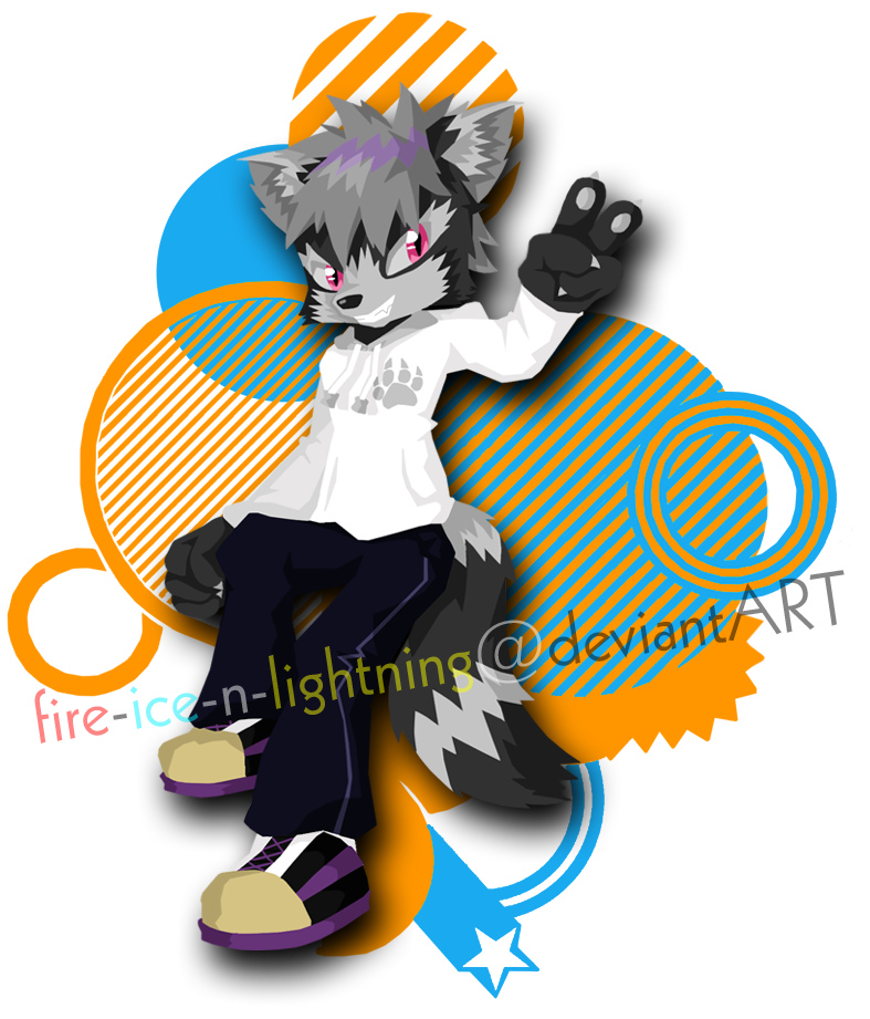
EDIT 2 - now in threee deee - [link] (glasses required)EDIT - made the eyes smaller, fixed the hands, ditched the gloves. S'all good. :3
--
herp derp new ID
Enjoy! Comments always welcome.

--
Lucas by *fire-ice-n-lightning
Related content


Comments: 19


Two things.
One, I've said it before but stop stealing my ideas!
And two, on a more helpful note, you might want to change the 'n' to white. It's incredibly hard to make out against the dark blue of his trousers.
👍: 0 ⏩: 1

Helpful note is helpful. Like I said to Hedgey, my computer's brightness is all over the place - I never know how these show up for other people.
Fix'd.
 (Cool)")
👍: 0 ⏩: 1
That's better! Although, having both black AND white as well as three other colours does play havoc on the eyes a little. How would the text look if ALL the black text was white?
👍: 0 ⏩: 1
The white bits won't show up very well on dA's background. The way it is now everything's visible. :3
👍: 0 ⏩: 1
Again, this is a thing to do with your screen- having seen the contrast on yours, I can say that other screens tend to look somewhat greener. Don't worry, white stands out perfectly on other monitors.
👍: 0 ⏩: 0


Cool ")

👍: 0 ⏩: 1
s'alright. I suck majorly at useful comments so I know the feeling. XD
And thanks!
👍: 0 ⏩: 0

This is cool, I really like it.
I would change the aqua color though. The aqua and orange kinda hurt my eyes a little.
👍: 0 ⏩: 2
A bit.  (Smile)")
👍: 0 ⏩: 1
Hmm, I see what you mean, but I'm not sure a darker blue is the sorta thing I'm after. I'll probably stick with the lighter one for now.
I've saved a layer with the darker blue anyhoo so I can go back to it if I change my mind. Thanks for the suggestion!
👍: 0 ⏩: 1
Oh, ok then.
You're welcome. I'm glad to help out!
 (Wink)")

👍: 0 ⏩: 1
Thanks! I'm glad you like it.
And thanks for pointing that out. I think my computer has a weird brightness setting and I'm never sure how these things show up for other people. I'll see if I can tone it down a bit.
👍: 0 ⏩: 0