HOME | DD
 FireEsper — Second Take
by-nc-nd
FireEsper — Second Take
by-nc-nd

Published: 2008-06-22 22:38:59 +0000 UTC; Views: 833; Favourites: 4; Downloads: 20
Redirect to original
Description
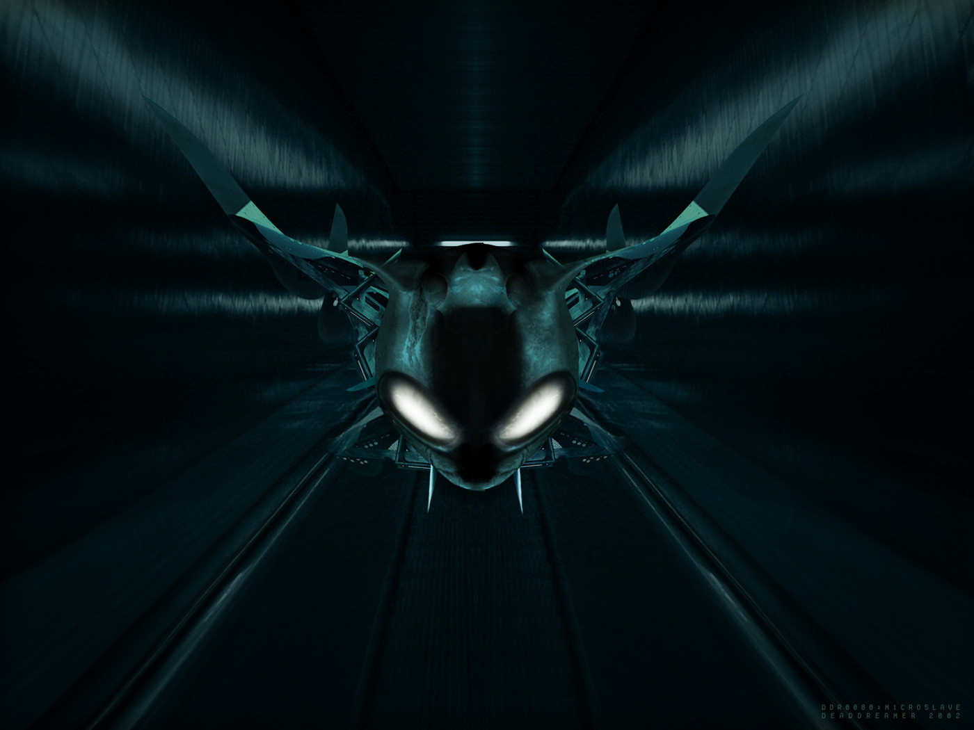
Draconic Avatars logo, based on previous rendition: [link]Mainly an exercise in font stylization: based on simple Arial text, each letter is layered over with simple graphical shapes, result cleaned up, further detailed and connected; final full word then re-detailed and re-done for overall flow and shape.
First and second words deliberately stylistically different: from simple, classical fairy-tale-like design to very distant, vague, slender and aggressive one.
Done in Photoshop (raster shapes).
...
Additional effect pass on the text is a combined texture overlay, stock effects and yet more combined overlays and adjustments.
Background is complex geometry rendered to flat and heavily processed with multiple effects and overlays, so that original geometry is only just barely recognizable beneath newly-formed abstract contours.
Related content


Comments: 2

I love it! 
 (Smile)")
👍: 0 ⏩: 1

Thanks! I couldn't come up with it either: it's improvised over an Arial skeleton.
 (Wink)")
👍: 0 ⏩: 0