HOME | DD
 FisHgRiNd — Warehouse

Published: 2012-03-19 22:10:12 +0000 UTC; Views: 2628; Favourites: 47; Downloads: 59
Redirect to original
Description
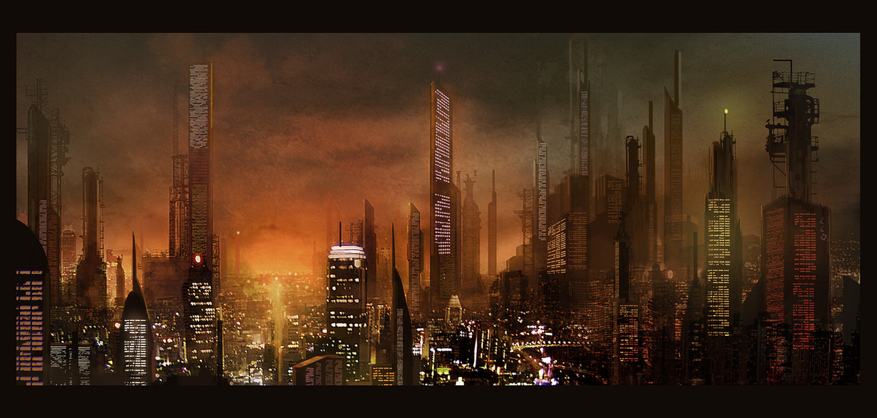
It was about time I did some more interior work, keep it simple on point perspective.Related content


Comments: 5

I like this, but one distinct element that would really improve it is some high-contrast shadows from a hard light source. The red framework in the middle of the image, for example, works with the overall image but doesn't have a shadow cast on the wall behind it, and looks a little flat because we can't see any shadows on the skewed elements (or at least, not that much). If you bring the contrast up about 10% for the overall image I think you will really have a sharp piece.
👍: 0 ⏩: 1

Wow thx for the critique! yeah I think you're right with the observation, I might just get back to it some time and rework it. Thx !
👍: 0 ⏩: 0
Thx yes its from scratch, although looking at it now I wish i'll broke up those straigh lines , looks a bit like a Sierra game
 (Smile)")
👍: 0 ⏩: 0

