HOME | DD
 fiveless —
Typeface Anatomy: A Brief
by-nc-sa
fiveless —
Typeface Anatomy: A Brief
by-nc-sa
Published: 2010-01-23 03:20:09 +0000 UTC; Views: 21181; Favourites: 488; Downloads: 745
Redirect to original
Description
10/12/11 Wait... what, a DD?! Haha man much thanks guys, I wasn't really expecting this because I really haven't been active much on dA for a really long while. Thanks for the love guys. I updated the preview file so that it displays better here, not sure why the .pdf preview is so strange. That said, the download is now a 48kb zip file with the pdf enclosed.And yeah, I was thinking of updating this one of these days, I did this thing a realllllly long while ago when I was still not that familiar with Illustrator and designey stuff so yeah, watch this space.
---
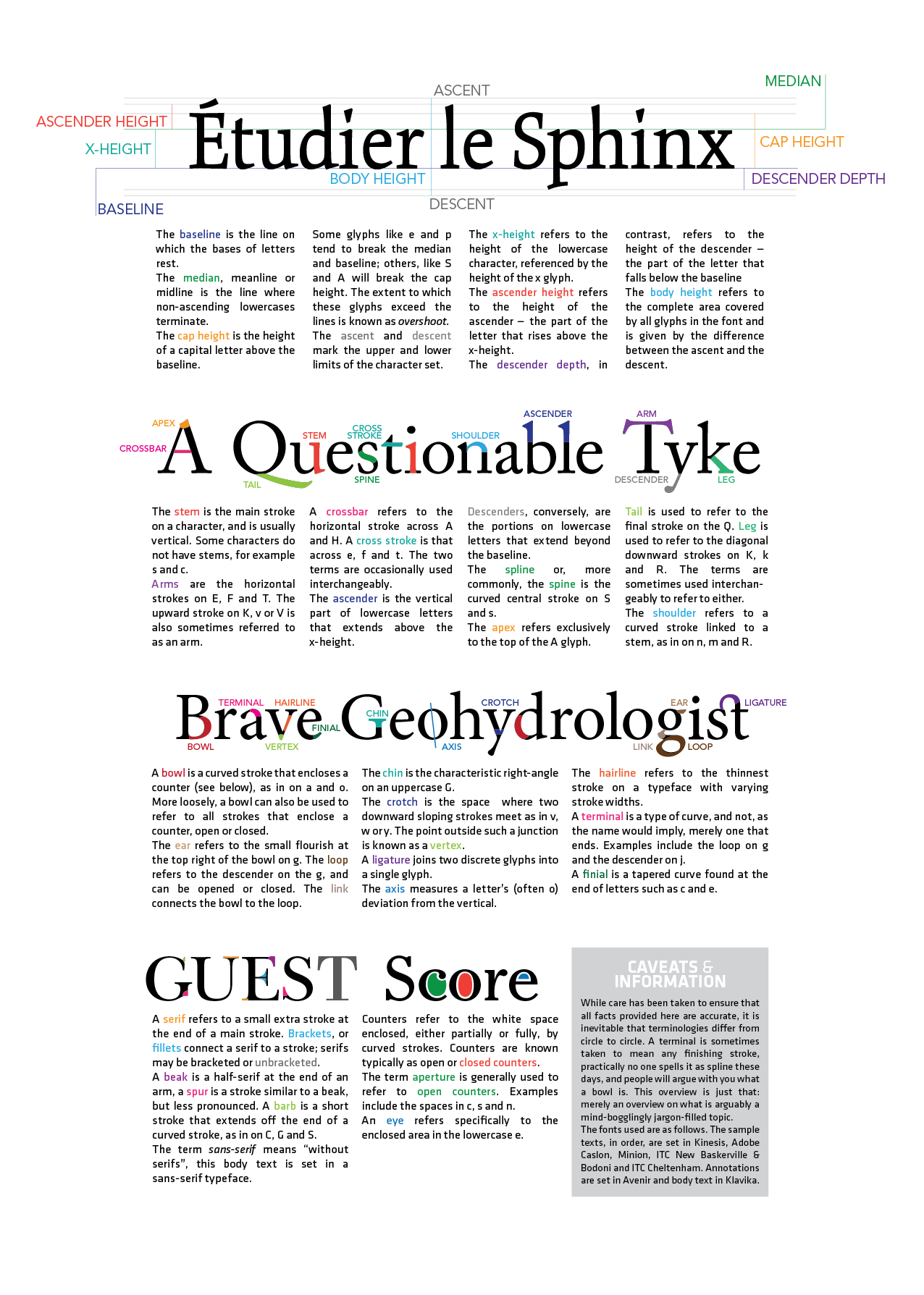
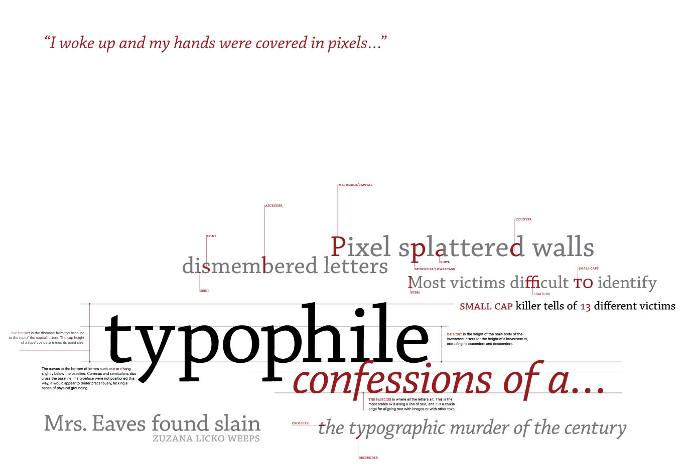
A brief, an overview. A brief overview if you've ever wondered what on earth they were babbling about when they say a typeface has "tall x-height with generous counters for ideal legibility".
Yes, it's CC-licensed, and yes, you can get a print if you're really into type. Or just download it. It's a pdf.
And, yay for grids! This is the first time I've worked on Illustrator, and I must admit it was pretty swell to use. I'm going to use it more often in the future.
So this is not technically text art, but humour me, no one would give a damn about this if I placed it in any other category. Ooh, there's a typography section under tutorials.
Aaaand, if you haven't got tired of reading all of this yet, leave a comment! Is something unclear? Did I (gasp) miss something out? Can the layout be improved? Did you find this useful?
And innit [link] awesome? It completely trumps this piece in, well, one fell swoop. In French, though.
Related content


Comments: 47


KERNING = LOVE

👍: 0 ⏩: 1


Awesome guide! I learned quite a bit which is lovely.
👍: 0 ⏩: 0


Wow, this is really useful and overall pretty awsome. I just have one question - what's the difference between median and x-height?
👍: 0 ⏩: 1

The median is the actual line and the x-height is the distance between the baseline and the median.
 (Smile)")
👍: 0 ⏩: 1
Oh, I thought it might be something like that. Thank your for answering! ^^
👍: 0 ⏩: 0

This is great.
My lil sis is in school for design.
I'v linked her
👍: 0 ⏩: 0


Beautiful and informative. I need this hung on my wall! <3
👍: 0 ⏩: 0

Short and informative, perfect! Thanks for making this and grats on the DD.
👍: 0 ⏩: 0

This tutorial has been used in the following news article:
Thank you so much for taking the time to produce guides to help artists!
👍: 0 ⏩: 0

Thank you for this. <3
I've been digging through typography tutorials for hours all over the net, and nothing really explained these terms as simply as this did. (:
👍: 0 ⏩: 0


👍: 0 ⏩: 0

Very nice and thorough. Well Done! I love the colors
👍: 0 ⏩: 0


That was actually, to my surprise, very interesting. Not sure when this knowledge could come in handy, but it's knowledge nonetheless. Uhh, the last section (using the example of the word 'GUEST') was harder to understand than other sections, perhaps because of the lack of labels, relying only on colour-coding (makes it hard for me as I'm partially colourblind), but apart from that, it was good
I'd give you the letter 'F' and say you've got two arms and a beak, but the comments font is a sans-serif font.
 (Wink)")
👍: 0 ⏩: 1

oooyeah, good point there, I didn't label the last section because all the parts there were so darned small. I might consider labelling those, now that you mentioned the point.
aaand 
👍: 0 ⏩: 1
Yeah. I know. Sucks when things are too small..(in a totally non-sexual way)
Woot! xD
👍: 0 ⏩: 0
e-oshima [2010-04-01 12:54:15 +0000 UTC]
the truth is i didnt read it all.
but this is really impressive !
well presented and detailed.
Great Work !
👍: 0 ⏩: 0

i know the terminology in my native language but it's good to know it in English also.
thanks!
👍: 0 ⏩: 1
you're welcome (: glad you found it useful
👍: 0 ⏩: 0


this is what they should have showed me at college instead of the terribly presented one. beautifully designed
👍: 0 ⏩: 2

AGREED!
I was looking for the like button. They gave us out a paper that was photocopied. This would of been much nicer to get 5 years ago.
👍: 0 ⏩: 0
ah kind words boost my ego  - :D")
👍: 0 ⏩: 0

wow! i only knew the first one, the basic parts! this is very informative!
and great work!
👍: 0 ⏩: 1
thank you!
umm i guess this is required

👍: 0 ⏩: 1


Also is there a term for the little nobules on the ends of the lowercase r and c?
👍: 0 ⏩: 1
they're called ball terminals. as opposed to a beak terminal, which you can see on the "r" in the first text sample.
👍: 0 ⏩: 0
I noticed that on the third section when talking about the ear it says "the ear is refers to." You might want to fix that. Over all I quite like it! You have such a clean and concise style of presentation. Makes me excited to take typography classes.
👍: 0 ⏩: 1

This is extremely detailed, clear, and well displayed. I've featured it in the "Typography Tutorials" collection in the #Typographers-Society favourites.
Thank you!
👍: 0 ⏩: 1
Ah, you're welcome. Glad to be of use
👍: 0 ⏩: 0