HOME | DD
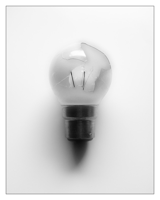
 flashmagic — DP4- Shining Darkness
Published: 2003-06-03 20:16:33 +0000 UTC; Views: 600; Favourites: 10; Downloads: 94
Redirect to original
Description
For ~diffuse22My colour was darkness. With the deadline approaching I didn't have time to do anything origional so...a smashed lightbulb.
Something to note: the lightbulb had actually blown before I smashed it
What I tried to do was make this as light as I could but still get the theme of darkenss across because it's a smashed lightbulb.
***Update- This can now be found as a wallpaper at [link]
Related content


Comments: 25

This comment is posted on behalf of ! hakfest , who is unable to submit his comment himself at the moment.
Nice still life work here. The break in the light bulb is nice, looks good, I like twhere it starts (top right), and where it ends (middle). What it does and doesn't reveal is good.
The lighting is great, although I would have preferred to have no shadow at all, I think that would have made this near-perfect.
The tone of the background is nice, it isn't 100% white, which I like, because that seems to be cliche these days. The tone of the background along with the border work make for a great presentation of the item. Also, good to see there isn't a reflection of your camera on the lower, metallic part of the bulb.
Fabulous work.
👍: 0 ⏩: 0


Wow... really minamilist, really great
Super idea, and well presented
👍: 0 ⏩: 0

The lighting is perfect. Too bad its not a wallpaper, looks like i'm going to have to make it one .
👍: 0 ⏩: 0


I meant to comment on this when the mega dev came out... as the other person with black as their colour, you pissed all over mine! Yours is brilliantly photoed, and a really fantastic concept too.
Excellent stuff... in fact, I think a is in order with it.
👍: 0 ⏩: 0

I like how it looks nice and clean. Great idea too
👍: 0 ⏩: 0

i agree with ~brecht
the simplicity does the trick...
nice contradiction with the title and the pure white background and frame.
well done!
👍: 0 ⏩: 0

cool, I like the framing and the "silence" of this.
👍: 0 ⏩: 0

I didn't even realize it was broken until I looked at it closely, even after reading your discription. Wow I feel blonde . Anyways, I really like this photo because of the simplicity yet dpeth the photo gives. I really like the concept and the composition. Very fine photo, I really enjoy it!
👍: 0 ⏩: 0

Fantastastic...
When is the print going to be available...
👍: 0 ⏩: 0

wheres that +fav button....
oh.... there it is
👍: 0 ⏩: 0

where do you get this excellent light fixture.
👍: 0 ⏩: 0

By far most the best contribution for the devpack of our beloved colors topic... My deviation getting more favs than you is a crime, so i'll put you a bit closer to topping me...
With this quality though, that'l be no prob
👍: 0 ⏩: 0


this is cool, really think you achieved your intend. Nice love this.... this needs more exposure
👍: 0 ⏩: 0

that would make one sweetass wallpaper. very very nice setup and execution here.
👍: 0 ⏩: 0

This is sooo great in it's simplicity. Love it a lot.
👍: 0 ⏩: 0

A beautiful example of minimalism well executed. I love the idea of clean and orderly marred by darkness and chaos.
👍: 0 ⏩: 0

Very interesting... simplicity with something extra
Anyway, great shot..
👍: 0 ⏩: 0

mm....sweet one dude...
it turned out really good from when you got the idea and told it to me on mirc
good one...
gg
👍: 0 ⏩: 0

nice photo. i agree with +anon-y-mouse about being more light than dark. maybe if you used a black background.
👍: 0 ⏩: 0

mm minimilistic
conveys light to me more than darkness. A single flame in a lot of darkness would work better for me sorries.
It's still a cool photo though, i like the lighting you've used, the shadow 'below' the bulb looks creepy in a way
👍: 0 ⏩: 0