HOME | DD
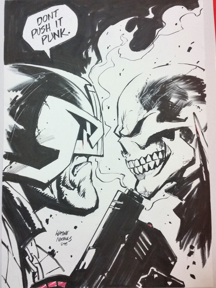
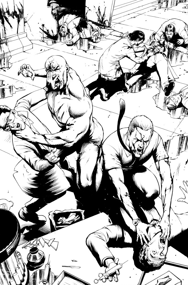
 FlowComa — The Institute - Issue 2 colour preview.

Published: 2016-05-19 12:59:29 +0000 UTC; Views: 1157; Favourites: 8; Downloads: 0
Redirect to original
Related content


Comments: 3

This has an almost animated cartoon feel to it. More Marvel Animated than Saturday morning.
Intentional?
👍: 0 ⏩: 1

Hi Rob,
No, there was no intention to make this look like a Marvel animated cartoon. The Institute is a psychological thriller so Marvel animation not an influence...
I did however go very heavy blacks in this series for a semi noir vibe. And when it came to colours, I wanted something that was rich and vibrant, but also somewhat moody and cinematic.
What I came up with kind of a mix of hyped saturated colours mixed with more muted subdued tonal shifts to match the beats and emotion of the story.
👍: 0 ⏩: 1
My comment was not meant to limit the work, my friend. I really like the look and feel of the page.
It simply struck me as similar, stylistically speaking, to some of the better sorts of animated cell work you sometimes see in high end full length cartoons. I use the word "cartoon" because as good as they may be in a relative sense, they possess nowhere near the sophistication of an animated feature. Even so, I often find that I enjoy the heavily stylized look many such cartoons have. Some of the Batman cartoons come ti mind as singular examples of what I am referring to.
It's an engrossing look, in any case. As usual, the flow is superb. The simpler style (compared to other work you've done) really highlights the action well.
I really must get around to buying and reading some of your work.
👍: 0 ⏩: 0