HOME | DD

FlowisKing — Clone Colonee

Published: 2006-10-14 14:02:04 +0000 UTC; Views: 21860; Favourites: 390; Downloads: 185
Redirect to original
Description 
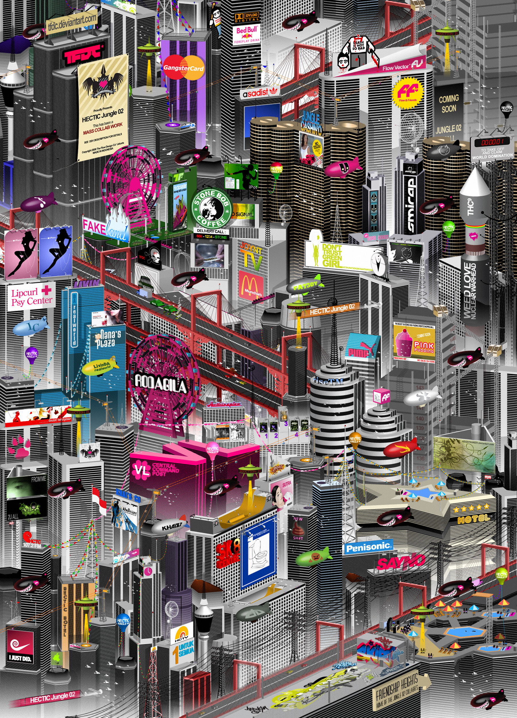
its about urban scape like in my city Jakarta, similar to all big city throughout the world...eventho them so complex and hectic..but if u notice it..they actually consist of the same ol thing over and over again..for example..rooftops with similar shape..similar tile, telephone and electricity lines with the same form..same color....full repetition..like clones...and grouped ...to form a colonee...


Copyright 2006 The Flow Design CoTM Jakarta
Related content
Comments: 120

wilsoninc [2008-07-18 10:12:23 +0000 UTC]

i love the shape of the train, so simple!

👍: 0 ⏩: 0

pica-ae [2008-03-17 12:36:59 +0000 UTC]

thats very cool
i like the positive/negative changes a lot, anyway everything is very well positioned, and that makes it so fun to look at

👍: 0 ⏩: 0

bona92 [2007-09-21 02:20:33 +0000 UTC]

Oh la la! Keren abiz bo!

👍: 0 ⏩: 0

NiYouMeiYouBi [2007-09-04 13:35:01 +0000 UTC]

amazing.. how long did it take you?

👍: 0 ⏩: 0

jdesigna [2007-08-07 19:37:20 +0000 UTC]

can't remember if i've said already, but fantastic work!

👍: 0 ⏩: 0

ngupi [2007-08-01 04:44:45 +0000 UTC]

wuffffff, rajin bener bapak kita ini, ~hail

👍: 0 ⏩: 0

2d4u [2007-07-24 13:46:23 +0000 UTC]

Very good composition!

Another one for my favs!

👍: 0 ⏩: 0

psktear [2007-06-20 16:11:29 +0000 UTC]

RESPECT!!!!! this is f;;;; great!!

👍: 0 ⏩: 1

FlowisKing In reply to psktear [2007-06-21 07:01:39 +0000 UTC]

👍: 0 ⏩: 0

murd3rlife [2007-06-14 08:14:18 +0000 UTC]

nice

👍: 0 ⏩: 0

couleur [2007-05-29 14:21:10 +0000 UTC]

nice arrangements

👍: 0 ⏩: 0

glue [2007-04-13 00:22:14 +0000 UTC]

Great example of urban sprawl.

👍: 0 ⏩: 0

exelans [2007-03-10 13:03:23 +0000 UTC]

fantasticooooo very good work

👍: 0 ⏩: 0

proverbialcheese [2007-03-01 18:12:53 +0000 UTC]

Awesome! put me in a New York state of mind.

👍: 0 ⏩: 0

khymikaze [2007-02-01 10:22:36 +0000 UTC]

marvelous composition, although I see something strange with some objects in there but since I`m not so into vector art I rader shut up...it`s in the `abstract` category anyway

👍: 0 ⏩: 0

bisma02 [2007-01-30 15:07:19 +0000 UTC]

*glekh*


gw bingung mau nulis apa buat ekspresiin kekaguman gw...

👍: 0 ⏩: 0

72ppi [2007-01-26 23:01:23 +0000 UTC]

Hi ..

Nice graphics! Looks awsome ..

We're on the hunt for talented graphic artists and illustrators, who has interest in earning money on their graphics, by letting us sell these on our online portal.
We're developing an online webshop, selling state-of-the-art T-shirts with graphics specially made by such as you.

Should you be interested, then please have a closer look at [link] or email me at charlie@teebee.dk

I'll be looking forward from hearing from you and hope that you find our project interesting enough!

Take care

// Charlie Nielsen

👍: 0 ⏩: 0

dPone2 [2007-01-19 15:25:51 +0000 UTC]

amazing job on the vectors.

👍: 0 ⏩: 0

DiedFamous [2006-12-18 04:52:52 +0000 UTC]

What would you say if I wanted to get htis as a tattoo?

👍: 0 ⏩: 1

FlowisKing In reply to DiedFamous [2007-01-04 13:47:10 +0000 UTC]

👍: 0 ⏩: 0

cherry-star [2006-12-11 00:22:08 +0000 UTC]

Love all of the little details that there are hidden in this piece!

👍: 0 ⏩: 0

CHARDMAINE [2006-12-04 03:06:24 +0000 UTC]

VERY SWEET

👍: 0 ⏩: 1

FlowisKing In reply to CHARDMAINE [2006-12-05 07:01:27 +0000 UTC]

👍: 0 ⏩: 0

simcDT [2006-12-01 09:58:58 +0000 UTC]

dope as fuck !!! awesome

👍: 0 ⏩: 1

FlowisKing In reply to simcDT [2006-12-02 15:19:50 +0000 UTC]

can say the same for ur works man...

👍: 0 ⏩: 1

simcDT In reply to FlowisKing [2006-12-05 10:54:50 +0000 UTC]

👍: 0 ⏩: 0

Masta16SniK [2006-11-30 23:35:04 +0000 UTC]

Respect!

👍: 0 ⏩: 0

eGanteng [2006-11-30 16:20:26 +0000 UTC]

keren!!!!

👍: 0 ⏩: 0

eGanteng [2006-11-30 16:19:53 +0000 UTC]

wah keren!!

👍: 0 ⏩: 0

psikodelicious [2006-11-24 22:55:02 +0000 UTC]

Great vector work.... the composition is very dynamik in a yet static sense. Props baba.

👍: 0 ⏩: 0

sam4grafix [2006-11-22 09:50:35 +0000 UTC]

u r just too good!

👍: 0 ⏩: 0

grecoart [2006-11-12 10:20:40 +0000 UTC]

great gallery
if you want visit my gallery and my website [link]
thanks you are welcome

👍: 0 ⏩: 0

xaosone [2006-11-10 16:57:58 +0000 UTC]

Damn!! Really nice. Creazy style i like it

::da' xaos one::

👍: 0 ⏩: 0

Idunknow [2006-11-10 14:35:57 +0000 UTC]

Very impressive! and

👍: 0 ⏩: 1

FlowisKing In reply to Idunknow [2006-11-10 16:00:47 +0000 UTC]

👍: 0 ⏩: 0

dlusional-permanence [2006-11-07 07:00:53 +0000 UTC]

bah beuhhh ...

👍: 0 ⏩: 0

FinBro [2006-11-02 11:28:53 +0000 UTC]

It really draws you in. Love the doves in the centre

👍: 0 ⏩: 0

FinBro [2006-11-02 11:27:10 +0000 UTC]

Really draws you in

👍: 0 ⏩: 0

sleazyb14 [2006-10-31 17:15:52 +0000 UTC]

exellent design

👍: 0 ⏩: 0

shawkash [2006-10-30 15:58:08 +0000 UTC]

Very interesting, The thing you had worked a lot ot draw all those details. Beside the composition looks profitional. visual trecks are appreciated at those 3 squares of man symbol with one magenta color! looks to me though better to go down a little, more close to a tension point if you may allow your design placed on role of thirds. but it is still ok to me. The thing I am not sure of is the train and cars, you made the form very plains as cubes which are very basic shapes doesn't look in the place inside other great objects in composition.

👍: 0 ⏩: 1

FlowisKing In reply to shawkash [2006-11-02 07:41:06 +0000 UTC]

well...back here...the trains is simple...cube like.. .... but i agree with you bout the cars...and the whole thing....i really need to update this...but i dunno...im thinkin of goin sideways with this...maybe add couple more of socalled urbanscape...here and there....
what do u think..should i go down?..or sideways?

👍: 0 ⏩: 1

shawkash In reply to FlowisKing [2006-11-05 10:43:09 +0000 UTC]

It depends. The layout still looks very beatiful for me. And if I were in your place I would add some lines run from center to edges, and may be that is what you looks for. There is another option for my eye speaks about the other left side at bottom, it has extra negative space, you may give some elements there to fill the gap.

👍: 0 ⏩: 0

o0Tron0o [2006-10-27 21:04:51 +0000 UTC]

man lots of detail....the upside down light posts makes a nice effect i'd say....

👍: 0 ⏩: 0

kcure [2006-10-23 02:47:45 +0000 UTC]

im really liking this one, so many nice details...

👍: 0 ⏩: 0

mistercreevy [2006-10-23 00:40:36 +0000 UTC]

what font did you use for "Clone Colonee" text

👍: 0 ⏩: 1

FlowisKing In reply to mistercreevy [2006-11-02 07:41:39 +0000 UTC]

i created it my self... its not a font...

👍: 0 ⏩: 0

endoers [2006-10-20 16:29:09 +0000 UTC]

wah... tumben warna hitaam!

👍: 0 ⏩: 1

FlowisKing In reply to endoers [2006-10-21 07:25:40 +0000 UTC]

hitam manis...

👍: 0 ⏩: 0

sonic21 [2006-10-20 16:13:26 +0000 UTC]

THIS IS COOL. THE BLACK WORKS REALLY WELL WITH THE CONCEPT AND THE NEGATIVE SPACE AROUND. GREAT JOB!!!

👍: 0 ⏩: 0

yayaaja [2006-10-19 16:35:35 +0000 UTC]

dasyat samm

👍: 0 ⏩: 0


| Next =>