HOME | DD
 FlowisKing — WUWI logotypes
by-nc-nd
FlowisKing — WUWI logotypes
by-nc-nd
Published: 2007-04-26 11:45:04 +0000 UTC; Views: 4727; Favourites: 33; Downloads: 0
Redirect to original
Description
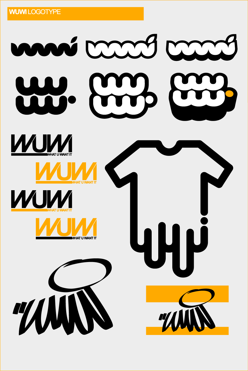
couple of logos for WUWI > [link] < soonRelated content


Comments: 30


itu namanya simbol.. bkn logotype.
eh, itu yg kolom 2 baris 1&2 he'eh tu.
👍: 0 ⏩: 1

logotype kali.. kan semuanya dasarnya tulisan... kalo symbol pan ga bisa kebaca...
👍: 0 ⏩: 1
simbol nyonk... logotype tu tulisan yg di bawahnya simbol,, susah yak ga ada contoh.
apa gw salah diajar nih?!heww
👍: 0 ⏩: 0

kok smuanya pada bikin wuwi -wuwi-an siihh? ada apa dengan wuwiiii
👍: 0 ⏩: 1
AADW dong.....hihihihihi...iya ni..biasa bisnis makanan cepet saji ama bule2... buat kampanye anti makanan berserat
👍: 0 ⏩: 0


I love the one in the second row from the top, on the right!

👍: 0 ⏩: 0


cool..
eh bos.. ym lo udah gw add blom sih?mo nanya2 flash dong..
👍: 0 ⏩: 0

[link] just the top on reminded me of that... you watch it? lol
i like all your designs though
👍: 0 ⏩: 1

👍: 0 ⏩: 1
hehe yeah i did have to stand on my head...
")
👍: 0 ⏩: 0


I love seeing the progression of logos. The idea flow. These are great. The top line is hot. The one with the yellow alternates is reading as MUM tho.
👍: 0 ⏩: 1
yeah... i notice that too , maybe wuwi need to change their name to mumi instead
👍: 0 ⏩: 0

very nice logos type, hermano... the secound line is well designed
👍: 0 ⏩: 1

yw ")
👍: 0 ⏩: 0

Hi! good job  (Smile)")
👍: 0 ⏩: 0


pengalaman ye? dapet yang ngandoi? btw...ngandoi tu ape?? bhs mane??
👍: 0 ⏩: 0

suka yg nomer 6 deh, yg ada titik orangenya..tp agak kurang bisa dbaca ya letternya..gmn pak? tp lucu!

👍: 0 ⏩: 0


lucu
kayak kumis
bahkan "kumis"
aku suka yg kaos meleleh
sama yg atas
great design bro
👍: 0 ⏩: 1

semuanya deh
personal favorite sih yg paling atas

👍: 0 ⏩: 0