HOME | DD
 Flutterknight — Scootaloo At Sunset - v2
by-nc-sa
Flutterknight — Scootaloo At Sunset - v2
by-nc-sa

Published: 2012-06-13 04:07:26 +0000 UTC; Views: 308; Favourites: 3; Downloads: 4
Redirect to original
Description
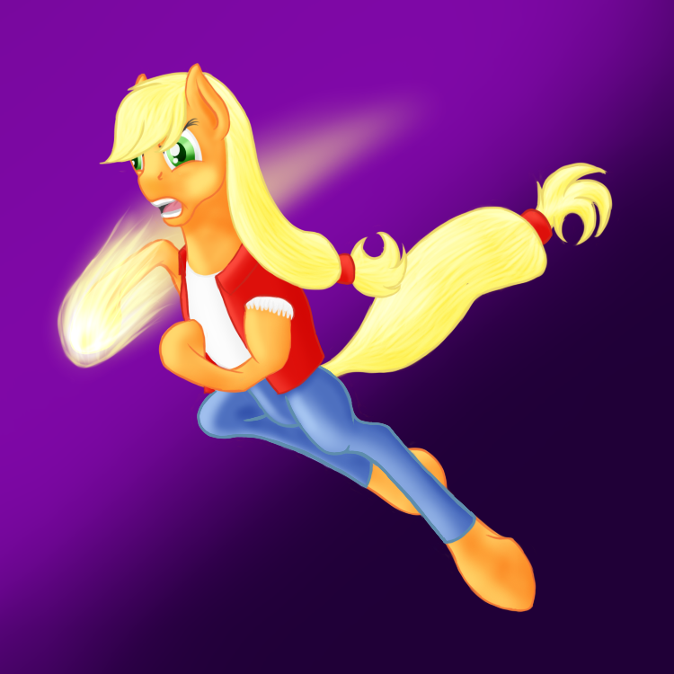
I finally got around to completely redoing the shading on my digital painting of Scootaloo at Sunset. I think it looks MUCH better now, though I'm not entirely certain I'm done with it yet. There are a few things I think could probably be better, like the wing and eyelashes, but I'm not quite sure how to got about improving them.For reference, the first version: [link]
Edit: Fixed shading. (Hopefully)
MLP, Scoots (c)
Related content


Comments: 12

That looks amazing!!!!!<3 The lighting is gorgeous and I love her facial expression~ Keep up the amazing work!
👍: 0 ⏩: 1

Thanks! I actually just put up the final version: [link]
^_^
👍: 0 ⏩: 1

Oh wow, compared to the v1, the shadings are totally different! This one is really neat, amazing job!
👍: 0 ⏩: 1

Instead of making the wings brighter where there's no light you can make them darker there. And the light doesn't go that far back on her neck. The ear is a bit tall, should start lower and be more formed like a football (like on this ref: [link] ). Scootaloo's body also seems a bit big, looking at the curves I can see so far. I'm pretty sure the eyelashes start at the end of the eye too. The shading on scootaloo's hoof is somewhat weird too, it should be darker to the left of it instead of bright, remember where you put your source of light. I really like the muzzle though, better than what I do, even if it might be out of perspective.
The thing with shadings might make more sense if you imagine looking at scootaloo from the other side, so you can see the light on her. Just remember where the source of light is and it should make sense where the light goes and where it should be darker.
👍: 0 ⏩: 1
The light on the leg and wing is meant to be reflected light from the ground to help show where they separate from the body (if I just made it get darker the further back the leg went, it wouldn't stand out from the body...), though I could probably make that a little bit darker for better effect. The wing I'm certain needs work, I'm just not entirely sure how to go about it properly, I can't really *just* make it darker, since the body around it already gets pretty dark, and it needs to stand out. As for her body, keep in mind she's sitting down (the downward neck curve, rather than straightening out, should indicate this), so her body is sloping downward, rather than curving upward a bit if she were standing.
👍: 0 ⏩: 2
But then again, I'm not completely sure of your style quite yet. Then you can disregard my anatomy and just focus on the shading part of my comment.
👍: 0 ⏩: 0
Maybe this would make sense about the body and the ear (not that professional, but should make sense): [link]
Reflected light isn't that strong. And as for the wing, since your wings seem a bit roundish, I guess there could be a bit of light in the middle of the wings, that way you can put dark color in the edges instead of light.
👍: 0 ⏩: 1
As I stated, she's sitting down, if she weren't, her neckline would straighten out near the bottom, rather than continuing downward. My ears are also generally a bit large (look at the sketch of your OC, his ear is pretty tall, and that wasn't one of the "I did this at 1am so I screwed up some simple stuff" things. ")
👍: 0 ⏩: 1
I know the ears on my OC is large, and everywhere else, that is a problem that I have hopefully corrected by now. I'm just saying that the ears in MLP style (showstyle (which is more the way I'm going)) is that way and if you're not going for that style, just like I said, just ignore that part of the comment. Focus on the shading part. It sounded a bit like you used my failed ears as an excuse for yours being that way, to be honest.
👍: 0 ⏩: 1
Actually, I was pointing that out to show that *my* ears are usually a bit large, not that you draw them large. >.>
👍: 0 ⏩: 0