HOME | DD
 fog-mire —
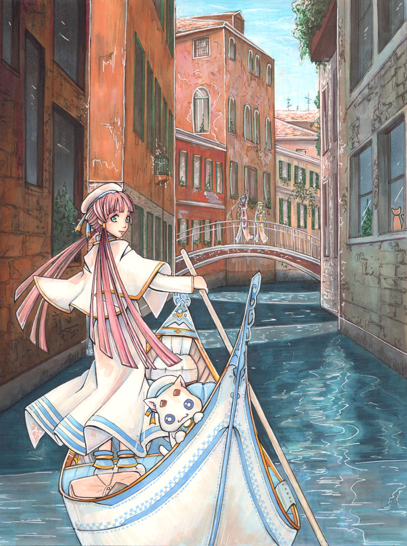
Aria cmsn
fog-mire —
Aria cmsn
Published: 2010-04-29 21:29:27 +0000 UTC; Views: 26534; Favourites: 2063; Downloads: 526
Redirect to original
Description
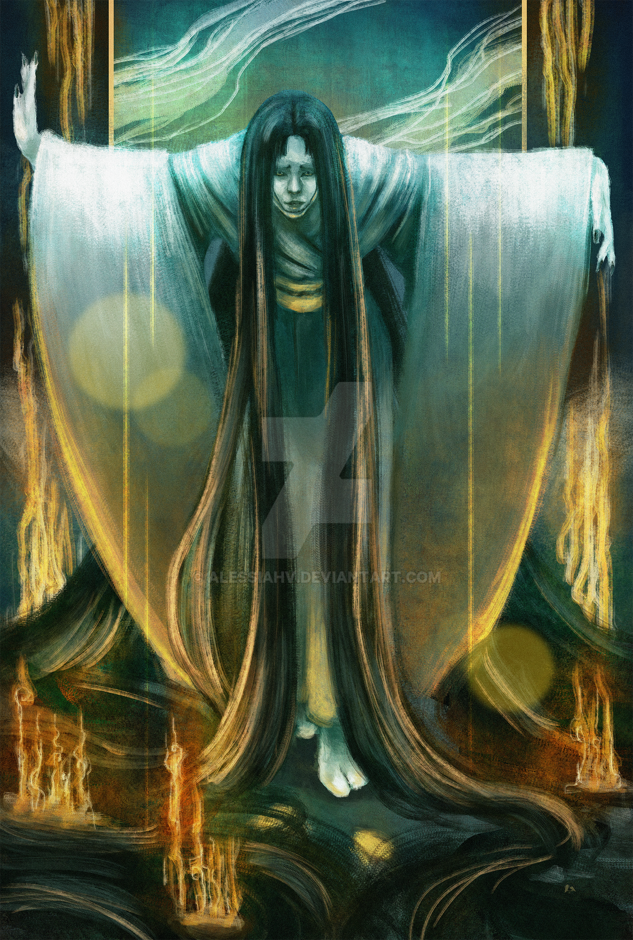
Commission for ~Brat-InnocentyCharacters are from manga/anime Aria.
art (c) *fog-mire
Done with markers, hope you enjoy

Related content


Comments: 435


This is a really beautiful piece. There's only one thing that kinda bothers me is that Alice seems to be wearing her gloves when she shouldn't be if Akari is using that boat. I'm just nitpicking, though. Probably because I love the series so much.
👍: 0 ⏩: 1

Thank you!
Haha, I knew I would mess up since I haven't watched the show XD
👍: 0 ⏩: 1

👍: 0 ⏩: 0

 (Smile)")
")
👍: 0 ⏩: 0


Ditto to :devwatsome:, maybe you're going for a soft look here but addition of high contrast shadows would make the picture pop out more.
Kudos on the DD!
👍: 0 ⏩: 1
Thanks! I fosho need to work on contrast
👍: 0 ⏩: 0

I think your characters need more shadow. The background stands more than the characters at front. If you do that, it's super mega awesomely perfect. =]
👍: 0 ⏩: 1
Thank you! I agree with you totally, Ill work on that
👍: 0 ⏩: 0

Sugoi! really looks so interesting! <3
Have an good composition of elements
And waaa~ Venecia~
There comes the name of our country, Venezuela <3
👍: 0 ⏩: 1

I'd love to give an in depth critique but i was only torn with the main girl, i was left wanting something special from her, something that made her stand out a lil more, at the same time tho i agree with her more 'plain' look (lack of better word ><) bcuz then it moves ur eye across the picture to admirer all the detail u put into the background, which btw is stunning =], Honestly, i dont see why u dont write ur own manga, this is deff worthy of it. I still was left a lil disapointed by the main girl however. OH! and major bonus points on the small detail u've put everywhere, its very thoughtful and i love it =]! I like the complimentary colors, of the blues and greens and the reds and oranges, but mebbe to make em pop a lil more, perhaps give the buildings and boat more contrast ? woo O.O im rambling. anyways, major bravo =] im excited to see what you come up with next.
👍: 0 ⏩: 1
Thank you very much!
That was such a nice in depth and balanced critique!
I'll work more on contrast and giving my suject more *pop*
👍: 0 ⏩: 1
Awww np!! ^////^ always love to help♥
👍: 0 ⏩: 0

Ah, this certainly brings back memories. The light colors are very atrractive. The gondola and buildings were so detailed. Beautiful.
👍: 0 ⏩: 1


What kind of markers do you use.
👍: 0 ⏩: 1
Are copic markers difficult to use? I am going to get some as soon as I have enough money.
👍: 0 ⏩: 1
Nope, esp if you've used markers before
👍: 0 ⏩: 1
I have only used the faber castell markers. I like thoes but I want some better quality ones like the copics. I just wanted to talk to people who have actually used them and find out what they are like before I spend almost $300 for a 72 pack set.
👍: 0 ⏩: 1
I personally like them better than fabers.
Fabers tend to be very heavy on the ink flow, whereas copics are very smooth and easier to blend.
I actually use 5 different brands of markers, and have to say that copics are my favourite.
However, I would buy touch (shihan art international inc.) over the copics just because they are such a good price compared to copics, and are a relative quality. Next I would buy promarkers, which are also cheap. That should give you a little room to look around anyways.
👍: 0 ⏩: 1
Thanks, I will have to experiment with some of the others.
👍: 0 ⏩: 0

Such elegant work and the color palette is very soothing.
👍: 0 ⏩: 1

This music always goes through my head when I see this. XD
👍: 0 ⏩: 1


Ah, I watched part of this anime, though I didn't finish it for some reason. XD But this beatiful art makes me want to get rekindled with it. Really, your piece is very lovely!
👍: 0 ⏩: 1
Thank you ^^
I haven't watched it at all... haha really should!
👍: 0 ⏩: 0

not a problem.
👍: 0 ⏩: 0

Actually I kinda like the contrast between the characters and the background. Some manga artists stick photo-realistic Screentone in the backs of their panels, and then the characters are practically drawn on top. It's a weird effect, but it's impressive that you'd be able to place 2D characters in 3D space so well.
👍: 0 ⏩: 1
Aww, thank you!
I struggle so much with contrast!
neat touch!
👍: 0 ⏩: 0

ARIAAAAAAAAAAAAAAAAAAAAAAAAAAAAAAA
Beautiful.
👍: 0 ⏩: 1


Aria has always been a wonderful anime with nice atmosphere <3
👍: 0 ⏩: 1
<= Prev | | Next =>