HOME | DD
 formaldehyde — agressive_combat

Published: 2003-10-23 22:38:24 +0000 UTC; Views: 212; Favourites: 5; Downloads: 100
Redirect to original
Description
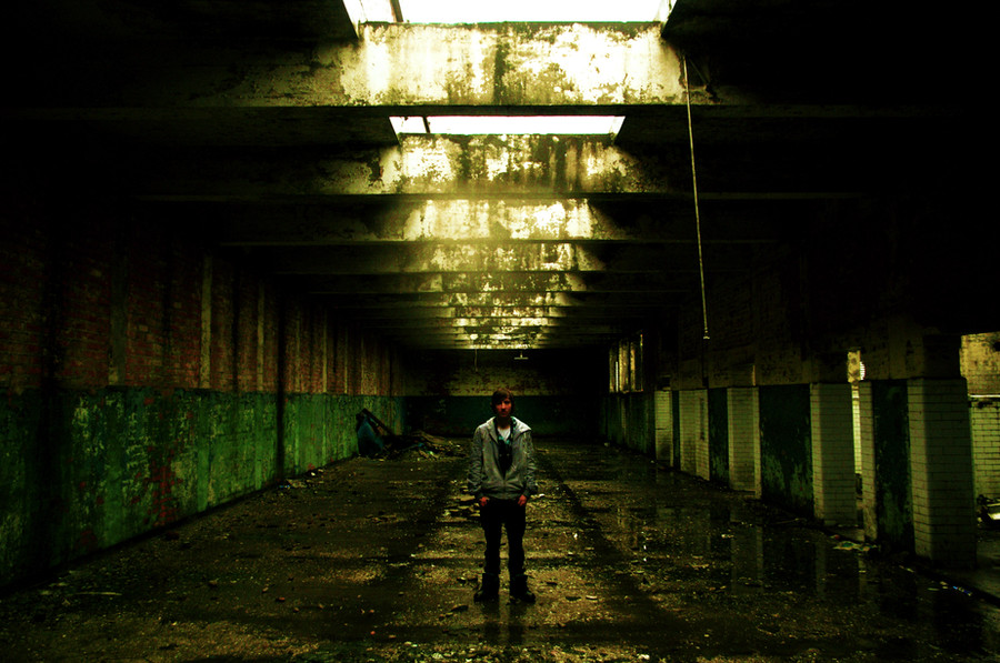
played around with stock by *gouine (she ROCKS). the result is influenced by silent warrior's offensive strike. i think i took it too far with the typography, but i like the visual result. comments are wlecomedRelated content


Comments: 11

Really cool. The colors all blend well, and the blurry sections work well against the other parts. The text is well placed too. Great work!

👍: 0 ⏩: 0

i love how mechanic this looks....i think it looks brilliant! nice use of stock.
👍: 0 ⏩: 0

I like the combination of colours and this text is sooo cute  (Smile)")
👍: 0 ⏩: 0

beautiful typeplay as well as visuals (which i love most)

👍: 0 ⏩: 1

its an honor to be commented and favd by you
👍: 0 ⏩: 1
the honour is all mine.
👍: 0 ⏩: 0

wow tom .. ! ")
fuckin amazing buba.
")
👍: 0 ⏩: 0

")

this is awesome stuff. love the blurryness, the colours, ah. a great composition. and *gouine rocks. she really really does.
👍: 0 ⏩: 0

Quality shit, i say!!
Me likes very much. (beteruf, yaani)
Good clean typography. Sylish.
Cool motion bluring and colors.
Good stuff i say!
👍: 0 ⏩: 0

Awesome photo manip. I love the colors. What is the stock of?? It would make a great wallpaper if it wasn't so small.
👍: 0 ⏩: 0