HOME | DD
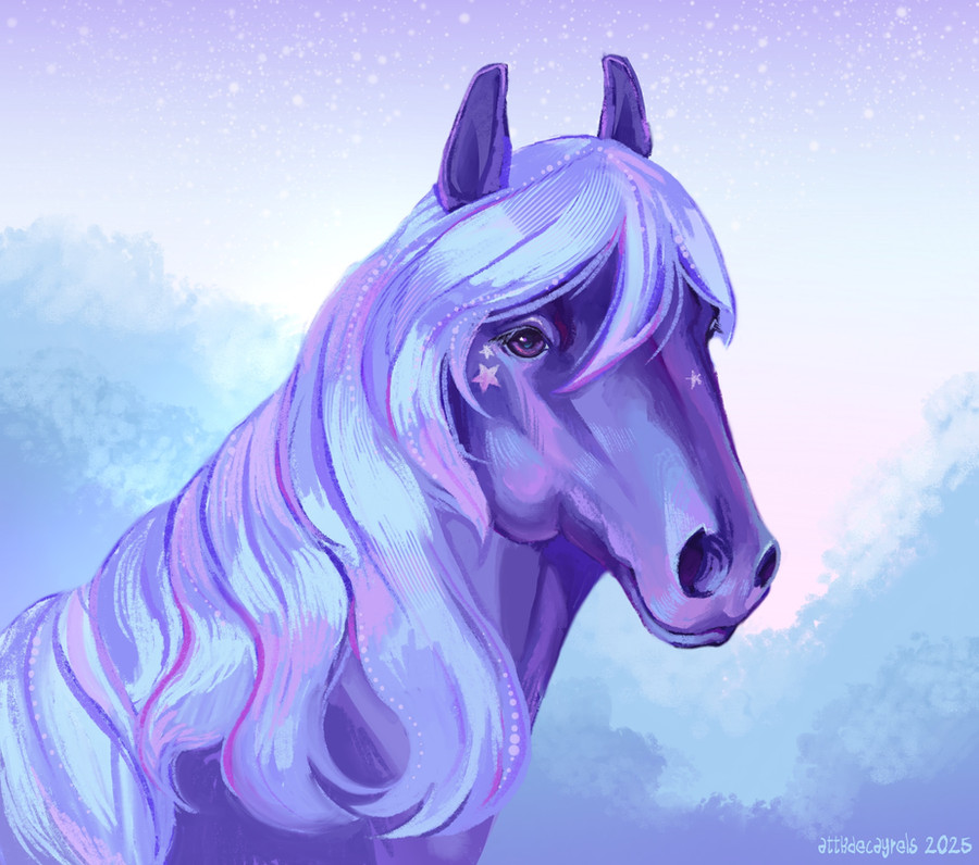
 Fortique — Request: Lantern Blessing

#animal #beast #beautiful #blessing #character #commission #creature #horse #lantern #magical #oc #oriental #original #pony #request #little #mylittlepony #mylittleponyfriendshipismagic #mylittleponyfriendship
Published: 2014-12-07 23:37:00 +0000 UTC; Views: 347; Favourites: 14; Downloads: 1
Redirect to original
Description
Request for 's OC Lantern Blessing.Excuse the appalling use of gibberish on the cutimark. At least I feel somewhat redeemed by this drawing, I should try stick closer to this cartoony/anime? style in future drawings. Or maybe it was the colour pallet? I liked doing the flowing/swish effect of the hair and ribbons, it wasn't really a strong point of mine.
I hope you like it, and I apologise for the lame background.
Tell me what you think in the comments below and dont forget to favourite!
Related content


Comments: 7

Strange, but interesting.The ribbons and hair were very well done even though you say it was your worst point. Depending on the style you are going for (guessing it's an MLP ref) the legs look a bit strange to me. Lol it may just be the style as I draw in a semi realistic/cartoon style. They just look a bit too much like a long noddle in the pasterns (lower legs) and too small in the muscle and hock area of the back legs and knees. The head could also be larger as even in the MLPS the head takes up a good majority of the pony's body. Proportionally, the head should be almost larger along the nose and cheek as the legs. Again I do not know the style and although it is not one of my favorites it is still a good piece.
 (Smile)")
👍: 0 ⏩: 1

Aye, thanks for the critique. I agree with pretty much everything. Yeah, everything is in the extreme regards the proportions. Anything 'realistic' goes out he window and there is a bit of distance from actual mlp art. The forelegs are super floppy but I just rolled with it and the back legs are so... wrong. But right enough for what I was trying to achieve. There are about three main parts to a horse's back legs and I just basically ditched one of them and exaggerated the other. Altogether, it's supposed to give a sort of elegant(?), 'flowy', femenine look? Maybe. When it comes to these proportions, I guess you get two kinds of responses: Those who like it and think it looks good on the character, then those who think that it just doesn't work and it looks weird to them.
As for the head, I focused on the petite size and the 'dish' shape that is considered 'pretty', again, depending on what the viewer likes. I guess, looking back at it, I didn't want the hairstyle adding too much size to the head either. And since the legs were so insane, I couldnt compare the head to them.
Thanks so much for the feedback!
👍: 0 ⏩: 1

Oh my, look at my baby! She looks SO pretty and elegant, you did such a nice job on her ;//v//;
Especially all the flow in her hair, and the details! It truly looks great 
Thanks once again for the lovely work <3
👍: 0 ⏩: 1
Anime(?) all the way! At least I think it's a sort of horse/anime style. Eh
👍: 0 ⏩: 1
Of course! <3
And to be honest, I way much prefer a horse/anime style rather than the one MLP is drawn in, I don't really like it much >n<;
👍: 0 ⏩: 1
I'm happy to make you happy, yo : o)
👍: 0 ⏩: 0