HOME | DD
 Fortranica — color practice - green
Published: 2009-04-08 02:37:01 +0000 UTC; Views: 1018; Favourites: 46; Downloads: 0
Redirect to original
Description
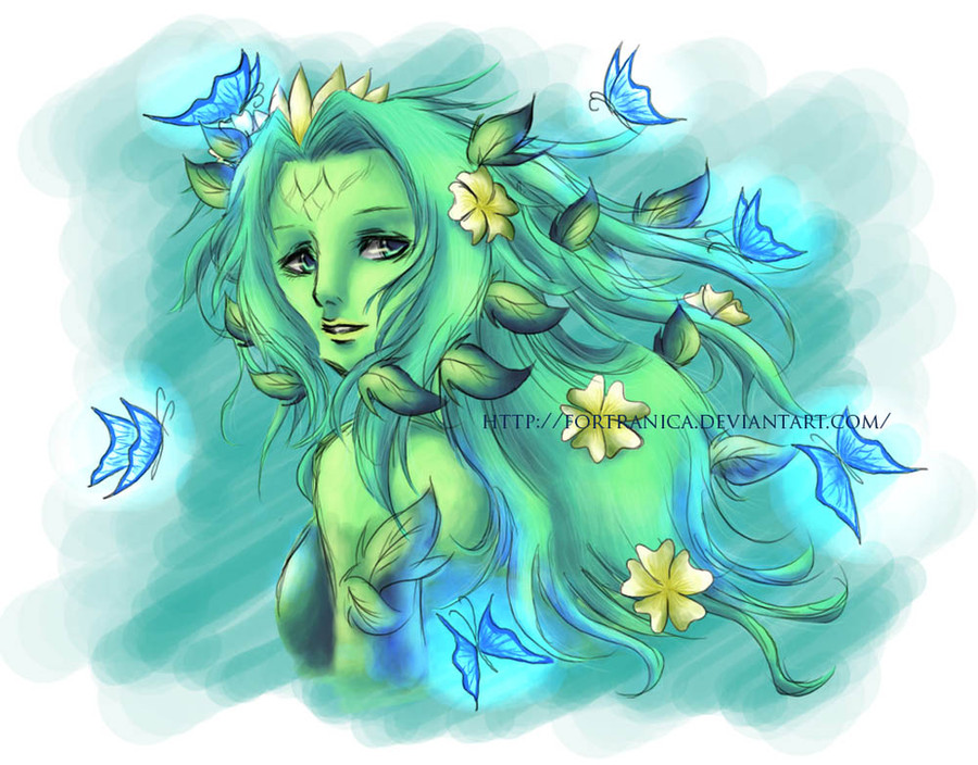
 full-view please thank you
Can you see her hair lines?
I know they are very very unclear, but if you full-view it, you can see them even they’re hard to see DX and I’m learning to add hair lines well. And, oh my gosh, does anyone know how to color the lips nicely? DX
This is my color practice again XD oh, I love green colors!
Actually I’m very confused about the bg, but then I want to make her hair strands visible, so I chose dark colors. And I made so many color blend experiments here >< combining colors is so fun!

I’m still trying new coloring style. I need critiques and advices from you, guys. I will appreciated them very much! thank you
Sorry for the messy lineart *especially the butterflies*
Related content


Comments: 50

Hi,
I just saw your sig somewhere, and figured you needed help. As I myself am learning to color as well, I do know how important constructive comments can be, and so here I am ^_^
First off, I simply love the color scheme! Green is my favorite color 
The picture in itself is very very well drawn, though in my opinion the hair and eyes could do with a little more improvement. Eyes are tiny, really, but they are most often the focal point of a picture. They can very effectively make or mar a subject, and though they aren't really bad here, if you improved even slightly, they could be superb! ^_^
Coming onto the shading, I am amazed at how effectively you are able to give roundness to an object. I still can't do that ;_; But you did that awesomely! The whole pic now has a real full, natural, sort of 3D look. The contrast between light and dark is very good too, though the highlights aren't as clear. You should probably try and make them clearer as they really add to a picture.
And erm... The lips aren't shaded too well, are they?? They seem flat, in comparison with the rest of the pic. I suggest you look at some photography, and then some pro work, and see how real lips look and are shaded. IMO that's the awesome way to learn ^^
The eyes are again a weak point, as they seem to be shaded too heavily. They are definitely round (which is far more than i can say for my work x_x) but the whites should have been lighter, I think.
The hair lines, yes, they are definitely very much visible  (Smile)")
There is something more you could improve... the butterflies. They are like tiny light sources on her body, aren't they? But they seem dull in themselves even though they cast light on her. I think if you could lighten the lines and brighten the colors, maybe they could look even better
There. I hope I helped! And someday maybe you could help me too
But the key is practice! Practice practice practice and some patience, and I can bet one day you will be brilliant
")
👍: 0 ⏩: 1

thank you for the visit. I appreciate it so much
yes I suck on highlights and shading the lips DX need to learn more. and yeah, I want to go crazy with lots color, but I'll try to make it make sense with other colors XD
thank you very much for the advices, dear
👍: 0 ⏩: 1
Even I face the same problems, and I guess the only way to overcome these is practice. So all the best, hun!
👍: 0 ⏩: 1
thank you, and good luck for you too
👍: 0 ⏩: 0

The colouring is really nice, I think your colouring skills are fabulous! I can see those hair lines, even though its a bit blur... It's distinctive. Nice job. This picture gives me a nature-like feeling... Haha.
👍: 0 ⏩: 1
thank you very much, dear
👍: 0 ⏩: 0


Nice one, but her face become a bit weird... >.< maybe you should choose lighter green
👍: 0 ⏩: 1
thank you
yeah I feel the same way too. thank you for the advice
👍: 0 ⏩: 0


She looks wonderful! And so delicate.
I also love the green colors.
👍: 0 ⏩: 1


I think it's beautiful. I'm not very good at critiquing and advice, but I don't really see any problems.
👍: 0 ⏩: 1

BGnya bikin mati...ahrusnya..BGnya lebih hijau ke arah kuning ato desaturate, jadi gak mati
👍: 0 ⏩: 1
itu justru sengaja bg-nya dibikin kyk arsiran kasar gitu & agak gelap, biar helai2 rambutnya keliatan DX thank you buat kritiknya
👍: 0 ⏩: 0

Rambutnya keren XD
Tapi entah napa, w ngerasa ada yg agak aneh sama matanya...
👍: 0 ⏩: 1
thank you
LOL emang, matanya ad sdikit kejanggalan hohoho
👍: 0 ⏩: 1

degradasinya mantep bgt... halus jadi kaya tradisional..

👍: 0 ⏩: 1
wah iya bener? br prtm kali bilang ini degradasinya bagus...DX thank you
👍: 0 ⏩: 0


BGnya menurutku aga annoy sih. kalau se soft depannya pasti bagus
untuk hair ama kullitnya sih dah top banget
👍: 0 ⏩: 1
thank you cc
👍: 0 ⏩: 0


you're coloring looks so beautiful
i also love the way you drew the girl


👍: 0 ⏩: 1

Wew~
what would i say?? u'r far better than me
BG nya kasi warna simple aja! gradasi klo emg ga ada object!! RAMBUT NYA KERENNN~ DX
")
👍: 0 ⏩: 1
thank youuu
bg-ny itu sngaja dbikin gt, hbs g ad ide c

👍: 0 ⏩: 0

keren~
gmana klo bgnya bikin kaya blur batang pohon warna coklat trus biar ga flat kupu2nya jadiin crimson ajah *since red + green = brown* kan kan? xD (sok tau bgt ya) duhhhhhhhhhh lg project van gogh.. jd kebawa mulu theorynya D:
iya tuh merahin aja kupu2nya xD biar ada contrast warna
koq itu daun2nya D: bikin jelek deh *sorry*
👍: 0 ⏩: 1
thank you
lol dr awal kpikir warna biru c ><
👍: 0 ⏩: 1
haha kmaren cuman kepikiran buat nge-warm in gambarnya secara green itu kan cool color
👍: 0 ⏩: 1
lol justru tujuannya cool color

👍: 0 ⏩: 1
oo... tp jd flat... org yg liat klo di pasang dijalan *katanya guru sih* org2 pada ga tertarik klo warnanya flat sama smua D:
👍: 0 ⏩: 1
namanya juga latihan ya suka2 saia lah DX makasih buat advice-nya
👍: 0 ⏩: 1

She's very beautiful! I like how you used similar colours throughout the whole picture; from the butterflies and flowers, to the skin and hair. It really makes it looked tied together, and the effect is all-around very soft and soothing, a perfect picture for April! I can tell you worked hard on the hair. It has a very stringy, edgy quality to it that contrasts the rest of the picture very nicely.
My only qualm is with leaves surrounding the face. To me, they look a little too symmetrical, as if there's not enough freedom. I can see the balance there, but it's a bit mechanical.
that could just be me, though. Stunning work!
👍: 0 ⏩: 1
thank you very much 
👍: 0 ⏩: 1
Well, I wouldn't worry about it if I were you. The entire piece is stunning, and you should be very proud.
👍: 0 ⏩: 1